If you like the work I do on this blog, please consider supporting it via my Patreon or a Ko-fi tip.
I think we all need a little bit more to digest all that information about contrast that I’ve been spewing lately, so today’s post is something a little lighter. (You are hopefully out there practicing painting with more contrast, right?)
This week Reaper released the first expansions to the Bones HD paint lines. These are two boxed sets of six paints each, which are thematically tied into their new Dungeon Dwellers miniature line. Since online store swatches are notoriously unreliable (I WILL be posting more to demonstrate how this is so), I swatched out the paints on paper to give people an idea of the colours. And as individual camera and scanner colour corrections vary, I both scanned and photographed the swatches. Screen display colours also differ, so what you see on your screen isn’t going to be 100% exact, but it should give you a decent idea of the colours.
I haven’t used these colours on a miniature yet, but I’m hoping I get the opportunity to do so soon as these are some great looking colours!
Note that as of writing these are expected to be available only in the boxed sets, and not for individual bottle purchase. MSRP is $21.99 per box.
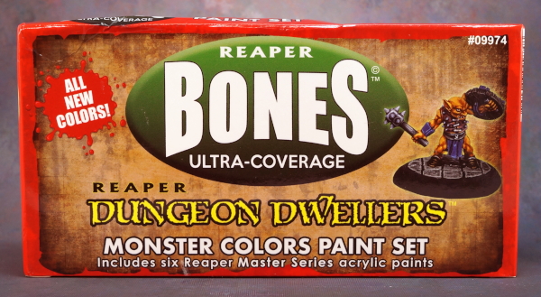
The first boxed set is designed to help you paint the monstrous denizens of your dungeon. These are also a great addition to the Bones HD line as more desaturated colours that will be handy for painting leather, wood, red hair, and a variety of other things.


 The swatches on the top are from my scanner, those on the bottom are a photograph. The paper they’re painted on is ivory not pure white.
The Dungeon box is an interesting mix of colours, and includes two new metallic colours. I have really been liking the Bones HD metallic paints a lot. They’re my go-to paints when using metallics from the Reaper line now. (I do primarily use Reaper paints, but sometimes use the Vallejo Air line for metallics. Steel/silver primarily, the colour selection of their golds is kind of odd unfortunately.)


 The swatches on top are scanned, those on the bottom are a photograph. The two rightmost swatches are metallics, which are hard to photograph at the best of times, but especially as swatches.
I had previously swatched out the core Bones HD line and posted that on my Facebook page, and will include those photos here. Again, these are painted on an ivory drawing paper. I hadn’t realized that I’d included the grayscale card in the photographs and scans of the first images. I used that card to colour correct the scans/pics of the new paints above, I just didn’t include it in the images.

 The selection of blues in the core Bones HD line. I like these a lot, and I am often annoyed by blue paints. (It’s just not my favourite colour, and I find it a pain to blend.)


The browns and purples in the Bones HD line. I also like these a lot, some really great colours that I’ve been using a fair amount.

 The flesh tone assortment of the Bones HD paint line. I haven’t really used pale flesh much as it’s just so, well, pale, but I’ve used the others pretty regularly. I particularly like the Ebony and Ruddy colours as offering something not found as often in paint lines.

 I’ve used these, but not as extensively as some of the other Bones HD colour families. I’m not sure what it is exactly, but they just don’t float my boat. I think it’s at least partly that I often use less saturated greens.

 The Bones HD reds have higher coverage than most of the reds in the Core Master Series Paint line. I always grab an HD red unless I’m being very particular about just what shade of red I need. I don’t paint with orange or yellow that often, so I haven’t used these as much as some of the other colours.

 Never enough neutrals is what I say! ;->


 I took two photos of the metallic colours in slightly different lighting to try to give you an idea of the shimmer effect. I love these metallics! Great colours and shine.

And this is the official colour chart. Note that this is from the date of the line first releasing. As of time of writing, current MSRP on Reaper paints is $3.69.

I don’t think these are their HD line (SKUs starting with 298xx). I was under the impression that they retired the HD line and would only be seeing MSP moving forward.
LikeLike
All of Reaper’s current paint lines are MSP (Master Series Paints). The two original lines were MSP Core, and MSP HD. The Bones HD line is the newest addition, and they are formulated in the same way as the original HD line. If you go look at a bottle of Bones, you’ll see it says High Density on the label, and originally they were capped with black caps, which was a sort of visual code. MSP Core bottles had white caps, HD bottles had black caps. Then another visual distinction was that the original HD line had yellow labels, and the Core had white labels, and the Bones had white labels that featured the word Bones.
They were designed in large part as a compact standalone set of paints that would be easier for small game stores to stock to ‘go with’ the Bones product they were carrying. (The original HD paints do not include metallics, so could not be carried by a store in that way.) It’s simpler to understand than the full complexity of the Reaper paint system!
There are some changes to the product lines and packaging that have been happening the past few months or are in process. The most significant one is that the original HD line has been cancelled. Colours that are included in the learn to paint kits will continue to be included in the kits, and I believe they will also be available outside of them, so there’s a chance a few other colours could get stick around and be folded into one line or other also.
Reaper’s paint department has been becoming more automated in recent years with new equipment. The new equipment does not like the black caps. (I’m not sure if it’s a softer plastic or what, but the production line doesn’t flow as smoothly with them.) So more paints have been packaged with gray caps or white caps recently.
All of Reaper’s paints are formulated in a fairly similar way. The HD paints, both original and Bones, are designed as stand-alone paint colours, for those who prefer to have a smaller selection of paints and then mix their own additional colours. They require mixing to create shadow/wash and highlight/drybrush colours. They are also designed to as much as possible be fairly opaque quick coverage paints. But just like any Reaper paint, they thin down well for mixing layers, glazes, and washes.
The majority of the MSP Core paints are designed in triads where you have three bottles intended to be used as a midtone basecoat, then a bottle for shadow colour/washes, and a bottle for highlight colour/drybrush. In most cases you need to mix intermediary steps between those to get smooth transitions with layering, and you’ll need to add a bit more of a darker colour to the shadow and lighter colour to the highlight to get sufficient contrast, but the triads are handy if you like less mixing. Many of the Core are two coat coverage like the HD, but the goal in producing them is to create a certain colour, so depending on the pigments some may be more transparent. There are also some specialty paints and tools in the Core line, such as the primers, sealers, wash medium, Clear paints, and liners. Whereas the paints in both the original HD and Bones HD lines are just standard paints and metallic paints.
Transparency and opacity has a lot to do with the core pigments that make a colour a colour. For example, the non-toxic pigments that make reds or yellows tend to be pretty transparent. This is true in watercolour, oil paints, etc. It’s just the nature of the minerals or chemicals that create the colour. So to make a red have better coverage it needs to be mixed with higher coverage paints like white or black. That kind of mixing tends to dull the vibrancy of the colour. So you may find a few super bright colours, like the paints with Clear in their names, but find they’re pretty transparent (so transparent that the paint maven, Anne Foerster, thought it best to just put Clear in their names to set expecations.) Anne does a pretty terrific job mixing saturated reds and yellows and so on for the HD paints, but she has to fight the nature of the pigments to do it.
I use all of the paints interchangeably, together, and in whatever capacity I wish (full strength, layer mix, super thin glaze) and generally choose by colour preference. I do tend to reach for the HD paints (including Bones) when I’m using a more transparent colour to save time, except on rare occasions when I feel like I need to be super specific about my colour choice.
LikeLike
Thank you for an extremely detailed reply. It was very informative! As a new painter trying to wrap my head around the different product lines and techniques I really appreciate your response and all of the content you provide.
LikeLiked by 1 person
You’re very welcome Jay!
LikeLike