Ko-fi tips help keep this content free. Patreon supporters receive PDFs with high res photos.
I had some thoughts about painting patience while I was painting the non-metallic metal gold on the Christmas Hugs figure that I wanted to share, along with my colour choices and some tips for painting NMM. Also if you’re trying to paint your own copy of Christmas Hugs and finding it challenging to identify all the gift items on the base, I’ve included a guide to what and where things are are near the bottom of this post.

The Patience of Painting
If you’ve been painting miniatures for any length of time, you’ve probably had non-painter friends and family look at your work in amazement and declare something like “I’d never have the patience to paint something small like that.” I’ve never really understood that remark. While the tools and techniques may differ between different art forms, the kind of patience it takes to sit quietly at a desk seems similar whether you’re painting a tiny dragon or a large canvas, and similar to lots of other creative hobbies, as well.

However, I definitely have found that different painting tasks require different kinds of patience. I’ve also found that it’s helpful to be aware of that and try to keep it in mind as you work. I think patience and expectations can get us into trouble with certain kinds of techniques. With many kinds of painting tasks, things start to look better pretty quickly. If you apply a wash and/or drybrushing to an area of texture, you can immediately see more detail and depth and it looks better. When you start layering or wetblending shadows and highlights onto matte materials like cloth and skin, you see results pretty quickly. A given area might look even better if you added more contrast or detailing or something else, but doing anything is an improvement over leaving it a flat coat of colour.
 I love this adorable little dragon! Julie captured so much joy and personality.
This is not the case for all types of miniature painting tasks and painting effects. Some effects do not look very good until you’ve done a lot of painting. I talked about this last Christmas with my experience of painting the source lighting effect on the Ghost of Christmas Past (below). I was painting the illusion of light being cast from a candle to the side of the figure, while I was looking at the figure under light falling from my ceiling lamp above. The figure looked wrong when it was only half painted because the appearance of the painted light on some areas contradicted the appearance of the room light falling on the unpainted parts. The contradiction prompted my brain to tell me to make changes to what I had painted. That would have been a mistake. I needed to resist that urge until I had painted most of the figure and could assess the appearance of the painted light over the figure as a whole. Once I got to that stage I was able to see that my mistake was in not having painted the effect of the light strongly enough. Giving in to the urge to tone things down in the early stages would have been a mistake on multiple levels.

The Mental Challenges of Non-Metallic Metal
Non-metallic metal is a similar sort of effect. You cannot really tell how well it’s working until you get enough painted that you have some quite dark sections and some very light sections. The main visual properties that set metal apart from other textures/materials are that it appears shiny and reflective. Extremes of dark and light, particularly in proximity to one another, are a large part of what creates the illusion of a shiny surface.
If you’re used to painting textures and effects that start to look better as soon as you apply paint, it can be very difficult to make the mental shift when you start to work on effects that don’t come together until after you’ve put on a lot of paint. It can be difficult to force yourself to be patient when you start to experiment with more advanced effects like source lighting and non-metallic metal. After all, if you don’t have a lot of experience painting NMM, how can you tell if you’re doing it ‘right’ but you just need to get more paint on it, or if you’re doing something wrong that you need to change? The answer is that you don’t. So my advice is go through the process you’ve decided to follow at least once without making major changes while you paint. Then assess the end result and see what you think. If you identify problems, consider what changes you might make to the process to resolve those on your next attempt.
I sometimes find it challenging even as an experienced painter who has been painting NMM for years. As I mentioned in my recent article on painting succubi wings, my patience has taken a hit in this unusual year. I have had fun painting things that are relatively quick and simple, and have found some high level display stuff to be a mentally exhausting slog.

With Christmas Hugs, I started by painting the gifts on the base. Some people might look at all that detail and not be too excited about the prospect of painting it. I found it perfectly suited to my current state of mind. It was a lot of little things I could break down into easily achievable goals. It didn’t require fiddly blending that takes forever. I have good light, good brushes, and a lot of practice painting details. I’m not saying that there weren’t parts where I had to position carefully or control my breathing to paint precisely. But painting the details went fairly quickly and I could see tangible progress hour by hour to have a sense of completion and accomplishment.
That all came to a screeching halt when it was time to paint the dragon. The Reaper Christmas dragon collection already has two red dragons and one green. Given the amount of red and green I’d used on the base, I didn’t think either was a good choice to make sure the Christmas Hugs dragon stood out against her base. I often use warm gold as an accent colour for the Christmas colour schemes, so I thought that would be a good choice for the dragon, and I busted out my favourite warm gold NMM paints.

Knowing it might take a few sessions to paint, I also busted out my ceramic welled palette and sponges. I often use a wet palette during a session of painting, but I don’t find that it preserves the paint in good condition to paint over several sessions. I know lots of people use it that way, but it just hasn’t worked well for me. I can use it for small touch ups, but not for extended painting. When I want to use paint over an extended period of time, I use this porcelain palette with small wells. (Small wells reduce evaporation speed.) I fill the wells at least three quarters full. I add water to the paint as necessary for the opacity that I want, usually a drop or two. If it’s very dry, I might add a little drying retarder. I add water to sponges to the point where they’re not literally dripping wet, but they will expel water with any squeezing. When I’m not painting I put the sponges over the wells of the palette, creating a sort of ‘reverse’ wet palette. Even while painting I will often put a sponge over one side of the palette if I’m not using those colours to help slow evaporation. I tend to put shadows on one side of the palette and highlights on the other partly for this reason. Every now and then I check on the consistency of the paint and add a drop of water as necessary, and I reload the sponges with water once a day.
 I bought mine at Cheap Joe’s, but sometimes I see similar palettes for reasonable prices on Amazon. Lab spot plates are similar.
Painting the hide of the dragon felt like much more of a slog than painting the tiny details. I had hoped to finish the dragon up in a relatively short amount of time, but as I started the second session, it became clear it was going to take me longer. I don’t know if that was a question of being out of practice with fiddly blending, the knowledge of the looming deadline, or just not being in the frame of mind to want to do it. All I can say is that it was aggravating. I spent a lot of time feeling like it just didn’t look very good at all. I questioned whether I should have started with a lighter midtone, or did I need to change something else I was doing? Luckily I have had enough experience painting NMM to know that sometimes it doesn’t start looking right until pretty close to the end of the process. I was able to refrain from making sudden poor choices during painting and instead convince myself to just push through and see how it looked at the end.
There are two suggestions I can make to help with the patience part of painting NMM. One is to paint a small area completely. This gives you an idea of how your colours are working with one another and what it looks like when it all comes together. Once you have that small part looking good, you can refer back to it to remind you what the end result will look like! I did this with Christmas Hugs. I started painting the dragon’s hide late in the evening, so I just mixed my paint, painted the end of the tail, and then headed to sleep. I had that end of the tail to look back at when I was questioning whether my colours were off or if the overall effect would work. While this trick works for NMM, note that it doesn’t work as well for all effects, like source lighting.

The second approach is to quickly sketch in the light and dark areas with your paint. You can do this with rough layering, quick wetblending – whatever works for you. The idea is to paint in the major shadow and highlight areas where they need to be. The transitions between shadows and highlights might look rough, but placing them this way should allow you to get a good idea of whether you are getting a ‘shine’ effect and if your colour choices are working well. It gives you a quick way to judge whether you’re putting things in the right place, and to determine whether you’re using enough contrast between your darkest shadows and brightest highlights. This approach helps you avoid getting something that looks like stone instead of metal! I definitely recommend trying this approach if you’re newer to painting NMM and have been finding it frustrating. You can see an example of me using this technique to paint Caerindra Thistlemoor. This approach works well for a wide variety of effects, like source lighting, though often you’ll need to sketch in all the large areas of the figure not just one section like I did on Caerindra’s metal.
In this approach the second step is to refine the transitions and rough application, and then add smaller detail elements. This can still require patience, but you at least know you got things right in the big picture, which makes it easier to avoid the temptation to change something that doesn’t need changing because you’re afraid it isn’t working. In this approach, as you can see in the pictures of Caerindra, I don’t bother with small details like rivets until the refining stage of the process.
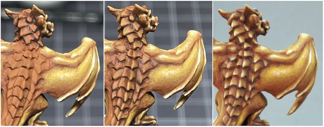
 The middle picture has shadows and the first few levels of highlight on the back plates, but it doesn’t look right because the lighter layers of highlights aren’t painted on yet. So for 80% or so of the time I was painting, things looked not great to me. I had to have faith about where I was going in the end to keep on with it.
The main point I want to make is that as you stretch your painting wings and move into painting intermediate and advanced techniques, your relationship with your inner critic might need to become a little more complex. Your inner critic is that little voice in your head urging you to tweak something a little lighter, add some of this colour over here, that kind of thing. It can you make decisions while you paint. But sometimes, particularly when trying something new and different, it can lead you astray.
It’s important to understand that your inner critic is calibrated to assess how your work is going based on your usual techniques and approach. It can be actively unhelpful when you’re trying to stretch to paint new effects or try new techniques. If you usually paint fairly matte textures with a low range of contrast (which is how most of us paint in beginner and early intermediate stages of painting), your inner critic makes suggestions based on how your work should look using that approach. It’s going to tell you that painting NMM with high contrast looks wrong and urge you to tone down your shadows or highlights. If you’re trying a new paint application technique, it will make suggestions based on your experiences with familiar techniques that could hamper you learning and understanding the new one. So if you’re used to drybrushing and trying to practice layering, it might prompt you to use types of brushstrokes or thicker paint or something that works better for drybrushing but isn’t great with layering.
It’s kind of like that saying about if you only have a hammer, you treat everything like a nail. Your inner critic is used to using a hammer. It can fight you when you’re trying to acquire and learn how to use a wrench. Sometimes it will tell you to use the wrench just to hit everything, like you do with the hammer.
The ability to look critically at your work and be willing to make changes as you paint is an indispensable tool for improving! But sometimes what you need to do most to learn is figure out how to mute or ignore your inner critic while you’re trying something new. Try to just follow the tutorial or the process or your new idea through to the end as you originally planned, and resist the impulses to deviate that spring to mind while you’re painting. Then once you’re done, go back and look at your result and review the process you used to get it, and consider how you feel about both. Actually, I recommend that you wait a few hours or even until the next day to do the assessment. You can usually see things much more clearly once you’ve had a break from painting. Then you are in a good position to make decisions about whether you didn’t get it quite right and how you might need to shift or change things.
Non-Metallic Gold Recipe
People often get quite caught up in trying to find the ‘perfect’ colour recipes for NMM colours. I think that’s a bit of a red herring. I recommend you not get too distracted by colour recipes. The perfect colour for something can vary quite a bit depending on the colours used elsewhere on the figure. The gold I painted on this dragon has a lot of reddish tones in the shadows. It looks good with the rich green and red colour scheme of Christmas colours. It would look overpowering next to the muted colours I used on the succubi. The colours on the pillow in this post are similar to the colours used for the NMM on the succubi. The pillow has more brown tones in the shadows, and weaker yellow colours than the dragon. I used some of these same paints in the gold NMM I painted on the Christmas dragon and on Ziba the Efreet, but the gold recipe for Ziba used purple in the darker shadows to tie into shadows used on the rest of the figure, as well as some different paints in the highlights.
 The gold on the dragon is more vibrant. It would draw attention away from the faces and skin if I had used this recipe on the succubi.

Usually any issues with non-metallic metal not looking correct has to do with values and colour placement. In theory, you should be able to use neon pinks and paint something that looks shiny and reflective like metal, though it might not make you think of a knight’s armour. ;-> Successful NMM requires a large range of value, with areas of dark shadow and bright highlights. Where you place those values is also very important to the effect. Our eyes are more likely to perceive something as shiny if we see dark shadows adjacent or near to light highlights. Not all shapes reflect light in that way, of course. Rounded areas like the dragons wings and knees (or round helms and shoulder plates) reflect light differently than sharper planes like the scales on its back (or swords or armour plates). Shiny surfaces reflect light differently than less shiny ones, so to really pull off the effect well requires studying the light reflection and understanding how it works on different shapes. But you can get a pretty convincing and attractive look even without that understanding if you use value extremes and judgement about where you place those values.
 The paint colours I used. I didn’t use the 9256 Blond Shadow on the dragon. The 9071 Chestnut Gold paint I used was recently discontinued. 9256 mixed with 9071 Chestnut Brown would work as a substitute for 9073 Chestnut Gold.
 The paint mixes I used. Unnumbered mixes are a combination of the colours to their right and left. 9073 Chestnut Gold is discontinued. Beneath that section you can see a swatch of 9256 Blond Shadow and a mix of Blond Shadow and 9071 Chestnut Brown that I think would work as a substitute.
One of the paints I used in this recipe (and on Ziba) was recently discontinued. I just did a test with another colour that is still available. It’s not quite as rich, but I think it should give a pretty similar end result used in combination with the other colours, as you can see in the photos above.
Identifying the Gifts on the Base
Julie Guthrie did an amazing job cramming a lot of fantastic geek-approved gifts into a small space on this base! When I first started prepping the metal figure and even after priming, I had trouble identifying what some of the objects are. Certain things can look a little confusing if you’re looking at the wrong angle. To help you avoid that frustration, I’m including some pictures with a guide to what each object is to help you out when you’re painting your copy of this fun figure.
There are several toy animals on the base. I chose to paint the bat and the dragon as if they were pewter miniatures to go with the brushes and paints, but you could paint them in any number of ways. There were a few small things that I weren’t entirely sure what they were and chose to paint as holly leaves.

1. A pair of socks, a very traditional Christmas gift.
2. A toy bat. I painted this one to look like a pewter miniature.
3. 3d6 (or toy blocks if you’d prefer, the numeral is painted not sculpted.)
4. A toy cat.
5. Several paint brushes in a box.
6. A sock monkey.

1. 3d6, or toy blocks if you prefer.
2. Three paint bottles.
3. Two more paint brushes.

1. The tops of the paint bottles.
2. A large sack. For dice, maybe?
3. A small sack. For smaller dice!
4. A Thingmaker Mini Dragon. This was one of Julie and Bob’s favourite toys when they were children. I painted it as a pewter dragon though.
5. A Mr. Bones stuffy!
6. Delicious candy canes.
7. The top of the sock monkey’s head.
Miniatures Shown in this Post
The Christmas Hugs dragon and the Ghost of Christmas Past are both limited availability holiday miniatures. For 2023 you can choose from Christmas Hugs, The Ghost of Christmas Past, and 10 other figures as a gift with purchase from December 4, 2023 to December 15, 2023 via the 12 Days of Reaper promotion.

Disclosure Statement
Links to products on Amazon in this article are affliate links. As an Amazon Associate, I earn a commission when someone makes a qualifying purchases by using these links. There is no extra cost to you when buying through these links. The commissions I earn are used to pay the costs of maintaining this site, and I very much appreciate your assistance!

So well written. Thank you for this. Very helpful to me. Obviously, the dragon is painted amazingly. Hard to say which is better done, the brilliant artistry on this really cool mini, or the wonderful post about how you got there. Keep up the awesomeness!
LikeLiked by 1 person
Thank you!
LikeLiked by 1 person
Very cool!
LikeLiked by 1 person