Ko-fi tips help keep this content free. Patreon supporters receive PDFs with high res photos.
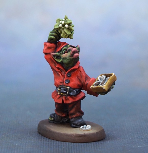
Today I’m serving up a small buffet of painting tips. These occurred to me while painting the Mistletoe Goblin from the Reaper 12 Days figures for 2020, but I hope they will be tasty tips to use all the year round.
 Looking for some holiday love.
Painting Red
Many people find painting red frustrating. This topic deserves a deep dive at some point, but for now, here are some quick tips you can try to see if they help reduce the frustration.
Midtones Make the Colour
Generally speaking, you need to make sure you paint a fairly large surface area in the colour you want the viewer to perceive – at least 40-60%. So to keep the jacket looking like a brighter, lighter red colour, I needed to ensure that a large surface area was painted in those brighter, lighter reds. I needed to keep the light highlights and dark shadows confined to smaller areas. Likewise to keep the pants a dark red, I needed to keep the highlights to small areas and not get too bright with them. (Shiny surfaces and other textures work a little differently, but this guideline works for a lot of surface types.) This tends to matter even more with red than some other colours because neither light red nor very dark red appear classically ‘red’ to people, so you won’t feel as if your item is as red if you lose too much of those midtones.
Reds are Transparent
Pretty much all miniature paint brand bright reds are somewhat to fairly transparent. This is a property of the available red pigments that are non-toxic and not super expensive. Miniature paint brand reds that are less transparent will also be at least a little less saturated (bright/vivid) in colour. This occurs because the most common way to make a paint more opaque is to add some more opaque pigments to the mix. Generally this is black and/or white, either of which reduce the saturation of colour mixes. (You can read more about colour properties.)
In the Reaper paint lines, the Bones brand reds have the best coverage. Brilliant Red is a good compromise between decent coverage and intense colour. The truest, most vivid red in the Reaper line is a transparent colour, Clear Red. You can glaze it over red areas you want to brighten up a little to increase saturation. (I did not do that here, I think of Christmas red as being pretty saturated, but it doesn’t have to be the most intensely saturated red.)

There are some red paint art store alternatives that aren’t as transparent, but that is a topic for another day. For now, just be aware that it’s about the pigment, not companies mixing paint poorly because they’re being cheap. (More about pigment and paints here.) You’re just going to have to have a bit of patience when painting red because it will take more coats than many other colours. I usually annoy myself by being a little careless with my shadow placement and then having to spend more time than I’d like smoothing out transitions or restoring the midtone bright red.
Shadows – Don’t Paint it Black
If you only own mid-value reds and you mix your own shadow colours, I recommend not using black to darken red. It makes fairly dull reds and can be more difficult to mix with precisely. Experiment with dark brown, dark blue, deep purple, or mid to dark greens instead. You might be surprised at the interesting rich shadows you can create for your reds! On this figure I just used darker reds, and mixed in a bit of Blue Liner for the deepest shadows and lining. (Full recipe below.)
Highlights – My Secret Ingredient
If you mix white into red you get pink. If you mix yellow into red you get orange. Neither really mimics the appearance of a red surface being lit by brighter light. If you mix pink and orange together you get a salmon colour, and I find that salmon colours work great for highlighting bright reds!
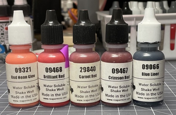
The first time or two I experimented with this I mixed my own, and then I discovered a Reaper paint called 61131 Red Dust. This has long since been discontinued, but now we have 9321 Red Neon Glow, and it works even better for the purpose. There is another colour you could try if you have it on hand – 9232 Bright Skin Shadow. This was very recently discontinued as well. It is also a duller colour. I would probably add a little orange to it, but it’s worth trying if you have some to hand and you want to test this kind of highlight colour on red for yourself before buying some Red Neon Glow.
My Recipe
To paint the Mistletoe Goblin, I laid out a full spectrum of red paint mixes from lightest to darkest. I used these mixes on both the pants and the jacket. However, I used different parts of the spectrum of mixes for the two items, and I used mixes in different proportions. 29840 Garnet Red is discontinued, but there are several darkish reds in the Reaper line that would work as substitutes. 9278 Gory Red (recently canceled) looks closest, but I think 9135 Carnage Red is also similar, just a little less dark.

Reference the Real World
I received a pleased comment or two about having accurately painted the mistletoe. Many people confuse mistletoe with holly or ivy, other plants which are traditionally associated with Christmas. Both of those have dark, rich green leaves, but mistletoe has lighter grey-green leaves.
It is worth taking time now and then to research what things look like. Most of us feel like we know what a lot of things look like. We’ve spent our whole lives looking at things, right? So we must know what they look like. The general observations that most of us have stored up in our minds are often somewhat to strikingly inaccurate or incomplete. We tend to focus on just one or two aspects of an item. Like we know that mistletoe is green, but might not have accurately stored knowledge of exactly what kind of green. (For another example, think of a set of stairs you climb regularly at work or home. How many individual steps are there? Few people can answer that, even if they walk up that set of stairs multiple times per day. We often see things but don’t really see them.)
The more you look at and study real objects, the more ideas you’ll get for how to paint them. You’ll also increase the accuracy and the number of the objects in your ‘visual library’ – the objects you have really looked at and know what they look like. If you paint worn leather a lot, work on a miniature where you look at some examples of worn leather and you aim to match the way the colours fade and the patterns of wear instead of just doing it from your imagination. Then the next time you paint leather from your imagination, you’ll have more information to work with!
 One of the watercolour mistletoe cards I painted.
I was familiar with mistletoe due to having painted some for Christmas cards some years ago. The painter in the tutorial I followed had some sprigs of real mistletoe to reference and shared them on video. She also described mixing the paint in some detail so I was aware of the desaturated yellow-green colours. I nonetheless did some online searching to refresh my memory of what mistletoe looks like. (I tried to find the video I followed to add a link, but if it’s still on YouTube I couldn’t find it. There are lots of others on painting watercolour mistletoe though!) There is also a difference in the appearance between North American and European mistletoe. The stereotypical Christmas mistletoe is based on the more attractive European version.
Focus
I spent some time talking about focus in the succubi wings article. It has been on my mind a lot lately as I work on putting together information for my ‘handbook of miniature painting’. It’s also something that I have historically not paid enough attention to in my own painting. So currently I am trying to focus on focus in my own work, and I figure it might be helpful to some of you if I share my thought process on that.
The Mistletoe Goblin is a simple example of trying to consider focus. To me the story of the miniature is in the goblin’s face and the hand holding the mistletoe, with a secondary focus on the box of chocolates. So how do I take that idea and turn it into paint on a figure?
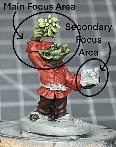
Ron (the art director at Reaper) and I agreed this should be a green goblin. Red and green are colour complements, and traditional Christmas colours, so I was starting off with a strong colour contrast advantage. But there were still plenty of ways I could have gone astray.
One issue I had to consider is that if the goblin is green, and mistletoe is green, how do I emphasize the face of the goblin as the main focus? Mistletoe is a light green, and lighter colours tend to draw more attention. Thanks to my research I knew that mistletoe is a more muted green. Muted colours draw less attention, so that was helpful. It also has white berries instead of red like holly, which would have been higher contrast.
Using a very saturated green on the goblin’s skin would have helped draw attention to the face, but I didn’t want to use super saturated green colours for the goblin skin. Unless I’m painting something very cartoony, I like to desaturate skin colours at least a little. Just as real world people are very desaturated versions of ‘red’, ‘yellow’, ‘black’, ‘brown’, I apply the same principles to fantastic skin tones. You can compare the more muted greens on the Mistletoe Goblin with the saturated greens I used on the Ghost of Christmas Present in the picture below.
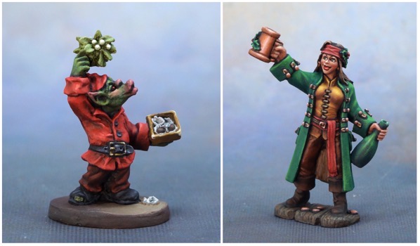
But by using more saturated greens on the skin than on the mistletoe, I could at least draw a little more attention to the face. After most of the miniature was painted and coming together, I also decided to add the touches of pinky-red to the lips, nose, and ears of the goblin. That brought the strong colour contrast of red/green directly onto the main area of interest of the face.
 Before and after adding some red areas to the face and ears.
Many of my other decisions were related to avoiding distraction in other areas of the figure. I painted the pants a dark red, and did not paint them with strong contrast between highlights and shadows. I chose black for the shoes and belt, and again pulled back a little on the contrast. Partly this was for character – with a hole in the shoe, these were clearly not well-polished new shiny black patent leather or anything! But it was also to avoid drawing too much attention away from the focus areas. The legs and feet add character details, but they are not a significant part of my story.
The ‘story’ I chose for my version of the miniature is just one possibility. It would definitely be possible to tell another story with this miniature that puts a lot of focus on the worn out shoes and half eaten chocolates, and that story would benefit from colour and value used in very different ways than what I chose. There’s not a ‘right’ answer to how to use focus on every miniature. The key is to think about the story/character you want to convey to the viewer and make choices that support that.

I’m not sure if the chocolates and box end up pulling more focus than they should. It’s a small area and something we don’t see a lot on miniatures, so I was concerned about making it as identifiable to the viewer as possible. I painted a light grey and just highlights of white for the chocolate cups, but it’s still strong contrast with the dark brown chocolate and then both of those contrast with the gold box. Possibly I should have painted the cups a little darker grey and the chocolate as more of a milk chocolate. But I’m still doing a lot of work figuring this focus stuff out myself! This is where things get interesting and artistic. And sometimes frustrating and challenging!
Miniatures Shown in this Post
The Mistletoe Goblin and the Ghost of Christmas Present are both limited availability holiday miniatures. For December 2023, the Mistletoe Goblin is available for purchase in the Reaper webstore. The Ghost of Christmas Present is part of Reaper Miniatures 12 Days of Reaper promotion, which is running until December 15, 2023. For each $40USD (or equivalent) you spend at the US or UK Reaper store, you can choose from one of 12 different holiday figures as a free gift with purchase. This stacks with the usual monthly promotion.


Thank you for another super helpful post. Red has confused me so much as a new painter, and reading things like this are invaluable. It’s nice to know when it’s not a mistake you are making, but a characteristic of the paint. Even more helpful when you offer an effective solution! Thanks so much, can’t wait to try it. Also, the section on focus just made me think of things sitting on my worktable in a whole new way!
LikeLiked by 1 person
I’m glad you found it useful! Your comment reminded me of a painting red tip that I forgot to mention. To help cut down on the number of coats you need to paint an area red, start with a coat or two of rusty red or reddish brown you have that is pretty opaque. Then paint a coat or two of your more vivid but more transparent red paint over that. (Yellow and orange can have similar issues, and similar tips work for them.)
LikeLiked by 1 person