Ko-fi tips help keep this content free. Patreon supporters receive PDFs with high res photos.
Do you think artistic ability is a talent that you have or you don’t? Do you put most of your miniature painting study emphasis on what your hands can do in terms of executing and learning new techniques? Do you curse your eye’s inability to match colours, or even see colours?* There’s something I think you need to know – many of your problems are not a lack of talent, not your hand, and not your eye. Much of the reason you struggle in artistic endeavours, including miniature painting, is all in your brain!
We are literally of two minds. Each mind observes and interacts with the world in a different way. The mind that is large and in charge for most of us does some amazing things, but the way it works regularly sabotages artistic attempts, in several ways. A better understanding of how our two minds work can help us paint and learn more effectively, but it can also help us treat ourselves less harshly when our artistic attempts don’t turn out as we’d hoped.
This is the first in a series of articles to uncover some of the mysteries of how our minds work in terms of visual art endeavours. But before I start delving into that, first I’m going to ask you to humour me and do this little exercise. I think the exercise it will make it easier to understand the points I’m making. I promise that this does relate to miniature painting, and that I will talk about miniature painting specifically further into the article. It’s just easiest to explain the basic issue with drawing.
I’d like you to draw a quick sketch of a cup using the reference photo included in this article. It shouldn’t take you more than a few minutes at most. Try to capture the overall shape of the object, and if possible some of the variation of values on it. You don’t need anything fancy – just a basic pen or pencil and a piece of paper, or even a napkin. You don’t have to show me or anyone else what you draw, this is just for you, so there’s nothing to be embarrassed about.
I did a similar exercise using pencil, felt-tip pen, and ballpoint pen. You can see my drawings and the reference photo I used below.
 Ornament – Photo by Charlie Solorzano on Unsplash.
Here is the reference photo I’d like you to use for your quick drawing:

![]()
One of our minds is often referred to as the right brain. It is in charge of observing, sensing, feeling – often on an unconscious level. It places you in space and performs other tasks based on its observation of the shapes, values, and colours around you. It is thanks to this mind that you can successful reach out to grasp an object, or raise your leg the right distance to step up onto a stair. It can do these things because it has been observing aspects of the world around you since you were an infant, when it drove you to look at, touch, and even taste everything in your surroundings to gain more information about the shape, colour, and location of objects based on how they look, feel, and sound.
When people talk about the artist’s eye, they’re largely referring to this part of the brain. It has access to a lot of the information you need to better perform artistic activities, and it can be trained to perform them even better. As learners we put so much emphasis on the physical aspects of our hobby – the right techniques to apply paint smoothly, the best tools to use. But there are artists who make stunning works of art with finger-paints. There are artists who have made representational art from Jello, sunflower seeds, Post-It Notes and sand. They are able to do this because a key component of making art is observing and recreating or evoking the shape, value, and colour of objects. While the hobby of miniature painting by its nature may require more dexterity and precision than many other art forms, it benefits from accessing and improving your artist’s eye as much as any other.
Our other mind is often called the left brain. It is conscious, analytical, and calculating. It is the mind of math, language, and logic. It identifies and interacts with the world around you through names and symbols. It makes the to-do lists, and figures out how to do the tasks on them. Or it rationalizes why you shouldn’t bother with those tasks and go play some video games instead. Most of the formal teaching and training we receive focuses on this mind, whether it’s our parents teaching us how to tie our shoes, our schools teaching us algebra, or our workplaces training us how to use the equipment required to do our jobs.
The terms left brain and right brain are gross simplifications of how our brains actually work. Multiple parts of the brain are involved in most of what we do. But they’re convenient short term labels, so I will be using them. I also like the terms observational mind and analytical mind.
Because of the way we’ve been educated and the tasks we need to consciously perform in our day-to-day lives, the analytical mind is the dominant one for most of us. And for most of us, it’s very dominant. When we try to perform a task that is better served by accessing information perceived by our observational mind, our analytical mind often gets in the way. Sometimes it gets in the way a lot.
It’s helpful to understand some of the specific ways our analytical minds sabotage us. One way they mess us up is because of how knowledgeable they are. Let’s look at the exercise from the beginning of this article for an example. I’ve started with a drawing example because it’s easier to explain and see, but all of this also affects miniature painting and how we approach colour use, colour matching, value, textures, lining, and of course – contrast! Later in the article you’ll find examples of how this same issue affects us in painting.
Earlier I asked you to draw a cup. Unless you’ve had some training in drawing, you probably made at least one of two common errors. That is not because you suck at art! It’s actually because of how much you know about the world around you. This sketch is an example of the common problems.

In comparison to the reference photo, the sketch has a much bigger opening for the mouth of the cup, and the bottom edge is much flatter than the cup appears in the photo. Below is a comparison with the original. In the picture on the right, the blue lines represent the contours on the reference photo, and the pink lines are the same areas from the sketch.

Several kind volunteers did this exercise for me to use in this article, so you can see additional sketch examples at the end of this article.
Issue 1
Without artistic training, many people who draw something like a cup, cylinder, vase or similar object will draw the opening much larger than it should appear based on the reference they’re using. (Or if they are drawing from imagination, they are likely to draw the opening larger than it should appear in comparison to the perspective used in the rest of the picture.) Why do so many people make the same mistake instead of a variety of mistakes?
We make this mistake because our analytical mind knows that the opening of a cup or the top of a cylinder is round. We may see it as an ellipse (oval), but we know that it’s round. Usually our analytical mind is sort of aware that there is a contradiction between what we currently see on this specific object and what we know about cylinders in general, so it compromises by drawing an oval, but one that is wider than in our reference.
If you look at the examples at the end of the article, there is a huge variety in the differences between the angles people used for the sides of the cup in comparison to the reference, with some drawing the two sides more parallel than they appear in the reference, and others drawing them with a much greater angle than in the reference. The knowledge we have stored about the sides of cylinders is much less fixed than the knowledge we have stored about the tops/openings of cylinders. Almost all openings are circles, but the sides of some cups taper, some are straight, and some bulge outwards in the middle.
Issue 2
Most people without training draw the bottom of a cup, cylinder, vase or similar as a flat or nearly flat line. Again, this happens because our left brain barges in with all its knowledge and overrides what we see. I mean, we all know that the bottoms of most cups and cylinders are flat. If they were curved they’d tip over on the table. But if you look at a cylinder from any angle other than straight on, both the top and bottom will appear curved. The bottom of a cylinder is a circle too, after all!
You can see how unhelpful our left brain can be – it can make us draw the top wrong because we know it’s a circle, and then it can ignore that the bottom is also a circle and makes us draw it too flat!
If you made either of these mistakes, trust me, you are in good company. Here are a couple of examples of medieval artwork with the same kinds of errors. In this first one the artist drew the plates as if we are looking down on them from above – they’re not even just too-large ovals, they’re completely circular! But then the artist drew the jug as if it were viewed from the side. The perspective of the jug is somewhat similar to the perspective of the people. The perspective of the plates doesn’t match anything else in the painting.
 The Last Supper by Alexander Master from the Europeana Collections.
This unknown artist below has made exactly the same mistakes – the plates appear as if viewed from above, the cups and jugs appear as if viewed from the side.

Those errors reflect the things our analytical minds know about each type of object – plates are round; the tops and bottoms of jugs and cups look flat when viewed from a direct side angle. I took a section of the above painting and edited the three objects on the right to appear closer to how they should look given the angle of the table to create an example of how focusing on depicting only what we see creates more realism than if we allows our left brains try to inject additional facts.

I want to stop and point out that the paint application technique and the overall rendering is pretty well done in both of the above paintings – the cloth has smoothly blended peaks and folds, there are textures and freehand pattern details. The paint is highly pigmented and was applied with appropriate tools. These aren’t the magnificent paintings of an artist like DaVinci or Vermeer, but they’re painted to a better standard than most quick tabletop miniatures. ;-> The big problems with the paintings are not problems with techniques of paint application or quality of tools. (Which are the kinds of issues that miniature painters focus all of our attention on.) The issues with these paintings are mistakes in the drawing of objects that result from failing to see them correctly. The mistakes are in the training of the artist’s eyes and brains, not their tools and skills. The same exact kind of issues affect most miniature painters, as I’ll explain below. You can look at a wide variety of paintings of the Last Supper, many of which have similar errors.
So the first Art vs Brain issue that affects us is:
Your analytical brain prompts you to include more or less information about an object based on what you know, rather than allowing you to try to replicate only what you see.
Knowledge vs Observation in Miniature Painting
Now I want to focus on two questions. The most important is – how does this drawing example relate to miniature painting? But I think it’s also important to consider how knowing why we mess up can help us.
How does Knowledge Overriding Observation Affect Miniature Painters?
Miniature Painting Example: Contrast Issues
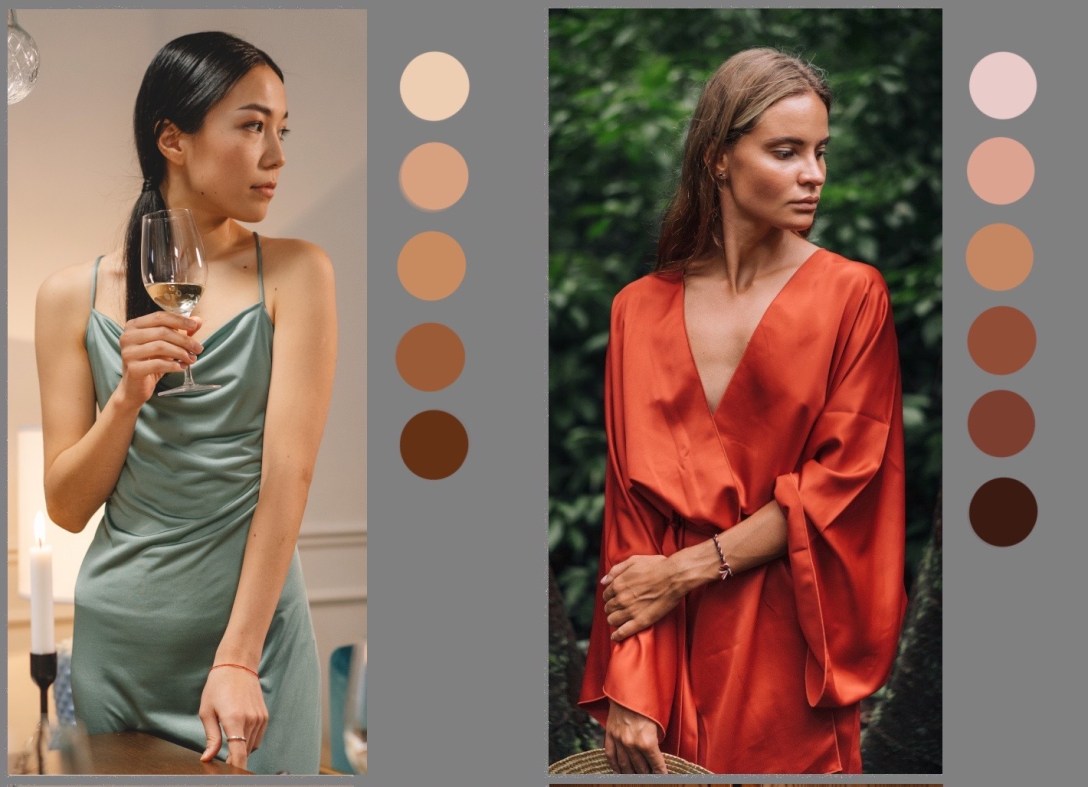
So how does this relate to miniature painting? The challenge of drawing the correct perspective of a cup or plate is just one example of how our analytical mind barges in and causes us to make mistakes. One of the biggest issues for most miniature painters is contrast. There are a variety of reasons that we find contrast so challenging, but one big cause for it is this contradiction between what we see and what we know. Let’s say we want to paint some cloth on our figures like the following examples.


The first thing we ask ourselves is “what colour is that cloth?” We come up with answers like forest green, rust orange, sage green, and white:
 Midtone colours sampled from the clothing pictures above, displayed on a 50% grey background.
That answer doesn’t tell us everything we need to know to paint cloth like that. We actually aren’t even asking the right question. Your left brain likes simple, direct questions. And it’s great at coming up with simple, concise answers. While that approach is effective in a lot of scenarios, it is too simplistic for good painting. In this case your analytical mind stripped away a bunch of information it considers unimportant to boil things down to the essential answer. It knows that the answer to “what colour is this” is the average or midtone colour of the object under a neutral colour light. (In art terms, this is called the local colour.)
If your goal is to buy a shirt or pick out a rug in the same colour as something you’re looking at, your left brain is correct. The simple question and the simple answer of the midtone colour is the only piece of information you need. If your goal is to paint fabric on a miniature that realistically represents how a piece of clothing looks, your left brain has led you astray. The pieces of clothing in those pictures are not just one flat colour. There are areas where light hits the cloth and makes it appear lighter, and there are other places that are obscured from the light and appear darker. You may be thinking of course there are, that’s why we paint shadows/washes and highlights/drybrushing on miniatures, why is she telling me this?
I’m telling you this because I can almost guarantee that you don’t paint dark enough shadows and/or light enough highlights. One reason you don’t is because your brain is experiencing the same kind of contradiction as people experience when drawing the cup. You can see that there are dark shadows on that white shirt, but you know that the cloth is white, and you’re trying to paint white cloth. So your left brain says okay, let’s compromise and paint some shadows, but don’t make them very dark, because this object is white.
Your left brain is so good at factoring out ‘unimportant’ information in favour of what it knows to be true that some of you reading this may not even be consciously aware of the range of contrast in the reference photos I chose. Below you can see the photos again, along with samples of colours as they appear on each piece of clothing, from lightest to darkest. You can see that there is quite a range of values between the lightest highlight and darkest area of shadow. This article discusses why dramatic lighting makes a better miniature than flatter lighting. (My example pictures aren’t flat lighting, but they’re also not super dramatic lighting.)
 Left: photo by MariaBeatrice Alonzi on Unsplash. Right: photo by Mikhail Nilov on Pexels.
You can see another example of a large range of contrast on a deep forest green in different lighting scenarios.
 Left: photo by cottonbro on Pexels. Right: photo by Lisanto 李奕良 on Unsplash.
We often fail to see the full value range of an object even when looking directly at it or a photograph of it. The problem is exacerbated for most miniature painters because we rarely use reference photos or direct observation of real life objects to guide our painting. Our left brain tells we don’t need to look at reference. After all, we see cloth, and leather, and metal, and other materials all the time, we already know what they look like! Think about the experiment of drawing the cup. If what our analytical mind knows can mess us up when we’re looking right at a picture of a simple object, imagine how many problems it can cause when we’re relying on our memory of what things look like! Our left brain knows that a plain piece of cloth is dyed one flat colour, so it resists the idea of applying shadows and highlights that are much darker or lighter than that flat colour. Then our left brain compounds the problem by telling us that stronger contrast isn’t even realistic, even though it often is, as you can see from the reference photos above.
When I give people critiques that their painting needs more contrast, they often tell me that they choose to paint with lower contrast because they want to paint in a more realistic style. While it is certainly the case that there are people who paint miniatures in a cartoony or dramatic style that pushes contrast past the point of reality, I think a lot of people who resist the idea of painting higher contrast are doing so on the basis of what their left brain thinks things look like, rather than studying how things really look. I think they also like a higher level of contrast when viewing the work of others than they feel comfortable applying to their own. Their right brain sees the higher contrast on other other people’s work and recognizes it as realistic. When they’re painting their own figures, their left brain yells at them to keep the colour flatter and more uniform.
Note that there is also a wide range of contrast on the skin in the photo examples I used, even though skin is not as shiny a material as the cloth in those photos. I also would not say that either of these pictures were taken in super dramatic lighting conditions.
 Left: photo by cottonbro on Pexels. Right: photo by Mikhail Nilov on Pexels.
You can see the contrast ranges I used on a figure with light skin, and one with darker skin. I also have an example from another artist with an accompanying instructional video. I have a contrast range example with blond hair that also has an accompany video. In all cases scroll down the articles to nearer the bottom to see the paints used to compare the darkest with the lightest values.
This is far from the only issue keeps us from painting with sufficient contrast, but I think it’s a big contributing factor to the reluctance to even try. I have written a number of articles about contrast, including one that discusses some other mindset issues, and one that suggests some hands-on methods for successfully increasing the contrast on your figures.
![]()
Miniature Example: Lining
Painting dark lines in between different areas (where skin meets shirt, shirt meets trousers, etc.) is the most effective thing a novice or basic level miniature painter can do to improve their work. Painting instructors give feedback to add lining all the time. And just as with contrast, we get a lot of pushback from people who feel that lining isn’t realistic. Thick black lines may not be strictly realistic, but the concept of lining in general is actually a way to simulate something we see in reality all the time.
When objects overlap or are directly adjacent to other objects, they usually cast a small line of dark shadow onto the underlying surface. Our right brain recognizes this. If you look at a piece of artwork that doesn’t have at least small shadow lines in the appropriate places, you’ll often feel like it’s floating in space and not a real solid object. Some of you may not have drawn any of the shadow cast by the cup in the reference photo at the start of this article. After all, I said the task was to draw the cup, not draw the photo or the scene. So your left brain may have focused on just the cup. In a similar way, many people paint areas of a miniature as individual objects – the robe, and the belt, the quiver, and so on. They are not thinking about how the figure is a whole where one object might affect another, such as by casting a shadow onto it.
Here are a couple of photo examples of this type of shadow in the real world. You can see that it looks more realistic and natural to have these shadow lines, even when the light is fairly diffuse and objects aren’t casting dramatic shadows. (Note that the dark line often seen underneath an object sitting on a surface even has a name – the occlusion shadow. This area is occluded from directional and even most ambient light.)
In this first example, I digitally removed the shadow line beneath the orange on the right. The orange on the left is unedited. Note that this is a very brightly lit photo, so there isn’t a dramatic value range between the highlights and the shadow on the oranges themselves, but even in this lighting situation there is a pretty dark occlusion shadow beneath them.
 Photo from Pixabay on Pexels, digitally edited to remove shadow under orange on the right.
In the example below, the original picture is on the left, and my edited version is on the right. I removed all of the shadow lines that miniature painters would replicate with lining. I also removed most of the cast shadows, since miniature painters rarely paint these. The effect of shadow lines (lining) in adding detail and making objects look three dimensional is particularly obvious around the bottom of her shirt, the hand on her hip, and the front of her pants. The front side of this woman is well lit in this photo. Even though there actually isn’t that wide a value range between the highlights and shadows on the front areas of her clothing, the shadow lines that we would replicate with lining on miniatures are still very much in evidence.
 Left: photo by Kai Gabriel on Unsplash. Right: photo digitally edited to remove shadows.
I have another article with more examples of lining type shadows in the real world.
![]()
How Does Understanding this Help Your Miniature Painting?
So now that you know about this issue, you should be able to paint the perfect amount of contrast and lining on every figure, right? Alas no. But being aware of the issue can help in a couple of different ways.
First, if you have been resisting using lining or higher contrast because you feel they’re unrealistic, I encourage you to make your own study to see whether that is really the case. Observe people and objects around you as you go through your day, and look at pictures on your phone or camera. Study the range of values on textures like cloth and metal. You can export pictures into an image editing program and use the eyedropper colour sampling tool to isolate values in different sections. Next look for dark thin lines where two items touch or overlap. You won’t find strong contrast and shadow lines in every example – they occur less when lighting is very diffuse or flat. But hopefully you will find enough examples of higher contrast and lining type shadows to convince you that it’s worth experimenting with pushing contrast and lighting on your figures. Try it on a few figures (more than one!), and then assess what you think of the results. Ask friends for opinions. If you try it for a while and you still don’t like it, you can always return to how you painted before!
Second, if you are someone who already is trying to push your contrast but finding it challenging – keep trying, it’s worth it! And don’t beat yourself up too much when you don’t succeed. There are reasons why it is challenging, but those reasons are not that you suck! The issue I’ve explored here isn’t even the only issue that makes pushing contrast hard; there are multiple reasons that your eyes and brain tell you’ve got enough contrast or even too much.
If you’re aware of the challenge, you can take steps to check your work. It helps to take breaks, step away, and come back to view it with fresh eyes to double check whether it was really as contrasted as you thought while you were painting. I still have to do this sometimes despite more than a decade of actively pushing my contrast. You can see lots of examples of me going back to add more contrast to figures!
I have found that the situation is pretty similar in learning traditional art. Knowing that I will want to draw the ellipse of a glass or jar larger than it should be doesn’t keep me from ever making mistakes. But knowing I’m likely to do this does prompt me to check my work and correct issues sooner in the process. It also helps me figure out what I did wrong when something doesn’t turn out that well.
It may be helpful to know that people studying many traditional art forms also have trouble with contrast! Newer artists are often hesitant to use strong contrast, and the need for to add darker shadows is common feedback from instructors. I’ve had fewer problems than many novices do because I spent years wrestling with it in painting miniatures. But even so, I still mess up sometimes, like I did in the drawing below.
On the left is my original drawing. The right is a digitally edited version of the picture. The only change I made to the features was to move the location of the eyebrows up slightly. Everything else is in the same place and the same shape in both drawings, but some things look like they’ve moved or changed because the darker shadows define them better. (I’m not able to share the reference photo, but the higher contrast version is also a lot closer to levels of light and shadow in it than the original.)
 Left is my original drawing. The right side is digitally edited to add more contrast. You can read about where to shade faces on miniatures.
Here’s another example of an historic painting. The painting has fairly realistic colour which was applied with precision. It has smooth blending where appropriate, lots of freehand pattern details, more realistic face proportions, and depiction of different texture surfaces like marble, cloth, and fur. The artist painted the glasses and jugs correctly, with small ellipses at the top and some gentle curves at the bottom that fit with the perspective of the tables and floor. Now look at the plate in the centre of the rectangular table – it’s drawn as if viewed almost from directly above! Even though the two glasses to either side of it are drawn with correct perspective to the rest of the painting and the artist got so many other things right. Even the other plate at the far end of the table is more correct.

Caveats and Notes
The book Drawing on the Right Side of the Brain by Betty Edwards is the classic reference for people looking to understand why drawing what you see is so much more challenging than it sounds. I like the book Your Artist’s Brain by Carl Purcell as well or better. I am indebted to both of these for helping me begin to understand these kinds of issues.
You may feel that the photos I chose for reference are cherry picked to have stronger shadows and highlights than what you might see around you on a day to day basis. And that’s a fair comment. I did look for photos with a good distinction between well lit and shadowed areas. I’d like to quote a section of a previous article to explain why I think the diffuse or flatter lighting we’re used to seeing in in indoor locations like offices and stores is not the optimal choice for miniatures.
I suspect there are a couple of reasons that people think darker shadows on light and medium skin tones are unrealistic. One is that we increasingly see people in very even lighting. A lot of photos and videos of celebrities, Instagram models, and advertisements use a soft front light or diffuse overall bright light on faces, because it minimizes the appearance of wrinkles and blemishes. (Flat light flatters!) Pro photographers photoshop faces to appear even smoother, and selfie takers follow suit by using filters. You still see the facial features, but this is largely because of cosmetics and just the scale of them as real people. Well, ‘real’ people. Photos that have been heavily manipulated with professional lighting, lenses, photoshop, and filters may be affecting our judgement of what appears realistic. They are a terrible reference to use for how people actually appear in reality.
A lot of candid cellphone camera photos actually have a similar problem, although they are usually less flattering. We spend a lot of time indoors in very even lighting, in our well-lit offices, homes, and schools. So those photos may be more realistic, but they’re often also pretty dull. They’re also not the only kind of realistic.
I encourage you to actively look at people in different lighting situations and see if dark shadows on skin are as unrealistic as you think. Look at faces outdoors in bright sunlight. Study faces when you’re in more mixed lighting situations like restaurants. Also remember that if you are painting fantasy characters, they do not live in our artificially lit environments! Torches, campfires, and gas lamps are all going to cast stronger shadows than our modern ceiling lights.
Another way to think about it is to compare the lighting in a sitcom versus a movie. Sitcom sets are evenly lit so the cameras can capture the actors from any angle and position and they’ll look pretty much the same. Movies are lit for specific scenes to evoke emotion and tell stories. Do you want your figures to have bland sitcom faces or dramatic movie scene faces?
 Contrary to how it appears in my drawing on the left, our cats have very ordinary food bowls. The perspective on the bottom of the bottle on the left is correct. The top of the lid is drawn much wider than it should appear.
I made the error of drawing ellipses far too round for years after I started to work on traditional art, as you can see above. I asked several volunteers to draw the cup in the reference photo. Many of them are already more in tune with their artist’s eye, and they made this mistake to a much lesser degree! Their drawings were so good, in fact, that I ended up drawing a deliberately wrong example to use at the beginning of the article. Thank goodness I had the medieval artists to fall back on to demonstrate that this really is a common error!
Here are the pictures drawn by my very kind volunteers. Congratulations to them on being too good to use as bad examples! And my hearty thanks to all of them for taking the time and effort to do this. In the comparison pictures on the right, the reference photo cup contours are drawn in blue, the contours from the volunteer sketch are outlined in pink. I laid each of the photos over the reference cup image to line up the tops and bottoms of reference and drawing, and I trimmed a few drawings for the comparisons. I adjusted the whiteness level of the paper on a few as well. I know from experience that it’s harder to take pictures of sketches than you’d think!


*If you are colourblind you have a physical impediment to how you see and match colour, but you may also experience some of these two mind conflicts, as they can relate to value and other aspects of colour than hue. But alas neither this article nor any other can fix colourblindness.
