If you like the work I do on this blog, please consider supporting it via my Patreon or a Ko-fi tip.
(Links to posts, events, figures, etc. mentioned in this post are provided at the end of the post.)
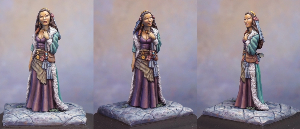
In my last post I showed off my figure Promenade, and talked about how well she’s done at the shows I’ve entered her into this year. I’m pretty happy about that, but that doesn’t mean that the figure perfect, or that I have achieved the pinnacle of painting skill. I know there are people who look at my work and wonder if they will ever be able to paint that way, or if they should ‘break their brushes’. The thing you might not realize is – I sometimes look at the work of other painters and feel a similar way!
In fact, the better at something you become, the more effort it takes to make ever smaller increments of improvement. I think this is true of just about any skill. Think about learning a second language. It’s not too hard to learn a few words. It’s a bit more effort to learn how to put those in sentences and communicate basic information. And a lot of effort to be fluent. But there are different levels of fluency. At a certain point you only run into unfamiliar words to learn every now and then, or you work to grasp a grammatical detail a little better. The progress you make is a lot less dramatic than knowing nothing and being able to ask ‘ou est la biblioteque?’ a few weeks later. But that tiny bit of progress can take as much or more work as going from nothing to sentences.
So how do I work to improve now that I’m pretty fluent at miniature painting? One way is to occasionally push myself to try something new, or to experiment with refining/shifting the way I do something. Another way is to see my work through a critical eye – both my own, and trying to view it through the eyes of another. This piece turned into an opportunity to explore those two methods. (Which are not the only roads to improvement, by any means!)
Trying Something New
I started painting this figure not with the idea of it being a contest entry, but to practice concepts from a weekend workshop with Alfonso ‘Banshee” Giraldes. One thing he does is use a fairly small selection of paints, and mix all the colours he needs from those. So he’ll have a couple of varieties of blue, red, and yellow, and then if he needs a green, he’ll mix a blue and yellow together to create it. You can mix browns and grays this way, also. With acrylic paints like we use for miniature painting, you also need white. While you can mix dark colours that can function as blacks from the basic colours, it’s fairly common to also have a black to darken mixes. Alfonso often adds a few very brightly saturated paints to his palette to add pop to his mixes. When I sat down to paint I added a skin tone and a purple to not have to mix those completely from scratch and save a little time.
 I didn’t remember until I dug up this picture, but I started working on this figure at a convention paint & take table during some down time. This might not have been the exact palette I’d have selected if I were at home, but it’s not that far off. Basically a warm and cool version of each of the primary colours. So a red that shifts a bit more to orange, and another that shifts a bit more to purple. This is known as a split primary palette. I’ll try to get into a bit more detail about it in another post some time. Basically the purpose behind doing this is to be able to mix a range of more saturated, truer colours, and also more muted colours. If you’ve chosen good primary colours, with practice you can mix just about any colour you could think of with a set like this, and then mix shades and highlights for them.
I almost always customize and shift the colours I use one way or another, but I have an enormous number of paint bottles, and I like it that way. I start with colours as close as possible to what I want for my main colours and tweak as necessary from there. I’ll use other premixed colours for shade and highlight mixes, with additional mixing between the mid-tone colour and darkest and lightest colours. I have occasionally painted with a super limited colour scheme. Once a four colour scheme with white, black, blue, and brown, and once a three colour scheme with a very dark wine colour and very dark blue colour as well as white. Those were both valuable learning exercises and I recommend them to other painters. But I won’t lie, I find colour mixing this way tedious. Even after spending a couple of years learning to paint with watercolours and doing a lot of mixes with those, I still had moments of frustration and tedium while painting Promenade. There are other people who love colour mixing, and painting with a small set of colours like this absolutely a great way to learn more about colour and paint mixing. (It’s economical in the sense of not needing to buy a lot of bottles, but I find I use a larger quantity of paint mixing this way. It’s easy to add a dab of a potent colour to a mix and need to add a whole bunch more of others to get it back where you wanted it. Or you put out a drop of each of the colours and end up not using half of them in your mixes and throwing them out. But it’s probably still cheaper to churn through a bit of paint than to buy 300+ separate colours…)
In addition to working on improving my colour mixing and complexity of colour use, I focused on another element in painting this figure, which is something I’ve been working on for the past year and a half or so. I’m trying to develop a much stronger effect of lighting on my figures, and to use a direction to the lighting rather than just painting standard zenithal style light. (That is a diffuse light coming from directly above, as with the sun or a ceiling light, and tends to be the default lighting of miniature painting.) This is one of the things I see the painters I admire do, and which I’ve been struggling with for some time. I’ve been inspired to really push on this idea after taking classes with Sergio Calvo Rubio and Raffaele Picca at AdeptiCon in 2017. I think this approach worked well with this figure and this colour scheme, and I did capture a nice sense of light.
The final element I was pushing a bit more was to keep my light warm and my shadows cool, as this is a property of light, and is generally attractive and effective in artistic works. (The reverse also works – cool light and warm shadow.) So there’s yellow and orange mixed into the areas lit by the light, and cool blues and purples in the more shadowed sections.
Meet the Critics
This is probably the figure I’ve had the most critical feedback on in a long time. Good critique is invaluable. It is the only real way we have to try to see our work through other people’s eyes. But before we get to other people, we always have ourselves available as a critic. The trouble is that it’s difficult to look at something you’ve painted and really see it. We’re just so familiar with it after spending so long working on it. It’s hard to separate out the work, and the intention and the planning of what you were aiming to do and just see the figure as it is. And even if you could do that, it takes time and effort to build a critical eye. That time and effort is worth putting in, but that’s for another post and hopefully another project that is cooking…
Anyway, I was my first critic on this piece, and I critiqued and futzed several times. There were a few spots that got painted one colour and shifted to another. There was a repeated push to bump up the contrast, in particular the highlights. Even after she’d already won the contest at CMON Expo, I bumped up the main highlights again before bringing her to ReaperCon. I had originally planned to show four stages of the figure in this post, but after editing up all the pictures and looking through them, I realized the ‘spot the differences’ puzzle was a little too subtle. So I’m just going to show two different views. The differences are most notable on the hair above her forehead, the fir trim, highlights on the hand near her neck, and the feathers on the back of her head. I’ve got another miniature that I’ll post some time that makes for a much better game of ‘spot the differences’ between original and revised versions.

 The lighting of the photograph looks a little different in this shot, I didn’t really mess with the overall warmth of the skin tone when I was revising, it’s just this picture. If you look at the front shot in the previous post, you’ll see it doesn’t have the cool look of the light in this photo.


After ReaperCon I was fortunate enough to get a very thorough critique from two artists I respect both as artists, and for how keen their eye is in assessing and critiquing figures. Both had a lot of things to say that gave me food for thought. (I am mostly noting the comments that were made on weaker areas, but like good critics, they both also pointed out the strengths of the figure so I know what to keep on trying to do in that manner.)
The first question one critic asked me was what kind of material I had been intending to convey on the dress and coat. And my answer was something like… clothish…I guess? I went over what I was focusing on while painting this above, and a realistic depiction of various materials didn’t even enter my head, even though that is another thing I have been working on these past few years. The one material other than fur (the coat trim and the hide at her waist) that I had thought about was the cup being metal. And the other critic pointed out some ways I could have done a lot better at that had I been more specific about the type of metal and thought more about possible environmental reflections. Both of those comments were spot on. The dress and coat are prettily painted, but they aren’t as interesting or real as they could have been had I put more thought into making them specific materials and looked at reference photos and so on.
I have certainly done that in the past few years working on materials. I figured out how to paint something to look crushed velvet, and I’m working on a figure with a satin dress at the moment. But sometimes when I work on those things, I don’t have the same kind of more complex colour use as I have on this figure, or the light and shadow isn’t as dramatic. Because trying to think about ALL of the things all of the time is hard, even when you kind of know what you’re doing!
Other valuable critiques were that I didn’t get the light effect or the warm/cool split completely correct across the whole figure. I have on occasion used photo reference for my light source, positioning a small lamp in the area of the light and taking pictures of the grey-primed figure to reference while painting. I didn’t do that here, and my nascent knowledge of forms and how light interacts with them led me astray in areas. (As an example, look at the back view above. The skin of the lowered hand is quite cool and dark in colour as it’s in shadow here. But the folds of the coat don’t display that cool/warm shift nor the shift in value as dramatically as the skin. The folds to the left (the direction of the light) are warmer and brighter, but the ones on the right should be much cooler and darker than they are.
There were a few critiques that I’m not sure I understood, and that happens. It is often recommended to repeat colours in a composition to help tie things together. I did that here with the slate blue colour, which repeated in the feathers in her hair, fabric swatches at her waist, and on the base. One critic felt that this use and placement created a distracting horizontal band effect. That is something I will work on understanding. Hopefully my use of colour like this will become more skillful as I study composition and continue to practice. Or perhaps as my understanding grows I will come to disagree with the critique. Either way, it gives me a direction to go in moving forward, and that is the most valuable thing about critique.
A note for those of you seeking critique. A good critic doesn’t have to be someone who is way better at miniature painting than you are. I have gotten some very useful thoughts from people who don’t paint at all, although generally speaking I think you will get the most insight from other people who paint miniatures or some other form of visual art. But they don’t have to be instructors, or experts. I made the most improvement in my painting after getting into a critique circle with a couple of friends around the same level. It is very helpful for it to be a circle. You will learn just as much by working to look at their figures with a critical eye to spot what was done well and what is weaker as you will by what they spot in your figures. The more you develop your eye and your ability to pinpoint and verbalize issues and strengths in a figure, the better you will get at being able to assess and improve your own work. As well as being a good friend. :->
Links to miniatures and people mentioned in this post:
Previous blog post on Promenade: https://birdwithabrush.com/2018/09/10/a-kudo-filled-promenade/
Buy your own copy of the Shaman figure here: https://www.darkswordminiatures.com/shop/index.php/miniatures/elmore-masterworks/female-shaman.html
Alfonso Giraldes’ gallery on Putty & Paint: https://www.puttyandpaint.com/BansheeArtStudio
Alfonso Giraldes’ Facebook page: https://www.facebook.com/alfonso.giraldes?fb_dtsg_ag=Adyp3vAe4JREObizhYIGugtO319zaeaCFzugEFxLHHNQNw%3AAdxYwbavi8F-3SpFp6hg7hgTPkobyQmhTDRGi7VFQdImdA
Sergio Calvo Rubio’s gallery on Putty & Paint: https://www.puttyandpaint.com/sergiocalvo
Raffaele Picca’s website: http://www.raffaelepicca.com
A brief overview of the split primary palette: https://crafts.stackexchange.com/questions/2464/what-is-a-split-primary-palette

I was interested to read your bit about the limited palette. I didn’t realize Banshee used one. In fact, I felt very alone in my choice. I’ve been using one for a while now and really liking it. I agree with your assessment that you put out more paint than you use.
This was a great article and I’ve been puzzling over the horizontal banding comment. I think the idea may be that in addition to composition with contrast and unity, you also need to create lines to lead the eye around the miniature. We are at the mercy of the sculptor but if you do create horizontal bands it can form a block for the eyes’ movements. Like, you are travelling up the back dress and hit the gubbinz on her waist and your eyes stop moving up and shift sideways, off the miniature and elsewhere. In the front the triangle of the fur and vertical lines of the hanging feathers form a path to continue upwards.
Does that make sense?
LikeLike
Absolutely that makes sense! Thank you for the insight. Composition is definitely a weak area for me, which is becoming increasingly clear as I work on 2D art. So much to study still!
LikeLike