If you like the work I do on this blog, please consider supporting it via my Patreon or a Ko-fi tip.
I live in the southeast of the United States, and while our days are getting colder and shorter, we are also still enjoying the last gasp of the beautiful colours of fall foliage. All the red and gold splendor and cool blue skies got me thinking about these figures I painted not too long ago, which also got me thinking about a useful tool to use for developing a colour scheme for a miniature.

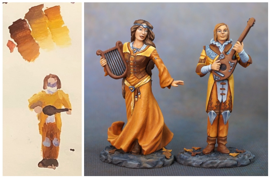
These figures were painted for Dark Sword Miniatures. They were part of a Kickstarter campaign for a line of classic character class miniatures appropriate for use in role-playing games, which were designed by the talented artist Stephanie Law. Bards are my favourite character class, so I was excited when Dark Sword offered me the opportunity to paint these. Stephanie’s concept sketches included some fallen leaves, so an autumnal colour scheme was a pretty natural choice. I also tried to incorporate the values (light, medium, or dark colours) she used in her concept sketches into my colour choices for the figures.

I don’t paint with oranges and yellows very often, so this was a novel experience. The face on the female bard is one of the loveliest face sculpts I’ve ever had the opportunity to paint. Sculptor Patrick Keith really did a fantastic job with this one. It reminded me of a figure from a Renaissance painting. I enjoyed the rest of the miniature quite a bit, too. I love painting hair, and she has lovely flowing locks. The sense of movement in her skirt was also a lot of fun, as well as the fun detailing to her outfit.

I also enjoyed painting the male, of course. His clothing is more finely detailed than hers in several respects, which made the occasion for some different types of painting. He also has some fun details on his instrument.

When you look at the two figures side by side, they work as a bit of an example of how using the same colours in different proportions can alter the appearance or effect of the colour scheme as a whole. The woman’s colour scheme is almost entirely made up of warm colours, with just a small area of lace and her jewelry in the cool blue colour. The man has a much larger proportion of the cool sky blues used. Where the yellow was more of an accent colour on the woman, the yellow, orange, and brown appear in almost equal proportion on the man.
When you’re making a decision about a colour scheme, the colours you choose are not the only consideration. Where you put those colours and the proportion of each to the others can have a dramatic impact on drawing the viewer’s attention where you want it (or shifting it along from where you don’t), and the overall mood and personality of the figure.
This next picture might look kind of goofy, but it’s a handy tool for working on colour schemes, so don’t dismiss it too quickly. It demonstrates a couple of ways that I work through and test colour ideas. Up top are basic swatches. I’ll often try to make these roughly match the areas of a figure and the proportions in which the colours would be used, but the main point of the exercise is to get colours next to each other to see if they look good together and give a decent range of values. You can see that my initial thoughts about the colours were still autumnal, but very different from where I ended up!

Just above the figure are some transitions from light to dark. When I find a midtone colour that I like for an area, I’ll often test different shadow and highlight options in this way to see what fits the colour and what I’m trying to do with the piece.
Lastly you can see a very rough representation of the male bard. My goal with this is not a fine drawing or painting, it’s still about testing the colour. I place the colours down in roughly the place and size of how they would appear on the figure to better get an idea of whether the colour scheme works with the figure. I ended up changing the hair colour and increasing the proportion of the cool sky colour, but overall I ended up painting pretty close to my test version. It might seem that something like this wastes time, but it’s a lot quicker to do a few rough colour sketches like this than to do a lot of repainting on the figure itself! I used to use index cards for this, but I have since found that good quality drawing paper is better but still quite affordable tool for these kinds of tests.
The painter who first exposed me to this idea is the very talented Derek Schubert. His colour sketches are quite lovely and artistic. He keeps a sketchbook for doing colour tests and working out ideas for figures. I’ve since seen other painters do similar things. If you have a picture of a plain sculpt of your figure, you can convert it to black and white and use a computer or tablet photo or graphics editing program to ‘paint’ on colours for similar tests, or print it out onto paper and paint on it. If you look at the beginning of the video at this link, you can see a colour scheme test like that of Marike Reimer’s Crystal Brush winning piece, Kraken Priestess: http://www.destroyerminis.com/kraken-priestess-video/
Another option is to ‘sketch’ directly on the figure and roughly block in your colour choices. This can occasionally be risky with smaller scale and very finely proportioned figures (as Dark Sword figures often are) as it risks clogging up some of the detail of the figure with paint if you revise your colour scheme ideas multiple times.

Links to Figures and People Mentioned in this Post:
Dark Sword Stephanie Law figure line: https://www.darkswordminiatures.com/shop/index.php/miniatures/stephanie-law-masterworks.html
Stephanie Law’s website: http://www.shadowscapes.com
Patrick Keith’s website: http://www.patrickkeith.com
Derek Schubert gets a lot done by spending minimal time online, but here is a short bio: http://www.reapermini.com/Artists#Derek%20Schubert
Marike Reimer’s main website: http://www.destroyerminis.com
