If you like the work I do on this blog, please consider supporting it via my Patreon or a Ko-fi tip.
In Part One of this series, I outlined some of my thoughts as I started to paint the classic Werner Klocke figure Tara the Silent, with the aim of sharing how how I look for problems during the painting process and try to come up with possible solutions.
I ended the painting session with the figure as seen below. The light is imagined to be coming from above and to the right in the front view photo. I had settled on the colours for the skin and cloth areas and finished painting those areas, but when I looked it over the next day, there was something I wasn’t quite happy about with how I had painted it. This issue relates just to the skin and/or cloth. The other areas of the figure are just flat basecoats, and will be changed to different colours.
 At the end of the paint session where I switched the cloth colour from green to blue.
When I looked at the figure the next day, I felt like the highlighting on the front of the legs stood out more strongly in comparison to the other areas of the cloth or the skin. I was unhappy with that for two reasons. One is that I was not intending the thigh/knee area of the figure to be a major focal point for the viewer. The other is that it does not evoke the imagined light source very well. If the light is coming from above and to the right, the right side of the face and torso should be more strongly lit than lower areas of the body.
I debated whether to just leave things as they were until I was further along in the painting process. It is always challenging to accurately judge elements like value contrast while areas of the figure are incomplete. Our perception of colours and values is heavily influenced by the colours and values around them. (This is particularly true when you use a strong value primer like white or black.) I find I always need to tweak a few things at the end, so often it’s more efficient to wait to address things like this until that stage. If you scroll down and look at a later stage picture, you can see that in fact the value contrast on the cloth overall seems much more muted once the lighter value areas like the trim on the shirt and the non-metallic metal areas are added.
But the lighting being off nagged at me, so I decided to address it before I continued painting other areas. I reduced the brighter highlights on the legs to confine them to a smaller area, and also painted in more midtones and shadows in the front of the legs. I then increased the brightness and the overall area of the highlights on the chest and shoulder.
 Not perfect, but I like it better.
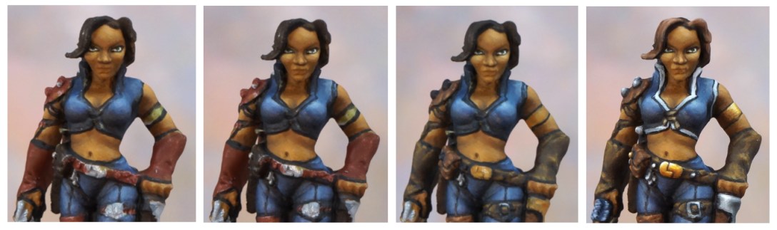
Finally it was time to move on to making more colour choices. Since I was going with an overall darker colour scheme, I decided to go for a somewhat worn leather texture. As I describe in the Catalog of Contrast, it is very visually effective to have a strong to moderate value difference between adjacent areas on a figure. (An example would be dark skin next to a light value shirt, next to a medium value skirt.) Sometimes that isn’t possible to do, whether because of your concept for the figure, or because there are too many adjacent areas on the figure. When adjacent areas are similar in value, it is important to create contrast between them in some of the other ways outlined in the Catalog of Contrast. Colour contrast is usually what people will think of first, and I did use that here, picking orangey browns to contrast with the blue cloth. But using different kinds of textures is also a handy tool in that situation. (Note that smoothness like cloth is also a texture, and that there are different kinds of smooth, such as matte wool versus shiny satin.)
 Much more of a classic rogue look now. But maybe she blends into the background a little TOO much for a visually striking miniature paint job?
 How the colour choices look from the back view. This is a Klockenbooty figure, the back view is important. ;->
I definitely felt like she was looking like more of a classic blend into the background type of rogue. Almost a little too much so in the sense that I felt my paint job was very dull to look at. That was another problem to work out – what was missing or not quite working? One feeling I had was that it lacked colour complexity. In this case, I decided I would leave making a judgement on that until the end stage clean up. My touch up phase always includes some glazing and colour shifting to add interest and depth.
Based on conversations I’ve had with people who are frustrated with their painting, I think this is one of those points where frustrated painters might have given up and just stopped painting, or even stripped the paint off the figure to try again. The thing about miniature painting is that you can’t always assess whether everything is working in the middle of the process. Expecting the areas you think you’ve finished AND the miniature as a whole to look good throughout the entire painting process is unrealistic. If you’re thinking like that, your mindset is more the cause of your frustration than your painting skills. What you need to do is push yourself to paint through these points and get several miniatures to the point of completion and THEN critique those figures as overall pieces to get a sense of areas where you’re weaker and need to work to improve. This is also true of many effects within the process – a lot of things don’t look good until you’re done or at least 90% done. (Examples include non-metallic metal, transparent cloth, and numerous others.)
So even though I wasn’t super enthused about the figure at this point, I proceeded onwards with the details – the trim and lacing on the top, the string on the crossbow, the arrow fletching, some decorative gold NMM, and some steel NMM areas, and then of course the hair. The hair is a fairly sizeable area of the figure, not a smaller detail, but I generally prefer to leave painting hair until a later stage as the top of the head is more likely than other parts of the figure to experience paint getting rubbed off while holding it in order to reach to paint other areas. I usually paint weapons extended in hands near the end for a similar reason. Affixing the miniature to a holder really helps minimize these kinds of rub-off issues, but I’m just in the habit of painting hair near the end now.
 Since many of the detail areas include lighter value colours, adding them in helps move the eye around and breaks up the dullness of the main colour scheme choices.
As I started to paint in the details, I felt the figure was already looking less dull. Why is that? I think it’s because the major areas of the figure that I had worked on (skin, cloth, leather) are all in the dark to mid section of the value range. They are also fairly matte textures, so the range from highlights to shadows doesn’t include very many areas of light values. The trim is a lighter value, and so are the midtone and highlight colours of the non-metallic steel and gold areas. Those small pops of lighter value colours help keep your eye more engaged and moving around the figure.
Although I was resolved to leave addressing most problems until the final touch up stage, that doesn’t mean I didn’t touch anything already painted. If I have paint on my palette that fits in with other areas of the figure, I’ll often add some glazes or do other touchups. During this phase of painting Tara, I added a bit more texture and highlighting to the leather, touched up the highlights on the face a little, and added some touches of brown to the rock she’s standing on.
When I reached the point of feeling I was pretty much finished, I took a few quick photos and edited those the same way I would my final photos. I find it is helpful to check photos before I go to the final touch up stage. It usually saves more time than it costs. There is almost always at least one thing that looks odd in the photos that I don’t notice looking at it in person, even wearing a magnifying visor. As another opportunity for you to exercise your artist’s eye, I’m going to share my final check stage photos here. I’m sharing at a decent size. In practice I actually look at the photos heavily magnified so I can see all the issues and goofs as well as possible. However, it is also very important to look at them at a much smaller size to get more of a sense of how the colours and values work on the figure as a whole. While I do want to find the problems with details, but I don’t want to get lost in the details and miss the big picture!
I write down the issues as I spot them in a way I can reference in my painting area so I don’t forget anything while I’m doing my touch ups. I tend to find my touch up issues fall into a few main categories.
Final details: There are a few details I often leave until this stage so I can use the paint colours from those in my touch-ups.
Neatness: stray brush strokes, lining that has gotten fuzzy, or edges that need more highlights.
Blending issues: places that should look smooth but where I see transition lines, or perhaps areas of texture that don’t look as textured as they should.
Value problems: Areas that need stronger contrast between highlights and shadows.
Colour: colours that look a little dull, areas where colour is more uniform than it should be. (Skin is not uniform in colour tone, metal reflects surrounding colours, etc.)
In addition to these pictures, you can also study the face view shown above, it was taken at the same time as these final check photos.


Did you spot where I went wrong in the first set of photos? Are you ready to scour my final check photos above for errors and issues? You can review my checklist of issues in the next article in this series.
Tara the Silent is an iconic Reaper Miniatures character that there have been a few different sculpts of over the years. I’ve even painted one before! (And then I painted her again, where she provided a good example of ways to paint with more contrast.) Reaper reproduced the classic Werner Klocke version in their new Bones Black plastic material as a promotional miniature for the month of May 2019, and also included it in their Bones 5 Kickstarter. It should go into general retail release in late 2021 or 2022. I painted the catalogue version for the new release of this figure.

Your SBS, especially how your observations affected your painting and color choice, and your list of final issues to look for are very useful. I will be reading this multiple times while I’m waiting for the paint to dry (speed reading?).
LikeLiked by 1 person
I’m glad that you’re finding it useful!
LikeLike