If you like the work I do on this blog, please consider supporting it via my Patreon or a Ko-fi tip.
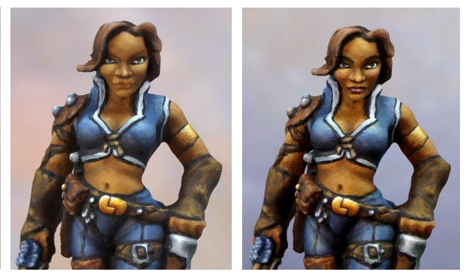
At the end of Part 2 in this article series I explained how I try to take photos of a figure when I’m nearly done so I can check for issues to fix. I included my photos of this stage for Tara, inviting you to spot problems in my painting. I’ll share the two main views again now so you don’t have to flip between two blog posts.

 Almost but not quite done…
Here’s the list I made of things I needed to add, alter, or fix. I just jotted things down in the order I spotted them, I didn’t go through an exhaustive checklist or anything. I will expand on/translate things from exactly as I wrote them down so they’re understandable to people who are not me, however. :->
* Soften the edges of the highlight on the nose, and broaden it to a wider area.
* Smooth the transitions on the cheek highlights.
* Tidy the edge of the shirt trim on the left collar point.
* Clean up the bottom edge of the top buckle.
* Glaze the leather texture.
* Smooth the highlight transitions on the arrowhead.
* Soften or increase gradation on the transition from the upper lip highlight to cheek area on both sides.
* Paint the base rim. (Hey, sometimes it’s easy to overlook the obvious!)
* Check the murky look to the shadow under the rib on the bow side.
* Darken the skin? (The question mark was in my notes. I had intended to paint a skin on the darker side of the mid range and wasn’t sure I had succeeded.)
* Paint the lips. Add pink/red glaze to cheeks.
* Add additional bright hair highlights in small areas.
* Clean up overly-wide strand line on the back of the head.
* Tidy up chin highlight.
* Check/improve brightest highlight on the quiver.
* Clean up edge of the bottom of the quiver.
* Add dirt glaze to steel areas.
* Glaze purple into shadows of most areas, particularly skin, blue.
* Clean up the shirt trim near the neck on the shoulder pad side, looks like blue got swiped on some areas of it.
* Increase highlight on waistband of pants.
* Smooth transitions on the steel of the shoulder pad spikes.
ADDENDUM: I was asked on my Facebook page to give more detail about the glazes I used on the leather and the steel. This was my reply.
By glaze, I mean heavily thinned paint. Closer to coloured water than thin paint, really. With Reaper paints you can use just water. I often use a mix of Brush-On Sealer and water. I almost always will test a glaze to make sure it is indeed super thin and transparent, since if I get it wrong on something like the leather texture, I’ll be covering over minutes or hours of work with a couple of brushstrokes I can’t remove once they dry. I test it by painting it on to a piece of paper and checking that it just barely tints the paper once it dries.
I also use the term glaze to mean paint applied in a deliberate, controlled manner. So while it’s thin like a wash (it’s even thinner really), I do not slop it all over like you would with a wash. I dip my brush in the paint, and then wick a lot of it off on to a paper towel. Then I apply a thin coat only where I want it to be. In the case of the steel, I applied the glazes in crevices and other areas that aren’t going to get rubbed with use or are harder to polish. In the case of the leather, I was using it to shift the colour and tone down the appearance of the texture, so I applied it all over the leather areas.
The glaze did not texture the leather. If you look back at the previous pictures in Part 2, there was plenty of texture on the leather long before I got to the end stage touch ups. The texture was built up in layers with unthinned or only slightly thinned paint. The point of the glaze was to tone the texture down just a little, since she’s a well-kept adventurer and not a half-wild orc or something. I also used it to shift the colour to a little more orange to play up the colour complement contrast with the blue cloth.
On the steel areas, I used a similarly thinned glaze of a dark brown colour. I keep this away from the lighter highlights. Partly because these areas are likely to be well polished and maintained, and partly because even super thin paint like a glaze painted over while will make it darker, and that’ll make the NMM less shiny.
I didn’t use the term, but some of the other places I used glazes were to add purple in the shadows of the skin and blue cloth, and to add a little bit of a blush to her cheeks.
END ADDENDUM
How many of the issues I listed did you spot? I look at these pictures full size; there may be issues that weren’t too apparent at blog-friendly size, so don’t feel too bad if you missed some.
More importantly, how many things did you spot that I missed?! On later reflection, I think I may have missed some big picture type stuff. And probably some small stuff, too. Feel free to let me have it with your critique!
Here are the pictures of the finished paint job, after I addressed the issues I outlined above.


If this piece had been intended for competition, my ideal would have been to finish it some time before the deadline. I’d put it out in a location I pass through regularly so I could see it often and observe it at different times of day. Or perhaps I would put it somewhere I don’t look often for a few weeks After some time had passed and I’d been working on other things, I’d pull it back out again and look at it with fresh eyes. That would be especially helpful to getting a view of the overall effect of the figure, the big picture. When you’re in the thick of painting something it can be easy to spot something fiddly like improving the nose highlight, but a lot harder to step back and see the big picture effect to judge how the overall colours, values, and other contrasts are working. It is very important for a competition piece to ‘pop’ on the shelf/table, not just look amazing when you stare at details close up. Popping out viewed at a distance is what makes the judges and other viewers want to look closer to see and appreciate all the detail work. (And also what looks most effective for tabletop play!)
Tara the Silent is an iconic Reaper Miniatures character that there have been a few different sculpts of over the years. I’ve even painted one before! (And then I painted her again, where she provided a good example of ways to paint with more contrast.) Reaper reproduced the classic Werner Klocke version in their new Bones Black plastic material as a promotional miniature for the month of May 2019, and also included it in their Bones 5 Kickstarter. It should go into general retail release in late 2021 or 2022. I painted the catalogue version for the new release of this figure.
Part 4 is the last part of this article series.
