If you like the work I do on this blog, please consider supporting it via my Patreon or a Ko-fi tip.
In the previous instalments of this series (links later in the article), I walked through my work-in-progress steps of painting the figure Tara the Silent. My aim was to share the way I try to identify and solve issues during the process of painting a miniature. Progressing your painting skills has as much or more to do with improving your critical eye as it does with improving your brush and paint use skills. I think many people do not understand just how valuable it is to improve your ability to really see and analyze a figure (or other types of visual arts)! I know that I would have improved much more quickly and consistently had I been working on that as much as I focused on blending and other brush tricks.
It occurred to me that I could use Tara for one more exercise to try to help others build their critical eye. This exercise is one of comparison between two figures. Comparison can be as instructive as assessing a single work, whether that is a comparison of more recent work against older work, or comparing one artist’s interpretation of a figure against another’s. This exercise could also give you some insight to the challenges that contest judges face. You can imagine that these two figures are the final cut for a contest award, and determine which which you would choose and why. I will not share my analysis/thoughts until the section after the last picture. So if you want you can test your eye first, and then read my thoughts.
 Anwyn the Bard is on the left, Tara the silent on the right.
Although I have never before painted this version of Tara, I have painted her ‘sister’, Anwyn the Bard. Reaper sculptors occasionally take a figure and do a significant conversion of it to create a different character. Werner Klocke first sculpted Tara, and then did a resculpt of the miniature to create the character of Anwyn. Even apart from the fact that the figures aren’t identical, this is more of a lemons to oranges comparison than an apples to oranges one. The colour schemes are quite different, even the cameras used to take the photos aren’t the same. But comparing like to like is pretty rare in comparison critique, and definitely rare in contest judging, so while the exercise is a little more challenging than a direct like to like comparison, it is an opportunity to practice the type of thing you’re likely to do more often.
If you’d like to review the previous instalments in this series, here are links:
Part 1: Colour scheme creation (and correction) on the fly.
Part 2: Spotting and solving conundrums of contrast.
Part 3: Giving the figure a thorough once over before calling it done.

So what kind of factors could you look at when making a comparison? Likely the first elements that will jump out to many people relate to the colour scheme. We are very responsive to colour, and our initial reactions to colour tend to be visceral and subconscious. Building your eye requires a more conscious and critical assessment in addition to that emotional response. As a judge, I have often been a position of awarding high honours to something I might not personally ‘like’ in terms of colour selection or subject, but which is very skillfully done.
* Do the colours work together in a pleasing and effective fashion? (Depending on the subject and the intended scene, ‘effective’ may mean garish or gross colours that aren’t ‘pleasing’ in the traditional sense!)
* Does the colour scheme fit the character and the story/mood that the painter is aiming for with the figure/scene?
* What is the level of contrast between the colours of different areas, and within the shading and highlighting of individual areas? Is the level of contrast sufficient to visually separate different areas of the model and help the viewer identify what the various items on the figure are?
* What is the level of nuance and complexity in the colours? Are there subtle variations of hue within areas? Is there harmony in the shadow and highlight colours over the whole of the piece? Do the colours of the main figure(s) and the scenic element(s) work together and look like parts of a consistent whole?

Brush skills are another key area to compare.
* Precision of paint application, both in larger areas, and within areas for placement of sharp highlights and darklining as appropriate.
* The success of the execution of details like eyes, small sculpted details, or pure painted details like freehand.
* Rendering of different surface textures – skin vs cloth vs leather vs metal vs wood vs dirt vs stone, etc. Is everything painted in a pretty similar way, or do these different textures stand out from one another in realistic and/or interesting ways?
* Consistency of rendering – is the overall level of the painting on the figure uniform? If you’ve ever wondered why something that looks fairly ‘plain’ scored higher in a contest than something with really great freehand or source lighting, consistency is often the reason. Doing an area or effect on a miniature spectacularly can fall short if the rest of the miniature is not up to a similar standard. That doesn’t mean that everything needs to have the exact same level of contrast or be super detailed! That is usually counter productive. You want to have areas of interest where the viewer focuses, and have areas that are less important fade into the background a little. But a miniature covered in detailed freehand standing on a base that’s had a quick wash and sloppy drybrush treatment isn’t as consistent as one with high quality but less flashy brushwork throughout the whole piece.
(I will admit that consistency is an area where highly skilled artists can and have gotten away with doing things I just stated should not be done. Figures with errant brushstrokes, or areas that are barely base coated. Those of us of more modest talents are still well advised to aim for consistency as much as possible! I’ve also heard stories of people scoring lower or missing out on awards for having bits they ran out of time to paint to the standard of the rest of the figure.)

Quality of preparation and the treatment of scenic elements can make a bigger difference to a figure than it might seem. They might not jump out at first viewing the way colour and brush skills do, but they’re a critical foundation to those elements.
* Prep work – the figure itself is your ‘canvas’. No amount of brush skill can completely overcome a poorly prepared canvas. Removing mould lines is just the beginning. You may also need to fill in pock marks on surfaces meant to be smooth, accentuate textures, file or carve weapons to look a little more sharp or pointed, etc.
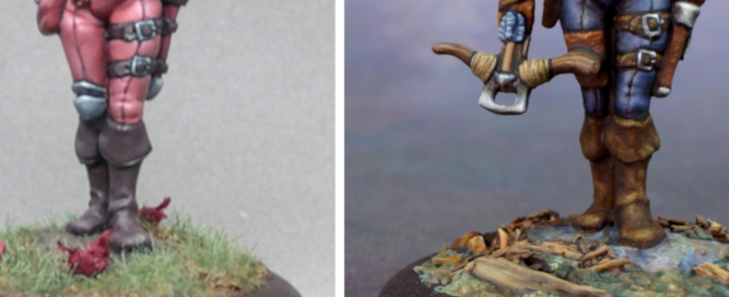
* Assembly is also important. Gaps between limbs will break the illusion pretty quickly! A common issue is the attachment of the figure to the base. If the feet look like they’re floating slightly above the surface rather than firmly planted, the miniature does not look like it’s part of the scene and doesn’t look like it has weight and substance.
* It is important to paint basing materials and most vegetation type flock. It seems like you should be able to put small rocks or sand or whatever on a base and have it look like rocks and sand, right? But unpainted basing materials do not look in scale to a painted figure. They also don’t look like they’re part of the same scene lit by the same light source. Painting the elements of the base, and using colours you used on the figure in those elements makes everything look unified and more realistic.
The last comparison picture is below, so don’t scroll past it if you don’t want to read my analysis yet!

I’ll be honest – I hesitated to post these comparison pictures. I painted Anwyn in 2006! I’ve improved in the last dozen years, but not nearly so much as I might have hoped or expected. I wish I had understood the concepts of deliberate practice and focused self-critique so much earlier than I did! (And truthfully I’m still struggling with incorporating those ideas completely into my painting process.) I worked hard to ‘get better’, but in such an unfocused and haphazard way.
In the end I have decided to take my lumps and share this in hopes that it may help some of you get where you want to be faster and more efficiently. I know the lure of chasing the right brush, painting, blending technique, etc. is hard to resist. But it really is only half the puzzle. Training your eye to see better so you can identify specific issues in your work and iterate through working to improve them is immensely important.
The Photos!
I can’t help but be struck by the difference in the photo quality. My camera in 2006 was a $400-500 mid-range digital camera. The one I used to take photos of Tara is just a little better in quality (it’s a new technology class of camera, but it was also in the $500 range at time of purchase, so fairly comparable.) It’s now six years old and I am considering replacing it. Partly due to mechanical issues, partly in hopes of being able to add video to my repertoire. Both cameras allowed for setting white balance, f/stop, and other features useful to taking pictures of miniatures. Some of the difference is also down to my improving my photo taking set up with more lights, and use of a tripod, as well as using a grayscale card to help with editing the colours to look truer to life. I did re-edit the pictures from 2006 to try to make the comparison between photos a little fairer.
Colour Comparison
I quite like the colour scheme on Anwyn, and suspect many people will prefer it to that used on Tara. I’ve been thinking about having another go of that colour scheme for a while now, and I hope a figure it will suit presents itself soon. The colour choices create more of a focal point around Anwyn’s face. Tara’s colour scheme is fairly well suited to the character, but lacks a little oomph from an artistic point of view, and it does not have a strong focal point.
Although there are some nice areas of highlight on Anwyn, I think I have improved my level of contrast over time. There are much deeper shadows on Tara than on Anwyn, as well as stronger contrast between some colour areas. I think the contrast difference is most noticeable in the hair and the non-metallic metal. That said, Tara has some contrast issues and needs stronger and more small top level highlights throughout most of the figure. The level of contrast isn’t that noticeably problematic in a photo, but viewed at tabletop distance she lacks the desired level of ‘pop’.
When it comes to nuance and complexity in colour, there I feel I have made noticeable improvement. Anwyn’s colours play it straight, and that results in a bit of a plastic, artificial look. Shadows and highlights are just darker and lighter variations of the midtones. There is no added complexity of colour in the face like blush or interesting shadow colours. The lack of colour complexity/variation is particularly noticeable in the difference between the two bases. Both are pretty simple, but Tara’s seems much more ‘real’ and related to the figure. This is largely due to the way it’s painted rather than the types of gravel or foliage I used.
Brush Skills Comparison
I don’t think it’s particularly evident in the areas of detail in these two figures (eyes, darklining, and so on), but I am confident that my brush skills overall have improved. The end result may not be strikingly different, but at least the level of frustration and effort required to achieve it has changed!
I am much more conscious of painting different types of textures and surfaces now, and I think that is pretty evident in comparing these two figures. Every area on Anwyn is painted in the same smoothly blended fashion, with the possible exception of her hair. I was obsessed with achieving smooth blends, and I think that shows. Tara demonstrates a lot more of an understanding of different materials having different textures – rough stone, worn leather, wood grain, shiny hair, etc. The transitions on the NMM are a little more varied and better represent the way reflected light can appear than the perfect smoothness on Anwyn’s NMM.
Preparation and Scene Setting
Both of these figures are presented on very simple bases, so there’s not a huge amount to assess there. I do think that my ability to make a decent looking simple base has improved, though that may not be saying much. ;-> Anwyn’s base is very simple, and lacks a bit of variety that would make it more pleasing to look at. The flowers very much look stuck on instead of being a bit more naturally part of the rest of the foliage.
I’ve always been a bit fussy about prep, so there’s not a big change to look at as far as that goes, either.
Conclusion
The end of the month crept up on me, so I’ve had to write this a bit more quickly than I usually prefer to do. Likely many of you will have spotted lots of issues with both of the figures or differences between them that I did not see. Feel free to share those in the comments. I am putting these figures out there to give people a chance to exercise their critique skills, so I have no problem with you tearing them apart. :->
Tara the Silent is an iconic Reaper Miniatures character that there have been a few different sculpts of over the years. I’ve even painted one before! (And then I painted her again, where she provided a good example of ways to paint with more contrast.) Reaper reproduced the classic Werner Klocke version in their new Bones Black plastic material as a promotional miniature for the month of May 2019, and also included it in their Bones 5 Kickstarter. It should go into general retail release in late 2021 or 2022. I painted the catalogue version for the new release of this figure. Anwyn the Bard is available in metal, or in classic Bones plastic.

😍
LikeLiked by 1 person