If you like the work I do on this blog, please consider supporting it via my Patreon or a Ko-fi tip.
In a previous post post I talked about how it was a change of pace for me to paint this large hydra figure because of the difference in size and subject to what I paint most often. Now I’d like to share a little of the actual painting process for this miniature.
 It’s not too late to get this and hundreds of other figures at much lower than retail prices.
Planning Phase
My first step was making a plan of action. This is the stage where I consider different colour scheme ideas, what might be the best order to paint areas, things like that. In this case I did not take very much time and effort at this stage. I was on a deadline and not wanting to psych myself out about the aspects of painting something less usual for me.
And my experience in painting this figure is an example of how not spending a little bit more time in thought beforehand likely cost me a chunk of time in execution. I had some broad colour scheme direction via photos from Reaper’s art director, Ron Hawkins, but I didn’t take the time do do any colour tests. With some minis, I spend a bit of time working out my exact colour choices on paper before I start painting on the figure. I decided to wing it with this one, and I didn’t get it right on my first try.
Colour Complexity and Variation
One thing I did think about a little was colour variation. This is a subject I often end up talking with intermediate painters who are looking to improve their work to the next level. While painting shadows and highlights on an area adds some variation and visual interest, it only does so much. If you look at something the size of the hydra, or even a cloak or large expanse of skin, it gets a little samey to look at if the only variation is a difference between the dark, midtone, and light areas.
 Top: Shades of darker and lighter grey only.
Middle: Grey shaded with dark Burgundy pink, and highlighted with pale Caucasian flesh tone.
Bottom: Shades of darker and lighter grey for the value transitions, glazed over top with other colours.
These colour variations represent real world objects more accurately than you might think – reflections from surrounding materials on shiny objects, variations in skin tones like blush on the cheeks, colour shifting caused by a light with a colour cast, all kinds of things create varied colours on surfaces. And just as with many elements of art that reflect real life, it’s pretty common for artists to exaggerate these colour variations to create a more interesting piece.
There are a number of different techniques you can use to add some colour variation to areas. I talked about a couple of methods in a Reaper Toolbox video I recently completed. Michael Proctor is a master of colour use, and he also has a recent Toolbox video where he talks about some of his techniques.
 I visualized the sunlight shining from the direction of the tip of the hydra’s tail, but much higher in the sky.
In the case of the hydra, I relied primarily on shifting the colours used to paint the lights and shadows, as in the middle photo of the example above. I added a little more visual interest to things by shifting the direction of the light to one side of the figure, and using some colour contrasts in my (eventual) paint choices. I visualized the light as bright sunlight streaming from the direction of the tip of the tail. This created a situation where one side of the creature would appear more in light, and the other side more in shadow, with some interesting interplay of light and shadow on the necks.
Airbrush Misstep
Several people have asked me if I used an airbrush to paint the hydra. My answer is yes and no. I did try to start with an airbrush. it seemed like a perfect fit for a large creature like this, and handy method to lay in the broad strokes of the directional light I planned. It took me a few hours of painting over a couple of sessions (my compressor overheated the first session!), but eventually I ended up with this.
 The more lit side after the airbrush stage. Crummy cellphone photo.
It looks pretty dull in the photographs, and that’s not because they’re just crappy cell phone pics – it looked pretty dull in real life, too! Essentially I ended up with a sort of zenithal prime effect – it was a good guideline to where to place my shadows and highlights, but not much more.
 The more shadow side after the airbrush stage. Cellphone photo.
Painting the Base
As I considered where to go from here, I realized that it would be tricky to reach all the areas of the base if the body were fully painted, so I decided to paint the base first. I talk about the techniques I used to paint the rocks in my recent Reaper Toolbox video.
 Painted base. Light side view. Cellphone photo.
The technique I used on the pillar pieces was a little different. I painted using my usual layering technique, but with some variation in the selection of colours for lights and shadows. I looked at some reference photos of Greek temples, and plenty of them are not perfectly polished white marble. Several seemed to have a fair bit of ruddy red showing on the pillars. So I started with a basecoat of cream, and used a clay red in the shadows. To keep the effect of the bright sunny day throughout the whole figure, I used some dark blue in the shadow areas of the pillars, and yellow in the highlight areas that are receiving full light.
 Painted base. Shadow side. Cellphone photo.
Re-Colouring the Body
Now I had to figure out what to do with the body of the hydra for a more interesting colour selection. I decided to keep my main shadow colours, but swap in more saturated midtone and highlight colours. As with the rocks and the pillars, I was using dark blues in the shadows, and yellow in the highlights to simulate a sunny day.
 After wet-blending new body colours. Cellphone photo. View from the direction of the light.
The majority of the paint on the body and necks was applied with the wet-blending technique. I started with a size 2 round sable brush, but this figure was large enough that I switched to a bigger synthetic brush for most of the basic lay-in of colour transitions, using the size 2 on smaller areas or to refine blends. I used the light to dark transitions created by my airbrush stage as a guideline, but refined and shifted the location of light and shadow as I deemed necessary to create the effect of the lighting or make the figure more interesting to look at.
 After wet-blending in new body colour, view from the more shadowed side. Cellphone picture.
Forging a… Five Heads
I was much happier with the colour selection for the body than I was with my first attempt. However, I felt like using the exact same colour transitions on the head would not work very well. The heads need to stand out in some way to help the viewer spot them and connect with them. I did some experiments with a couple of patterns to see whether patterning would be a good way to make the heads stand out. Sometimes I’ll grab a similar figure to practice tricky freehand or do tests like this (Bones are great for this!), but in this case it was just as easy to test on the figure, and it is sculpted with such definition that a coat or two of extra paint wouldn’t be an issue.
 Testing some ideas for patterning on the heads and/or neck scales.
I also decided to use more saturated colours on the heads than I had on the body. I switched out my brown shadow step for one that was more green, and swapped my kinda yellow highlight step for one that was a more intense yellow. The heads and spines scales were smaller areas and I was working with more transparent colours, so for these I used my usual layering techniques rather than doing any wetblending.
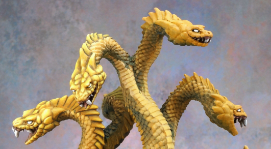
 Painting completed on two heads. They are a slightly different colour scheme than the body to help them stand out to the viewer.
Lining the Scales
The next time I sat down to paint I wasn’t in the mood for fiddly blending with semi-transparent colours, so I decided to work on painting the lining between the scales instead. I talked about the technique I used for that in a previous blog post.
 Adding lining between the scales makes a big difference in the appearance of a figure like this!
Once I had the lining in, I reevaluated my intention to paint some patterns on the heads and/or spine scales. The lining between the scales added a lot of texture and I felt like the contrast between that texture and the smooth blending on the heads would help keep the heads as the focus.
Belly Scale Dancing
 Test of a blue colour scheme for the belly scales. I used slightly different colours on the final version.
The last thing to figure out was the colours to use on the belly scales. As with the pattern experiments I decided to test right on the figure rather than grabbing a separate one or testing on paper. I wanted to pick colours that would stand apart from the belly scales, but not steal focus from the heads. The brown was a bit too bland. The blue worked better, but it was important to keep it muted so that it didn’t compete with the yellow of the heads. I tweaked the colours a little on the final version.
 Test of a brown colour scheme for the belly scales.
Concluding Thoughts
As you can see from my experience painting this figure, one of the things to keep in mind when painting something that is different from what you normally paint is that the process is not likely to go as smoothly as usual. You have less experience to draw on, fewer helpful habits established. Even though I was painting this on a deadline, and I felt some pressure to make it look as cool as I could for the sake of the Kickstarter campaign and a few other reasons, I had to accept that I lost time to mistakes and having to do tests to avoid more mistakes. There would have been no value to beating myself up or getting too frustrated about it.

Great column! I really appreciate being able to follow your creative process. Your details are very helpful in my own painting. Thanks!
LikeLiked by 1 person
Thank you!
LikeLike
Excellent stuff… Thanks for sharing, very enlightening.
LikeLike