Ko-fi tips help keep this content free. Patreon supporters receive PDFs with high res photos.
In my last post I discussed the idea of shifting your thinking and asking different questions to find ways to help you improve your own painting experience and results.
The question of how much water to add to your paint is a great example of conducting tests and experiments to be able to answer a painting question. The correct dilution of paint for various tasks like a wash or a glaze is a vexing issue for many painters. What ratio of water to add to a drop of paint to make a wash/glaze/etc. is a very common question that experienced painters are asked. The usual answers are:
It depends.
3 drops water to 1 drop paint for a wash (or similar specifics.)
People expect answers like the second one. They think that there is a formula, and they just need to learn what the formula is to experience better results and less frustration in their painting:
1 drop paint + 4 drops water = wash
1 drop paint + 1 drop water = layer
If you aren’t very familiar with paint that’s a natural expectation, but unfortunately it doesn’t work that way. There are variations in paint opacity between manufacturers, and much more critically, there are variations in paint opacity between colours. Almost all yellow or magenta paints are very transparent, whereas darker black or brown paints are much more opaque, and paints with a lot of white in them are more opaque. Even within those broad colour categories there will be differences of opacity and transparency, as we’ll explore below with an assortment of black paints.
You may have already noticed some of these tendencies yourself, perhaps becoming frustrated at how many coats it takes to paint an opaque base coat with some of your paints compared to others. That is the start of learning your materials and making observations! Make notes on your observations when you use new colours or ones you don’t use as often so you won’t forget. If you have paint left over after your session, you can use it to test dilution or study how colours mix together and learn a little more from something you were only going to throw out.
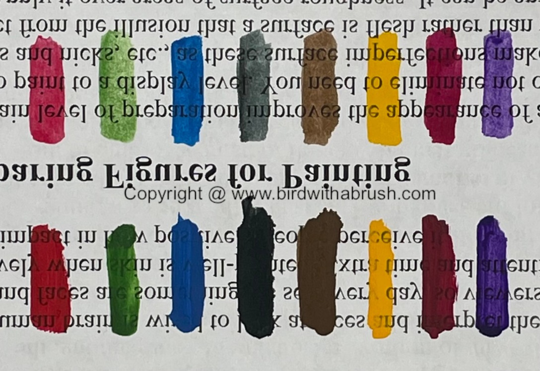
Following are some photos of some tests I did with a few colours. I chose one paint from each brand I own. You can see the tested paints below. The Kimera bottle has the paint name on the back instead of the front. It is called Magenta.

I put the paints out on a piece of palette paper. One pool straight from the bottle/pot, and then one drop mixed with one drop of water.

I painted stripes of each paint onto a piece of paper with text printed on it. Using the paint straight from the bottle/pot allowed me to observe the viscosity of the paint, so I could judge whether it was fluid enough to use straight from the container, or might need a little water added to avoid creating texture when applied. It also demonstrated what is called the mass tone of the paint – the paint’s colour at full strength.
Mixing a little water into the paint allowed me to make additional observations. A lot of darker colours can look pretty similar in mass tone. You often need to thin them down with water or add a little white paint to get a more accurate idea of their true colour. Thinning the paints reveals what is called the undertone. The purple and magenta on the far right both look much more vibrant when thinned down with water and painted out than they did as drops on my palette straight from the bottle.
 Top row: One drop of paint diluted with one drop of water.
Bottom row: Paint straight from the container.
Adding water increases the transparency of the paint. But you can see that the degree of that effect is not universal. One drop of water had a much stronger effect on the green paint than the others. It’s pretty much wash consistency already.
I have a lot of general knowledge related to colour and pigments, so I wasn’t too surprised at the results, but it’s still helpful to me to do testing with my actual materials and not rely on theory alone. The transparency of the green with water added surprised me a little. I am sure that other greens from that brand, or similar greens from other brands, might not act the same way, since they will have been mixed from different pigments.
I was lazy and didn’t clean up my desk immediately after, but that ended up being a happy accident. The next day I saw some interesting results in the dried paints. Some of the paints mixed with water had dried surprisingly shiny, and one had a lot of cracking in the wash. I would have to do additional tests to see whether either thing would have any effect when actually used for miniature applications, but it was a graphic reminder that there are also differences in the base formulations of every acrylic paint, as well as differences between pigments. (My guess on the shiny ones is that they had deeper pools and the matting agent sunk to the bottom. You can read more about the characteristics of paint.)
 The thinned and undiluted paints from my test after drying on the palette paper.
The fact that you can’t follow a standard formula like add 3 drops of water to make a wash doesn’t mean that there are no guidelines for deciding how much to dilute your washes. What you need to do is shift your thinking. What questions could you ask or what tests could you do to find out what you need to know. To my mind the formula for diluting paint looks more like this:
1 drop paint + X drops water = wash consistency
You are looking for the answer to X, and the people who tell you ‘it depends’ are right. The answer for X isn’t fixed, it depends on the characteristics of the paint you are diluting. The first step to solving for X is to understand your desired solution as well as possible. What is wash consistency? It’s a paint mix that is transparent enough to tint underlying paint, but with enough colour/opacity that the colour builds up where it pools in sculpted recesses on your miniature.
So how could you solve for X? You could brainstorm possible ways to test the consistency of your washes, and then try them out to see which works best for you. And the great thing is, there isn’t necessarily only one right answer! If you’ve painted enough to have an idea of the consistency you like in a wash, I invite you to pause reading for a moment and think about ways you could check your paint mixes to see if they match your desired consistency before scrolling down and reading my suggestions.
One way to check your wash dilution is to study the paint behaves on your palette. I often use a welled palette. I can assess paint dilution and consistency by pulling a stroke of paint up the side of a palette well and then observing it. How much of the underlying white surface can I see? How long does it take the paint from the stroke to fall back down into the main pool?
On a flat palette like a wet palette, painters might move the paint around a bit with the tip of their brush and assess how strongly or weakly the paint covers the palette surface. They may also consider other properties, like consistency. It’s pretty common for painters to compare how paint behaves on the brush to other liquids, like you might want to mix paint equivalent to a cream consistency for a basecoat, and to more of a skim milk consistency for a wash. Judging by consistency can work well if you always use the same paint brand and diluent. However, different paints have different consistencies out of the bottle. Water and mediums are equally transparent but differ in consistency. Water is a very fluid diluent, but matte medium or glaze medium are more viscous.
Over years of teaching people miniature painting and trying to come up with a simple but still accurate answer to that question, I finally figured out a way to visually test the paint. I use a piece of paper printed with text. I paint stripes of a paint mix on the paper to assess whether it seems like it is the correct transparency/opacity for my paint task. I am judging the visual appearance of the paint, so it doesn’t matter if I use a paint or diluent that is more fluid or more viscous. (Ben Komets came up with a very similar answer to the question with his Dilution Helper strips.)
You can see me demonstrate mixing and testing a wash in this video, where I also performed more dilution experiments on a selection of black paints. I gathered up nine black paints to test.

I painted swatches of each paint straight from the bottle, and then swatches of one drop of each paint mixed with two drops of water.
 Top row: One drop of paint diluted with two drops of water.
Bottom row: Paint straight from the container.
As you can see from the diluted paint swatches, the opacity of the paints differs a fair bit. Paints that all looked pretty similar out of the bottle look different in a 2:1 mix of water to paint. Some of those paints are ready to use for washes, others would need to have more water added. The diluted paints also demonstrate slight differences in colour, with one black being a little cooler or warmer than another. Those differences are pretty subtle in black paints, but you would find them much more noticeable with darker colour paints.
If you find this kind of experimentation interesting, you might want to check out my show on Reaper Miniature’s Twitch channel. It airs live on Mondays at 2-4pm Central time. You can also watch on demand on Twitch, or when it is uploaded to Reaper Miniature’s YouTube channel.

