Ko-fi tips help keep this content free. Patreon supporters receive a PDF with high res photos and a few work-in-progress pictures.
Working out the colours to paint a miniature can be tough! I want to share the process I used to choose the colour scheme for the figure below, as well as a few other ideas you could try for testing colours. Fathom is my character in a Dungeons and Dragons game on Twitch with some of the other Reaper artists. I wanted to try to choose a colour scheme that reflected the character well, and which would also look good on the fantastic terrain boards Knight Heart Gaming puts together for our streams.
 Fathom the Tiefling warlo… magic user with a mysterious patron.
I know a lot of us find colour to be very challenging to use. You’ve surely had a situation where you pick out a colour to paint on your miniature that looks one way when first applied, and a different way once you’ve finished painting the figure. If you use white primer, a colour you use in the early stages may seem fairly dark when you first apply it over the white primer, but once you paint the rest of the figure it looks more medium in value or even too light. The reverse is true with black primer, where something might seem too light until the whole piece comes together and you discover it’s not. You might notice something similar with some of your favourite colour recipes. You might use a set of colours for wood or gold non-metallic metal that looks good on most of the miniatures you paint, but find that there is a miniature or two where the colours look more washed out or more garish than usual. This happens because the way that we perceive colours is always relative to the other colours around them.
If the way colours appear is always relative, how are you ever supposed to know how to pick successful colour combinations?! I think it helps to be aware that this is just how colours work. You can still paint using on the fly colour choices and recipes, but you have to accept that there might be times when colours don’t jibe as you hoped, or they need to be tweaked a little. It can also help to study colour properties and colour theory and use tools like a colour wheel.
For more important figures that you’re willing to spend a little more time on, it can be very helpful to do some colour studies or tests before you begin painting. Making this effort now and then will also help you improve your overall understanding of how to use colour. When you do colour tests, you can test your colours overall, or start by working out a few colours and building from there with trial and error on the miniature.

The photo above includes examples of a number of different kinds and methods for colour testing that I’ve used over the years. Some are tests of an overall colour scheme. Others test shadow/wash colours, or colours and brush strokes used to create textures. Some are on paper, others on figures. Some are just colours placed in proximity to one another in the approximate proportions in which they’d appear on the figure. You don’t have to paint a complete test figure or a detailed drawing on paper. Even playing around with some paints on your palette or on a piece of paper before you start painting can give you a lot of useful information!
 The Reaper catalogue photo of Churrusina.
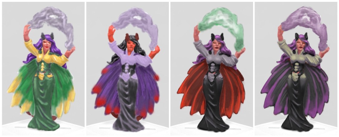
There are digital tools you can use, as well. These vary in levels of sophistication and complexity, as well as cost. I decided to use a digital painting method to test colours for my character Fathom, pictured below. I used the Procreate app on my iPad, but as I mentioned, there are a lot of other options for different platforms and budgets. I loaded the unpainted catalog picture of the figure, seen above, into my digital program. I found the photo on the Reaper Miniatures site. Many manufacturers have similar pictures you can use as a starting point for colour tests. I reduced the transparency of the layer with the photograph on it to less than 20%. This gave me a faint image to use as a sort of colouring book outline I could use to test different colours. For Fathom, I went to the extent of painting in some shadow and highlight colours, but even doing some basic block colouring on the main areas would help you get a sense for how your proposed colour scheme works.
Another option would be to print out a catalogue photo like the above and paint colours onto the paper. This has the advantage of allowing you to test the exact paints you’re thinking about using rather than approximating colours in a digital program. If you don’t have access to a good catalogue photo for your figure, you could prime/paint it in grey or white, place an overhead lamp over it, and make your own reference photo. You can see an example of a colour test with physical paint in Marike Reimer’s slideshow of the steps to paint her Crystal Brush winning Kraken Priestess. I used a rough drawing on paper to test an autumn colour scheme for a bard character.

The photo above shows the colour schemes I tested out for my character Fathom. I ended up painting the figure mostly like the one on the bottom left, but swapped to the shirt colour of the one on the bottom right. It had a touch of green in it, so I felt it would look more harmonious with the reddish skin and red of the cloak. I think the figure on the upper left works really well in terms of being an eye-catching colour scheme, but it did not fit the concept of my character. Fathom has decided to lean in to the stereotypes about tieflings instead of trying to fight them. The upper left colour scheme would have been a great choice if her patron had been more of a fey type.
Here are a couple of more views of the completed paint job on the character. Since this figure was intended for game play, after I took the photos I brushed on gloss sealer for some additional protection, and then sprayed that over with matte sealer for my preferred matte finish. Note that sealer works best if you also take other steps during prep and painting to create a sturdy paint job.


Once I finished painting, I sent Fathom off to Frank and Ann of Knight Heart Gaming. They host a Dungeons & Dragons game for some of the Reaper artists on Reaper Miniature’s Twitch channel every other Friday. Frank is a wonderful DM, adept at dealing with the parameters of running an entertaining game in a streaming environment and time limit, and also at dealing with our crazy artist nonsense. I often forget to take screenshots in the midst of the fun role-playing, but here are a couple of shots of Fathom and her compatriots adventuring in the fantastic Knight Heart scenic setups. You can catch up with past episodes on Reaper’s YouTube channel, or via the droll musings of Kay Nimblewit (played by Jen Greenwald on the far right below. Jen also has a great painting oriented blog.)


Figures in this Post
Churrusina is available in metal.
Anirion, Elf Wizard is available in Bones USA plastic, clear plastic, or metal.
Isabeau Laroche, Paladin is available in Bones plastic and metal.
Geisha Assassin (colour tested on Isabeau) is available in metal.
Seoni, Iconic Sorceress is available in Bones plastic.
Male Bard with Lute is available in metal. (Colour scheme on paper.)
Arran Rabin is available in Bones plastic and metal.
Children of the Zodiac, Cancer is available in metal.
Wing from Griffon, available in Bones plastic or metal.
