If you like the work I do on this blog, please consider supporting it via my Patreon or a Ko-fi tip.
Freehand refers to patterns, pictures, text, or similar elements that are painted on a flat surface, as opposed to decorative elements that are sculpted into a figure and enhanced by paint techniques like washes. Freehand is a way to individualize your interpretation of a sculpt, and reflects the universal human urge to decorate ourselves and our surroundings.
 The top shield is an example of sculpted detail. the design and letters are sculpted in strong relief on the shield. The quarters are sculpted into the bottom shield, but the trees were added with freehand – flat paint painted over flat paint.
Many types of freehand can be quite challenging to do on a miniature figure since it involves both drawing and doing it at a very small scale. As a result, miniature painters understandably tend to focus on the technical aspects of executing freehand. But sometimes that focus distracts us from taking more general artistic considerations into account. (These same considerations also apply to use of decals.)
What do I mean by artistic considerations? Your figure/scene should work together as a whole to illustrate a character or tell a story. This means choosing colours, textures, and elements like freehand that work together, and applying them in a way that enhances the whole. I think a lot of us don’t think of the figure as a whole that way. We want the whole thing to look cool, but we might start by thinking we want to paint the cloak this colour and the hair in that way without a lot of consideration into whether all of that would come together to a pleasing whole. Even when we do think more holistically, it is very easy to forget that big picture when you start working on the individual elements. Freehand is definitely something that can end up being a distraction or looking showy or unnatural.
 The sculpture/castings of these 54mm figures is a little rough. I chose to use a lot of freehand partly to distract from the rough spots, and also because it was germane to the character types. But to keep it from being too noisy I painted most of the freehand/texture as tone-on-tone. Although the silver trim on the man’s tunic is sculpted, it is an example of a distracting element. It is painted with a high level of contrast and in a colour much different than its surroundings so it draws the eye too much and becomes a bit of a distraction. Compare it with the more subdued gold trim on the woman’s sleeves and belt that better fits in with that figure overall.
Detail tends to draw the eye. On a simple humanoid figure that often works to our advantage. You have larger plain areas like clothing, armour, and weapons for the bulk of the figure. The face with its features becomes an area of detail that focuses the eye in the correct place for appreciating a character’s personality. (We also have a part of our brain that specifically looks for faces, so we’re naturally drawn to look for and at them and the effect is magnified.)
Freehand is detail, and outside of an occasional face tattoo, it tends to be applied to areas outside of the face. It takes one of the plainer areas like a piece of cloth and adds a lot of detail to it. That detail can draw the eye quite a bit. It can even compete with the face. I have talked to contest judges who dislike freehand that seems applied just to demonstrate the brush skills of the painter that ended up detracting from the piece being appreciated as a whole.
 The freehand detail on the sash and its bright white and red colours are both elements that draw the eye away from the face or appreciating the miniature more as a whole. I painted this to match artwork, but the artwork does not suffer from this issue. One reason is because Wayne Reynolds dulled the white down to more of a grey in his drawing, which kept the pattern lower contrast. Also because he’s Wayne Reynolds and pretty awesome at this art thing.
This was my dilemma painting the second succubus. She is seated on a cushion. It seemed like it would be visually interesting and appropriate to the character to have that be a decorated cushion. But how could I be sure to add freehand that would accent but not overpower the character?
One way is to give careful consideration to the question of colour, and this is a reason to spend a little time learning colour theory. Warmer colours draw the eye. More saturated colours draw the eye. The figure has warm reddish-pink skin. It is somewhat saturated but not a pure strong saturated colour. There is a touch of blue in the non-metallic metal jewelry. It is both less saturated and cooler. Since I already have red and blue, yellow would make a logical third main colour to add for a red-blue-yellow triadic colour scheme. I also have the loincloth to paint, so I need to figure out colours for that and the cushion. Golden yellow and a bit more blue seem like good choices, but I have to be careful. Yellow is warm colour, and in context to the figure a lot of yellows, even duller, darker yellows, would look very saturated.
 I often do tests and practice for trickier work like freehand. I practice first on a flat surface, and then on something similar to the surface I’ll be painting on the miniature. (Blog post on painting this figure.)
Here’s where relying on recipes can get you into trouble. I do have a gold non-metallic metal ‘recipe’ I use quite often. A satin or brocade cloth is also shiny so similar paints to NMM would seem to suit. My standard recipe is Mahogany Brown, Chestnut Gold, Palomino Gold, Buckskin, Linen White. Chestnut Gold and Palomino Gold are both less saturated than pure yellow. But they are also both as or more saturated than the colours I have on the main figure. In context they would look more intense and more yellow than they do in a general context. (I did not use this recipe as the gold for the jewelry on the first succubus for a similar reason.) If I don’t want the pillow to draw all the attention, it would be advisable to choose colours that are more brown with a touch of yellow than yellows that are a little muted.
I might also want to keep the freehand subtle. Choosing a colour/value for the freehand that strongly contrasts to the fabric of the pillow will make the freehand stand out more. Letters, numerals, and identifiable symbols also strongly attract the viewer’s eye, and will distract them with wanting to read/interpret any symbols. Pictorial representations of faces, human(oid) figures, or even objects that are human made also tend to draw the eye.
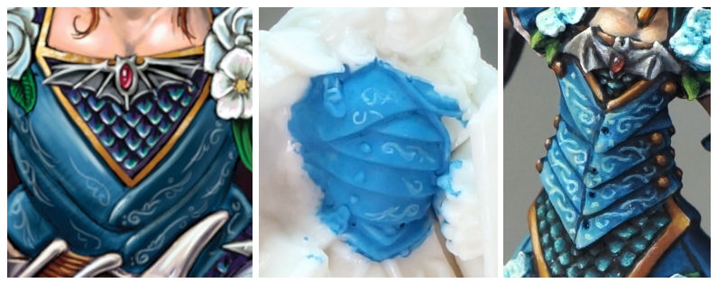
 On the left is the initial stage of laying in the freehand pattern. Stage two is cleaning up the curving patterns. Stage three on the right is adding some dots to make the pattern look more complex and interesting.
Keeping all of that in mind, if I want to add a freehand element in this situation I might do well to use a more abstract design, and to make colour choices that are lower in contrast within the freehand, and/or lower in contrast to the main figure. I went with a tone-on-tone gold, using the same mixes of paints to paint both the cushion background fabric and the decorative design.
 While I didn’t want the pillow too saturated or bright a gold, it was a little dull as initially painted. For a final step I glazed with a yellow-brown colour to add richness and a bit more colour.
It helps to have in mind your purpose in adding freehand to a figure. Sometimes it might be required to fully expression your ideas for a character or scene – insignia or text on military and sci-fi characters, richly decorated clothing or scenic elements for a noble character. Sometimes we might wish to add it as a way of demonstrating our skills to the viewer, like for a contest entry. Occasionally we may even use it to obscure an area that is poorly sculpted or where we missed some divots or mould lines. Some of these purposes require specific types of freehand in specific areas of the figure, which we may need to balance by making other kinds of choices for the figure elsewhere.
 Examples of freehand added to areas where it would have looked odd and more distracting to leave it off!
Colour Scheme for the Pillow:
Midtone basecoat: 9200 Harvest Brown
Shadow: 9137 Blackened Brown
Highlights: 29826 Desert Tan (out of production, 9256 Blond Shadow would likely work as well), 9257 Blond Hair, 9258 Blond Highlight
Glaze: 9314 Heartwood Brown
Figures in this Post and Where to Get Them
Sprout von Harvest II (metal) – Charity fundraiser figure for Second Harvest Food Bank of East Tennessee
Baran Blacktree, Veteran Warrior (metal) – there’s a painting guide for this figure
Dancing couple – I do not know the manufacturer of these figures or if they are currently available for purchase
Rivani, Iconic Psychi (metal)
Masquerade Ball Sophie (metal) – Painting to Match Artwork, general Painting Process
Sir Malcolm, available in metal or in plastic.
The seated succubus is available for preorder in plastic by adding the Demonic Temptations add-on to your Bones 5 late pledge. The add-on includes three succubi and three incubi. Previous post on painting her skin.
Inspector #3 – Camille Van Towe
Inspector #2 – Johnson
Sid the Rockstar
