Ko-fi tips help keep this content free. Patreon supporters receive PDFs with high res photos.
NOTE: There are many more WIP pictures in the Patron PDF version of this article.
Romag Davl was an interesting figure to paint as he presented an opportunity to work out how to do an effect I hadn’t done before. This miniature is also a great example of a dilemma we face in miniature painting that I suspect causes people a lot of frustration. In this post I’m going to talk through my thoughts about that, as well as the paint colours I used, and talk a bit about weathering powders.

![]()
The Brief and Pre-Painting Thoughts
Romag Davl is an updated version of a classic figure – modern proportions and quality, but with a nice old school vibe. Bobby Jackson did a wonderful job capturing the essential elements of the original. I like clean, simple figures like this a lot, and strongly recommend them for those just learning to paint or when practicing new techniques. Romag is part of Reaper’s Bones USA plastic line. (The copy I painted was a 3D print as production copies were not yet available.)

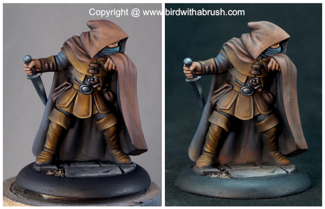
Then and now! Enjoy more classic Dungeon Dwellers at https://ddwzrd.com
I painted this for Reaper, and Ron Hawkins, the art director, had some parameters for what he wanted to see in the paint scheme. Romag is a dungeon-delving rogue type of character, dressed in dark browns to better hide in the shadows. Ron also requested that he be a bit grimy from his adventures, and even a bit sooty from the torches the party would have to carry for its human members to see their way in the dangerous depths.

The dark-clothed skulking rogue is a classic character concept. And one that is largely at odds with the things we need to do to paint a visually effective miniature. People are drawn to look at vivid colours and high contrast between colours and between values. Most of us have been in the position of entering a contest or posting something online for feedback and being told that we need to make it pop, we need more contrast, we need to add/increase blacklining and edging to more clearly define the different areas of the figure. And most of us have also been in the position of being annoyed about that feedback because we felt that the story or personality of the figure that we were trying to convey demanded dull colours, or dark colours, or low contrast.
There are lots of character types subject to these kinds of issues – assassins, thieves, soldiers in camouflage, animals with colouring that blends into their surroundings, and many more. You can run into similar problems with the opposite kind of characters, too – fair maidens and light airy angels, for example. I discussed that with an example of how Cindarella has been portrayed in a recent article.
Thinking about the nature and personality of the miniature and how to express that with colour and technique choices is a vital thing to do. However, it is also important to remember that the miniature as an object has a function apart from representing a specific character: a miniature figure is an object intended to be looked at. Whether you’re plunking the figure down on a tabletop, displaying it on a shelf, or entering it in a contest, the goal is for people to look at it. To paint a visually effective miniature you need to make choices that draw the eye and make people want to look at it. Sometimes that may mean tweaking or shifting elements to be less ‘realistic’ but more interesting to look at.

Of course, you are always free to paint these kinds of characters exactly as dark and dreary as you think they should be! But if you choose to do that, you then need to accept that a lot of people aren’t going to be drawn to look at them. They’re going to fade into the background on a display shelf or when scrolling through Facebook/Discord/Instagram. If they do get feedback, it’ll likely be comments about needing more contrast or pop. What draws people to look at things happens on a visceral, subconscious level, long before they get to consciously thinking that this character is a rogue/assassin/camouflaged so of course it makes sense that it fades into the background.
So how did I decide to handle this with Romag? I’ll get into colour choices and such below, but one decision that I made is that my primary goal was to paint to fit my client’s brief. It was also helpful to accept that I was primarily painting for a stand-alone photograph. If I take this figure to ReaperCon and put it out on my artist desk or enter it in the Master Series Open, I don’t expect it to get a lot of attention from people. It is not going to stand out when surrounded by colourful and highly contrasted figures. It’s a decently painted figure and I’m proud of it, but it’s not a showstopper that will grab a lot of attention. So in a sense I adjusted my expectations as much as I adjusted how I painted the figure.
For more on constraints like painting for photographs or the competing goals of character/story vs what people want to look at, check out this recent article.
![]()
Lighting Choices
After Ron mentioned soot from torches, I thought one way to try to add a little visual oomph to the fade in the shadows character type was to play with the light that would be casting those shadows. I decided to envision him as standing just behind another party member who is carrying a torch. I visualized the light as coming toward his face and upturned arm. In essence I wanted to try to paint OSL without a source light on the figure. Another way to put is that I wanted to paint directional light rather than zenithal or ambient light. I have talked about this approach, more than once, and it’s an excellent way to add a little more visual punch to a paint job.
I envisioned a scene with a bit of light from other torches bouncing around to create a dim ambient light, not one that was complete darkness illuminated by only the one torch. That kind of dramatic lighting can be very visually effective and is a good choice to consider for adding visual impact to fade into the shadows character types. In this particular situation, I was painting a catalog miniature, and I don’t typically feel comfortable going too extreme with OSL on catalog miniatures. Shoppers need to be able to see the figure as a whole and what all the bits are to determine if it fits their needs. I am also aware that people often use studio paint jobs as guidance when painting themselves.
Since I had a strong directional light in mind, it made sense to start with airbrushing in the big picture of light and shadow. So I broke out my Vex and some black and white primer to do that.

And then I thought about the fact that the bulk of my miniature would be painted brown and thought maybe I should start with brown, so I broke out the Vex again and this time loaded it up with brown paint. ;-> (I would have needed to do a separate priming stage anyway, so this wasn’t a complete waste of time, just sort of funny.)

The colours I used were 9137 Blackened Brown, 9307 Red Liner, 9161 Shield Brown, and 29105 Skysmog. It’s not super significant that you have those exact colours if you wish to try this technique, since all of this foundation layer was painted over by the end. So just about any dark/medium/light brown combo would have done the job. This was just to help me keep track of where things should be lighter and darker as I painted. A sort of roadmap, which you do not need an airbrush to do. In fact there are some things you can do creating a roadmap with a brush that you can’t do with an airbrush.
I do think I should have done a final highlight layer with white or a light cream on the airbrush roadmap. The sense of light is much stronger in the black and white one than the brown one. That issue carries through to the final version of the figure. I don’t think I pushed the highlights high enough to evoke the idea of source lighting. I would have needed to lighten the highlights a fair bit along the edge of the hood and the folds of the raised arm. Particularly since I planned to come back in with weathering powders that would tone things down a little.
Below is a comparison of the actual figure versus a digitally edited version that shows what it might have looked like had I used some warmer and lighter colours in small areas to push the idea that Romag is being lit by a torch carried just out of frame. Probably still not enough to compete with a shelf full of high contrast, brightly saturated figures, but it does help it pop a little more while still keeping the idea that it’s overall pretty dark.
This is also an example to keep in mind when you get advice to make things pop or push contrast. You don’t have to make everything brighter and/or lighter. If everything’s brighter or lighter, that’s not really contrast. Keeping your brightest highlights to small tight areas is often the most visually effective approach and a method for having a darker overall look that still pops. The analysis of the Death Dealer painting and miniature versions in this post has additional visual examples of using small, bright highlights to add visual impact to an overall dark colour scheme. Which granted can be challenging to do on a paint application level! But it helps to begin with an understanding of how to fit concepts of painting with high contrast into darker, moodier colour schemes.

I was actually a little closer to the goal before I applied the weathering. I did not plan enough for how the weathering powders would likely mute the contrast of the paint. I needed to paint the contrast a fair bit higher than I wanted to get an end result that would be where I wanted it. Below is a comparison of Romag from before (left) and after I added the weathering powders.

![]()
Colour Choices
My brief specified brown, and I did consider doing a 50 Shades of Brown type of approach and using only browns. In the end I decided that if I needed to keep the colours as dark as possible, I had better use a little contrast between colours to separate some areas of the figure. In particular, I wanted to paint the inside of the cloak a different colour to work as a ‘frame’ for the main body of the character. I decided to go with a very dull blue for that, with the idea of creating colour contrast between the blue and the yellow and orange tones in the browns of the armour and skin. I used various values of this blue on the clothing and non-metallic metal as well.
I also chose what shades of browns to use with an eye to creating contrast. The colours I chose for the cloak were based on a colour combo I had used years ago and had long meant to explore some more. Since those browns incorporated some purple and blue tones, I picked more yellow-based browns for the leather armour and boots. That creates some colour contrast between the two types of browns.
Apart from that the main consideration I made for colour choices was trying to use some paints from Reaper Virtual Expo that I haven’t gotten to paint with before!

The colours on my palette (above) give you an idea of how dark and how brown the paints were that I used. The two lighter spots of blue to the right and the small dots of bright blue and green were for glazes used on the dagger. The small dots of yellow and off-white were for painting the eyes.
![]()
Paint Application
I applied the initial coats of paint over my roadmap using rough wetblending. I mixed up my shadow, midtone, and highlight colours and painted the appropriate value over the areas of my airbrushed roadmap. You can do a similar thing with rough layering. The roadmap is just a guide, I consider ways that I might need or want to tweak it as I paint, like adding highlight details like on small folds and wrinkles, or making the shadows deeper in the folds on the back of the cloak.
Here’s an example from when I was painting the cloak. The area of the upturned arm has had colours roughly applied. From this stage I use my paint mixes and a gentle touch to soften the hasher edge transitions between the highlights, midtones and shadows. I also tweak to lighten or darken areas if I see places that need it. The right side of the cloak has had some smoothing and tweaking completed. The hood is still just the airbrushed brown stage.

Here’s what that area looks like on the finished piece. If I were painting a different sort of material for the cloak, I might have smoothed it even further.

![]()
Weathering and Colour Variation
I often use thin glazes of paint to introduce some colour variation and add weathering. On Romag, I only used glazes on the dagger, to add just a hint of blue to it. Instead I chose to use weathering powders. I am by no means an expert in using these types of products, as I typically work with paint. I’m going to share an overview of things I do know about them, but I’m sure you can find videos and articles from more experienced users if you’re interested in more information.
Weathering pigments are pigments in powder form. The instructions that came with my set say they’re mixed with dry adhesive that is activated with friction. You use a somewhat stiff brush to rub them into the areas of the miniature where you wish to apply them and they stick pretty well. It also says that this works best on a matte surface, so if you use glossy paint or sealer on your figure you’ll need to apply some matte sealer over that before applying pigments. You can also use a damp brush with them or mix in some water or acrylic medium for more of a muddy look or dried streaks and similar effects, but I did not do anything like that on Romag. When used dry, you can remove errant applications with a damp brush, so pigments can be a bit more low pressure to use than glazes and washes that cannot be removed once they are dry.
I purchased my set at my local HobbyTown years ago. These days there are several companies catering to the miniature hobby that offer weathering products. You’ll also find these from vendors that cater to model kit and model train enthusiasts. Many are sold individually, but you may be able to find kits with a selection of colours. They usually come in small plastic tubs rather than the bags of my set (which came in a small plastic organizer.)
 Some of the pigments from my kit, and the instructions. I use a piece of index card to tap excess powder off my brush. I did not use any of the green, but used all of the other colours shown here. There are additional colours in my kit as well.
Before I had this set I also made my own by sanding dry pastel or Conte sticks that I purchased at the art store. You may be able to find these sold singly so you can buy only the colours you want. These will not have any sort of adhesive like the purpose made pigment powders, so will likely not stick as well to your figure. You may be able to make the application more durable by applying spray sealer over them. Purpose made weathering pigments are more durable, but I don’t know if they can stand up to heavy gaming use. Even if they did wear off a little you could just reapply more later.
SAFETY NOTE: The particles of weathering pigments and soft pastels are small and light. They can easily be inhaled. I recommend wearing an N95 mask or similar protection when working with any kind of particulate. Particulates are very tough on your lungs. Airbrushing also creates aerosolized particles. I wore a mask when doing the airbrushing and weathering on Romag, and recommend you do the same.
I began by applying some of the powders to the hem of the cloak and the boots. I started with my darkest dirt colour and worked up from there. Some pigments fell on the base, but that was okay! That allowed me to add some browns into my base and tie the figure and base together a little more. Pigment powders are a nice way to add a little colour variation as well as weathering. When there was more pigment than I wanted or the location wasn’t quite right, I wiped it off with a damp brush and allowed the area to dry and then tried again.
 I used a mix of glazes and weathering powders to add the colour variation and stains to Barglemore and Camille.
Now it was time to see whether I could get an effect of soot and ash. What I really wanted was the pigments to appear just as they did when I dropped them on the figure, rather than how they looked after scrubbing them in like on the hem. So I tried dropping bits of pigment on the surface and then tapping rather than scrubbing with my brush. That worked really well with the lighter ash colour. It wasn’t quite as successful with the darkest colour, though I did get it working in a few spots on the hood. It’s possible that other areas where I was applying it needed a bit more matte of a surface. I suspect this will not hold up to heavy handling, but that’s not really the fate of this figure, so it should be okay. Trying to make the darker soot effect work is the stage where I ended up covering up too much of my highlights.
The company I purchased my set from has a website, but it looks like it hasn’t been updated for a while and they’re operating by mail order. So if you’re interested in trying out pigment powders you may want to ask around on your favourite forums or Discord channels or similar to get recommendations from people for other brands.
![]()
Paint Colours Used to Paint Romag Davl
I was painting fast and in the zone for much of this, so I wasn’t as precise in tracking my colours as I usually am. The key colours should be correct, but I might have swapped a shadow or highlight mix colour here and there.
Initial Brown Airbrush Stage
9137 Blackened Brown, 9307 Red Liner, 9161 Shield Brown, and 29105 Skysmog
Skin
9301 Red Liner, 9491 Minotaur Hide, 9494 Gnome Flesh, 9487 Yellow Mold
Blue (Inside of Cloak, Clothes under the Armour)
9066 Blue Liner + Red Liner, 29109 Hardsuit Blue, Yellow Mold
Leather Armour
Blue Liner, Blackened Brown, 9491 Minotaur Brown, 9429 Rich Leather, Skysmog
Cloak
Blue Liner, 9136 Walnut Brown, Blackened Brown, 29114 Roogtarki Flesh, 9428 Saddle Brown, 9260 Bronzed Skin
Base Stones
Walnut Brown, 9085 Shadowed Stone, 9500 Brinewind Brown, 9087 Weathered Stone
Dagger
Blue Liner, Shadowed Stone, 9086 Stone Grey, Weathered Stone, glazes with teal mixed from clear paints
![]()
Figures Shown in this Post
Romag Davil is available in Bones USA plastic.
Barglemore and Camille are available as a set in metal.
