Ko-fi tips help keep this content free. Patreon supporters receive PDFs with high res photos.
Recently I have been experimenting with washes. With my skeleton bone wash experiment, I learned that different colours of washes could be used to quickly add a little individuality to batch painted figures without too much extra time or effort. The experiments also suggested that variations in shade colour choices could help tie colour/light schemes together, or be a useful tool to convey different effects or moods, if some of the other colours were adjusted a little.
 The skeleton bone has different wash colours, but the same basecoat and drybrush colours. The bases were painted Naga Green in preparation for today’s experiment.
In the case of the skeletons, I applied washes of somewhat saturated colour over an fairly neutral ivory basecoat colour. I didn’t have time in the initial wash testing stream, but I also wanted to study the effect of applying saturated colours on top of a saturated colour. In a follow-up stream, I used the bases of the skeletons for this experiment. Each was painted with the steps outlined in the Core Skills Learn to Paint Kit, other than changing up the wash colours. The starting basecoat for the bases was Naga Green.
You can also watch the video version of this if you prefer.
I picked out a selection of colours to use for the washes. Since the Naga Green was a darker starting point than the Desert Sand of the skeleton bone, I chose darker value colours for the washes than I had on the skeletons. Regardless of colour, the washes still need to function as shades that shadow the recesses.
 The paint colours used for the washes.
As with the skeletons, I had some ideas of how these paints might or might not work. Some of my ideas are based on years of study and practice with colour. I know colour is a confusing and scary prospect for a lot of people, but I think that some elements of colour use are areas of art well suited to more left brain thinking painters. There is colour theory you can study, and practical experiments like this that you can perform. You don’t have to have an innate sense of colour to be able to paint with it successfully! You just have to accept that you might not be successful with colour every time. (And I don’t think those with a more innate sense of colour use get it right every time, either!)
Pine Green: This seemed like a pretty safe wash choice. Similar green to the basecoat, just darker. Not too exciting, but very unlikely to ‘fail’.
Rotting Wood: I thought this less saturated green would dull down the base a little, and fit the atmosphere of a skeletal figure better.
Ritterlich Blue: Blue can be a very effective shade colour for more saturated greens, so I expected this to work as a shade, but I wasn’t sure if it would look like convincing grass.
Coal Black: With its touches of teal, I thought this would strike a nice balance between creating good contrast and adding a little colour variation.
Gothic Crimson: Green and red are contrasting colours. (Magenta/pink is considered red in colour theory.) Mixed together they create brown. I expected this to dull down the green to the point where it might not even look grasslike anymore.
Styx Purple: Purples work well to shade a surprising number of colours, including green, so I thought this could be interesting.
Mahogany Brown: Mahogany is a red-brown. Since it’s less saturated than the Gothic Crimson, I thought it would work better as a wash colour for green, dulling it down a little but not turning everything brown.
Basic Dirt: This is more of a true brown. I expected it to dull the bright green to more of a muddy grass type of look.
 The washes (and drybrushing colours) on my palette at the end of the stream.
I had three additional skeletons at hand, but these were posed on rock bases. They are sculpts that used to be used as a substitute for the other skeleton figure in the Learn to Paint kits when it ran out of stock. Now the kit skeletons are manufactured at the Reaper facility using the Bones USA material and should always be in stock for kits, but those of you who bought kits in the past may have received this different Skeleton Warrior Archer instead. I painted the rocks as described in the Core Skills kit, starting with a basecoat of Mountain Stone. Then I used these washes:
Goggler Green + touch of Pure Black (Rock): I thought this might create a moss or algae covered rock look.
Coal Black (Rock): I thought this would make a nice shade colour for cool grey rock.
Ritterlich Blue (Rock): While touches of blue might simulate some kinds of coloured rock, I thought a blue this saturated would look ridiculous.
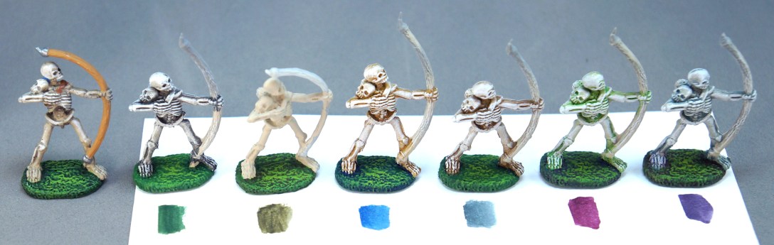
Below you can see pictures of what the bases look like after completing the drybrushing steps. The drybrushing steps started with the original Naga Green, and then a couple of steps of lighter greens achieved by mixing in Candlelight Yellow, as outlined in the Core Skills learn to paint kit. Below each figure is a swatch of the wash colour I painted on its base during the stream. The figure on the far left of each picture is painted according to the kit directions, using thinned Pure Black for a wash, and is there for comparison purposes. The stone bases were highlighted with mixes of Mountain Stone and Dragon White.


Drybrushing with the original green (or grey for the stone) altered the appearance of the washes. Brushing on additional highlights of the green mixed with yellow further altered the appearance by introducing touches of a third colour, yellow. The difference in impression between the green with just a wash and the green with both wash and drybrush steps complete was significant, as you’ll see in an example photo below. These are my impressions of each base to compare with my guesses for what might happen with the colours.
Pine Green: The general effect is harmonious, though possibly a bit bland. The green I chose wasn’t quite dark enough and/or I added too much water. The crevices need a bit more shading.
Rotting Wood: The effect is more natural than the black wash, and the slightly duller green fits the skeleton figure better.
Ritterlich Blue: This is a gorgeous shade on a saturated green highlighted with a yellow-green. This colour mix might not be well-suited for simulating grass, but I definitely want to keep it in mind for other types of materials like cloth.
Coal Black: I mixed too much water into this wash, so it didn’t effectively shade the recesses and provide enough contrast. I think the colour works well, I just would have applied a second coat if I’d been painting in my own time.
Gothic Crimson: At the wash stage this looked very jarring, but once the drybrushing was added what remained was a brown created by the visual mixing of the green and magenta. I think it actually ended up working a little more harmoniously than the red-brown Mahogany Brown version.
Styx Purple: I chose a somewhat blue-violet purple. It was interesting to see how much more apparent the pink/red component of the purple became when the wash was applied over the green. The purple gives a really nice sense of depth to the crevices, but I think it needs to be just a little darker to bring out the sculpted details well.
Mahogany Brown: The contrast between the complementary colours was very jarring after just the wash phase. In the end it is less contrasted than it initially looked, but the red and green do fight a little.
Basic Dirt: This gave a look of ground made up of mixed dirt patches and grass patches that fit well with the skeleton figure. The effect is less jarring than with the Mahogany Brown.
The wash on the rock bases wasn’t dry enough to paint over by the end of the stream, but I finished them up later.
Goggler Green + touch of Pure Black (Rock): The colour works well as a shade, but if I really want to convey the idea of algae or moss, I would need to apply some additional drybrushing or glazing in green colours.
Coal Black (Rock): I used a less transparent mix of this for the wash on the stone, and it works well for shading the recesses and creating a cooler grey look.
Ritterlich Blue (Rock): This has great contrast and ended up being my favourite of the stone versions! I might use a slightly duller and darker blue for stone going forward though.
Since I performed this experiment on a live stream, I don’t have any WIP pictures. I did add a wash to a single base so you could compare the difference between the wash stage and the final result stage though. In the picture below the base on the left and the one in the centre were both painted with the Mahogany Brown wash. The base on the right was painted with the Gothic Crimson wash. The centre and left figures demonstrate the differences between wash stage and final stage on the skeleton bone. Both were painted with a wash of Naga Green.

I think these experiments make a good argument for breaking away from using just black or a darker version of a colour to do a wash. You can get additional depth and richness or add little touches of variation by using more coloured washes.
I was somewhat surprised that the majority of these experiments worked pretty well. I had previously had an experience of combining a more saturated wash with less saturated base and drybrush colours where I did not like the end result at all. Perhaps that might partly be related to the texture and the type of figure? If nothing else, that experience demonstrates that even people who well practiced at doing something can have instances where things don’t turn out as expected. Results we don’t love happen regardless of our skills. They aren’t a reason to beat ourselves up or get down on our hobby pastimes, and often we can learn from them.
Products Mentioned in this Post
Core Skills Learn to Paint Kit
Skeleton Archer in plastic or in metal
Skeleton Warrior Archer in plastic
Mountain Stone
Pure Black
Naga Green
Pine Green
Rotting Wood
Ritterlich Blue
Styx Purple
Mahogany Brown
Basic Dirt
Gothic Crimson was a special release colour at a convention.
Coal Black has been seasonally available in the Holiday paint set, which is currently on sale for people who don’t like to order paint in the colder weather. This set is being retired after this run sells out. Below is a swatch of all the Holiday paints.
 The Holiday paint set is on sale right now. Sparkling Snow is a metallic colour.
