Ko-fi tips help keep this content free. Patreon supporters receive PDFs with high res photos.
Most of us love to get feedback on our miniatures. What did we do that worked well? What could we do to improve? When we get that feedback we are often reluctant to alter the original figure, for a variety of reasons. But without taking that step, many of us find it difficult to visualize what the figure would look like if it were tweaked to adopt some of the suggestions. I did a critique and repaint of a figure to provide a visual example.
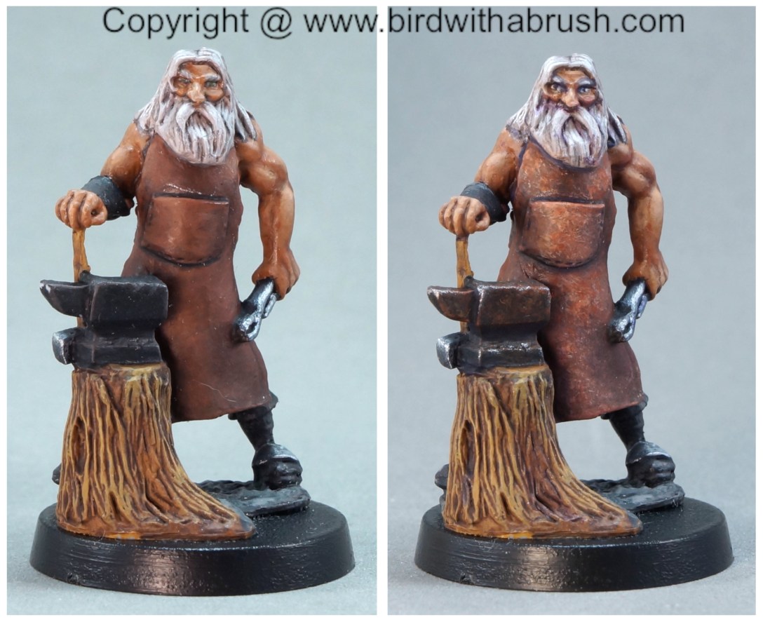
 Left: The before miniature that I critiqued.
Right: The miniature touched up to respond to some of the critique issues.
Conventions and shows are back on the calendar, and people are preparing miniatures to enter at ReaperCon and other events. I want to spend some time over the next few months addressing some common issues that come up in post-contest critiques to give people an opportunity to try to catch and address some of those before they enter their figures into a contest.
On the third episode of my Beyond the Kit Stream on Twitch, I talked about common issues in contest entries, gave critique on a miniature, and then did touchups to that miniature based on the issues mentioned in the critique. I used a blacksmith miniature I had painted for use in our home role-playing games. I’ve written this article as a summary of what I did in the video, and to share the before and after pictures for direct comparison.
My secondary goal with this project is to encourage you to try doing some touchups on your figures. You don’t have to begin experimenting with touchups on your entry or a special figure that you previously received feedback on. You can take the general ideas from that feedback and try them out on an older figure or something you painted quickly for game use to get more comfortable with the idea and the process. If you are working on an entry for a contest, I encourage you to work on it well in advance of the deadline. Once you think you’re finished, put it aside for a few weeks. Then come back and look at it with a critical eye. Is there as much contrast as you thought there was while painting? Do you need to tidy anything up? You will often be able to assess your figure more clearly if you take a break and return to it with fresh eyes.
The ReaperCon MSP Open (and most other contests that are organized under the show system) is open to painters (and sculptors/converters) of all levels and experience, as well as to figures from any manufacturer and in a variety of sizes and scales. Entries are judged against standard established for their category, and awarded Certificate, Bronze, Silver, or Gold accordingly. The number of awards at each level is not limited in any way, and entrants are competing only against the standard and their own previous placements, not against each other. Many of our entrants are newer to the hobby or people who prefer to paint for gaming, and those entrants are as interested in feedback as seasoned competitive painters. This figure was selected to demonstrate some of the issues that are often identified on Certificate and Bronze level entries. I often see these types of issues in online contest entries as well.
 Left: The before miniature that I critiqued and then repainted.
Right: The miniature touched up to respond to some of the critique issues.
![]()
The Critique
First I gave the figure a critique. I went over the issues that would likely come up if an experienced painter or contest judge were to review this figure. One of the best parts of ReaperCon is that painters and judges are available to give people feedback on their work, although this is certainly not the only venue for feedback!
Note that this is a very thorough review. I had more time to assess and consider the figure than most people offering critique will have. And since it was my own figure, I didn’t mind tearing into it a little! I wanted to try to cover as many of the more common feedback notes as I could so people who have received that note on their work in the past can get a better understanding of what it means than they might have been able to in a busy convention setting or a short comment on an Facebook/Instagram photo.
 The before version.
I’m going to run over the main feedback topics here. You may also find it helpful to watch the video to get a view of the figure in the round. In the video you can also see me pointing to the specific parts I’m discussing.
Paint Job Damage
It’s hard to see in the photo, but there are a few chips on the bracer. I can’t speak for all judges, but if I see one or two isolated chips or scratches on a figure entered at a convention, I tend to assume those could have happened in transportation to the event, and I don’t ding entrants at all for that.
Metallic Paint on Apron
If you look just above the pocket, you can see a light line of paint. It’s actually metallic paint, so it’s even more noticeable when you’re moving the figure around because it looks shiny. Judges do prefer to see a clean and finished paint job where the painter has gone back and corrected and tidied up issues like this.
Visual Impact/Colour Scheme
These issues are more obvious if you look at the figure from a distance or scale down the size of the photographs. And if you think about it, scaled down is how a lot of people will first encounter your miniature – on a shelf or table at a distance, or in a thumbnail on a webpage. You need to catch their eye there to make them want to look closer and see all the detail work you’ve done. This figure reads decently from the back due to the red-green colour contrast and better alteration of lighter – darker areas on the figure. In the front view the apron and skin kind of blend together. The face doesn’t stand out much. The viewer’s eye is more likely to go to the higher contrast, saturation, and texture detail of the anvil and/or stump area. This is partly related to shadow/highlight contrast, but is more affected by colour and value choices for the main areas of the figure.
 I scaled the figure down to simulate seeing it from a distance or as a thumbnail.
You can review the Catalog of Contrast for an overview of the different kinds of contrast we can use to make our figures easier to ‘read’ and draw attention where we want it.
Head Poorly Defined
The face and head area do not command the attention they should. People are drawn to look at faces, so painters need to make them clear and interesting to look at.
Contrast
Of course it doesn’t have enough contrast! It’s the eternal struggle for all of us.
Generic not Specific
The apron and anvil on the figure are probably the best painted areas in terms of paint application technique. At the same time, they are also kind of generic and dull. We think we know what a lot of things look like, such as leather. But our mental images for objects are often amalgamations of all the individual examples we’ve seen, which tends to make them generic or symbolic. When you think of an apple, you probably think of something like a Red Delicious apple – uniformly red, fairly symmetrical in shape, etc. If you look at some individual apples next time you’re at the grocery store, you’ll find very few of them actually look like that! They’re all kinds of weird shapes and a mix of colours. When I looked up images of working blacksmiths to see what their aprons and tools looked like, they had details of texture and wear that my painted blacksmith did not.
 Look at that cool texture on the apron! And the anvil has some light rust with brown and orange in it. Photo from goodfreephotos.com.
Reality versus Exaggeration
This is a thorny issue for many miniature painters. We want to paint something that looks realistic. One issue is that we often don’t check in on reality before we make painting decisions. Like with the blacksmith’s apron. Rough and damaged is how a working blacksmith’s apron looks in reality, not the nice smooth blends I originally painted. The second issue is that we tend to be restrained in our depictions of textures and effects to try to be more realistic. I’ll come back to this in future articles, but during the stream we talked about the idea of going big and exaggerating effects – make OSL so bright viewers will need shades, contrast so extreme no one could ever say you need more, wet t-shirt rather than slightly transparent cloth etc. Partly I suggest this because the small size of miniatures means we need to exaggerate for people to see and understand the effect at all, and this is more important than super strict realism. I also suggest going to the extreme because even when it feels like you’re doing that, you probably aren’t. But you’re more likely to get to where you need to be more quickly if you push for the extreme than if you hesitantly increment up your level of contrast.
The Base
Entries in the Painters category at the MSP Open at ReaperCon are judged primarily on painting. Basing work and general construction and prep are a smaller part of what is considered. So the base on this figure would be judged for how it is painted, but would not be penalized for being an integral base glued on top of a round base without any additional groundwork. If I were entering this in a different style of contest I would definitely want to flesh out the base, however.
![]()
Prepping the Figure
I did this part prior to the stream. I dusted the figure off with canned air and brushed it with a large brush. Then I mixed a solution of water with 91% isopropyl alcohol and brushed that over the figure. My goal was to remove any dust and also skin oils that might be on it from handling in game play. Acrylic paint adheres well to acrylic paint, but not as well to grease floating on top of acrylic paint. Painting over dusty miniatures could result in a rough bumpy looking surface.
![]()
The Touchups
One of the things I wanted to demonstrate in the stream is that doing touchups might be less scary than you think. I was hesitant to do them for a long time in my earlier days of painting, and I regret that. I encourage you to learn from my mistakes and give it a try! You don’t have to try it on a cherished contest miniature, you can start to experiment on an older or speed painted figure that you don’t have a strong emotional attachment to.
It is less important to match exact colours than you would think. When I did contrast touchups on the figure below, I did not correctly remember the colours I had used on the dress. While I prefer the purples I originally used to the pinks of the revised version, the slight shift in colour did not ruin the underlying paint blending and the contrast is definitely much more effective in the revised version.

The key to making this work is to concentrate on value. Value is how light or dark something is. So if you get a skin tone that is kinda sorta similar to your original one and you paint a shadow mix into the shadow area and the value of those shadows is pretty close, it should work fine. Then you add in some darker shadows and increase the contrast from there.
If you put some paint down and the value is way off (it’s much lighter or darker than the area where you placed it), just grab a damp brush and scrub it off. Then tweak your mix and try again. Doing this value matching will get easier the more you practice like this, and practicing it will help your overall painting considerably, it’s not just useful for doing touchups.

If you study the teal areas in the above photo, I think you can get an idea of the process. If you look at the side of her hood to the right side of her head, it’s the same before and after. That was essentially the midtone, and I didn’t touch that area with new paint. I added darker shadows under the fold of the hood, and lighter highlights on the peaks of the folds and the top of the hood.
To prove the courage of my convictions about not needing to match colour, I used brand new paint colours to touch up the blacksmith. These colours had not been released when I first painted the figure. These included colours from the swag boxes for the upcoming ReaperCon 2021 (currently on preorder) and colours that are releasing as part of the Bones 5 Kickstarter fulfillment. I was sent preview copies of these. I’ll list the exact colours I used to touch up the blacksmith and include scans of swatches at the end of this post.
Contrast
I added more contrast to the blacksmith in a similar way as to that Victorian lady above. I took the shadows of areas down a step or three darker than they started, and applied highlights a step or three lighter than where those started. So when working on the highlights, I started with a value pretty similar to what was there and applied that. Then I mixed a lighter value and applied that on top in a smaller area, and then a lighter value again in a smaller area on top of that. The areas I applied contrast with standard layering include the skin, the pants, the leather (boots and bracer) and the hair. With the hair and beard I used the side of the brush held perpendicular to the texture to keep paint out of the recesses between the strands.
Note that I did not push the contrast on the blacksmith to the extreme of what I personally would paint at this point in my hobby journey. I was trying to simulate what someone at an earlier stage of their painting journey might do if attempting to push to what they would feel is extreme contrast.
Texture
I wanted to add both contrast and texture to the apron and anvil. I used brushes designed for stippling to do this. These have stiffer bristles. One was cut flat, the other was more of a teardrop shape. As with drybrushing I used more opaque paint to keep the stipple texture visible.
Based on my reference photos I added stronger texture to the apron and more subtle texture and colour variation to the anvil. Adding texture to the anvil at all goes back to the point about exaggeration versus realism that I discussed above. If you scaled my blacksmith reference photos down to the size of a miniature, you probably would not detect much texture or even colour variation on the anvil. We had a couple of people with smithing experience on the stream who pointed out that a good smith would take good enough care of their tools to not have much visible rust. Adding a bit more visible rust to the miniature anyway makes the miniature more specific, more interesting, and more readable, and it doesn’t stretch reality to a ridiculous point.
_055-2000.jpg") This photo of a blacksmith shows a different colour of apron with similar wear, and more of the subtle variation of colours on an anvil. Photo by Matěj “Dědek” Baťha from Wikipedia Creative Commons.
This photo of a blacksmith shows a different colour of apron with similar wear, and more of the subtle variation of colours on an anvil. Photo by Matěj “Dědek” Baťha from Wikipedia Creative Commons.
Colour Variation and Unity
It is helpful to add some colour variation to miniatures to add visual interest so people enjoy looking at them more. Among other things, this mimics the effect of reflected light and colour casts in light that happens in reality. Using the same couple of colours to mix the deepest shadows and lightest highlights is another way to trying to create some colour unity and give the impression that everything is being lit by the same light source.
For the blacksmith, I thinned down Carnival Purple and added it into the shadows of most of the items on the figure. Even a little bit in his hair! I applied it to the darker areas of the apron, and the shadow areas of the skin and pants. Purple often works well applied over the shadows of many colours, or even mixed into your shadow colours. Adding some hints of rust colours on the anvil is another example of adding colour variation. I applied a thin glaze of red to the blacksmith’s cheeks and the tip of his nose.
Definition: Lining and Edging
There was a bit of definition on this miniature, but I added more. Definition is an issue that comes up a lot in ReaperCon critiques, and just in general critique. Techniques like lining and edging help define the different surfaces that make up a miniature and allow the viewer to more easily see what is what on the figure. It helps it stand out and get noticed on the table/shelf/thumbnail. I applied lining in several areas of the figure, and did edging around the edges of the apron.
Adding lining is probably the number one tip I would give a newer painter to improve their work. People often feel like it is unrealistic. And again I would say look at reality. You will often see a shadow line where one part of the body or an item of clothing overhangs another. Lining is based on that principle. So it’s not just something from cartoons and comics, it’s something from real life. Edging involves applying a lighter colour to the edge of a surface, like the hem of a cloak. These areas often do catch the eye a little more or look lighter due to greater wear and tear.
For a more extensive discussion of the importance of definition and lining and for another before and after example, see this article.
Details
I was not able to work on them on stream (they’re very small and inset), but after the stream I did try to improve the eyes over what I had originally painted. I also tried to add some additional shadows and highlights on the metallic areas after the stream, but I don’t feel like these made a lot of difference.
![]()
Arm’s Length View and Black and White Study
Compare the scaled down images of the before and after pictures. You can see more information in the small view of the touched up figure than you could on the original. That is due to having increased the contrast and adding definition through lining and edging. You can’t really see all the sculpted texture of the stump and hair, or the painted texture on the apron from a distance. Nor can you see all of the subtle colour variations. The same is true of freehand or other details we often add to figures. But you need the effect of contrast and definition to make a figure readable at a distance and draw the viewer in to take a closer look at all of the details and subtlety you’ve added.


If you are viewing this on a mobile device, try to scale the above pictures down to the size of a miniature viewed at arm’s length to better compare the before and after. Areas where you can most strongly see the effect of contrast are the muscles of the back, the hair and beard, and the folds on the pants.
The last time I posted a before and after like this, some people commented that they couldn’t see much difference between the before and after. It can take some time and effort to develop our critical/artistic eye, just like it does to develop our brush handling dexterity. It may help to view the image converted to black and white so you can concentrate solely on the contrast and definition differences. Another trick you can try is comparing one small area at a time. Compare just the before left boot to the after right boot, and so on. Think of it like one of those spot the difference picture games. You can also consider this an argument for why almost all critique includes the comment to increase contrast. The viewer always sees less of it than the painter does!


If you would like to see another comparison with a different figure (and also a comparison between two similar figures), I wrote an article with a digital repaint of the figure below.

![]()
The Colours
On episode two of Beyond the Kit I did a lot of colour swatching. Depending on the surface you use and the way you apply your swatches, swatching out colour can help you see some important and helpful information about a paint, including opacity, mass tone (the colour at full strength once dried), and undertone (what the colour looks like thinned down or with white added).
I used cheap watercolour paper to paint my example swatches. It’s possible to paint swatches on even printer paper, but thinner paper or paper that isn’t designed for wet media application is likely to curve and buckle a little, and very thin paper might be damaged by paint mixes with a lot of water. I’ve had decent results with index cards and drawing paper as well. I scanned the swatches as I think the colour reproduction of my scanner is pretty good. Though of course actual colours may vary slightly given that you’re seeing this on a different screen and so on!
One set of swatches below are colours included in the various pre-order swag boxes for ReaperCon 2021. There are an additional three colours that will be included in the onsite VIP swag bags. I was sent preview copies of many, though not all, of the ReaperCon preview colours. I’ll be adding the additional colours to my swatch sheets next week and will update these scans after that.

The other set of paints that I swatched are the upcoming Kickstarter 5 paints. One pack of these are colours that are already part of the line, but were available at a discount via the Kickstarter. These are the Anne’s Favourites colours below. Anne Foerster recently shared some information about these colours and tips for using them on her Patreon.
The other pack is a mix of colours that were previously available via special edition and brand new colours. Reaper adds a few new colours to the line in each Kickstarter. These will first be available to the Kickstarter backers, but eventually they will go into standard retail and be available for purchase to all.
I’m particularly excited about the Oxide Yellow, Oxide Red, and Oxide Brown. These are similar to earth colours like yellow ochre and burnt Sienna that are common in traditional painting and are very useful for mixing. I’ve been playing around with some of the other new colours as well and enjoying those.

The specific paints I used to paint the touchups on the blacksmith, in no particular order:
9444 Tawny Flesh
9494 Gnome Flesh
9487 Yellow Mold
9333 Brown Oxide
29139 Grave Glome
29128 Goggler Green
29129 Drow Skin
9039 Pure White
9328 Black Indigo
29150 Rusted Anchor
9332 Oxide Red
9505 Chum Red
9331 Oxide Yellow
9507 Kraken Ink
9325 Carnival Purple
9452 Blade Steel
9673 Bright Silver
![]()
Figures in this Post
The Blacksmith is available in Bones plastic or metal in a pack with two other townsfolk. The copy I’ve shown here is Bones.
The Victorian lady is available in a pack with a second Victorian lady in metal.
Beach Babe Libby is available in metal.

_055.jpg)
Hello,
Thanks for this great post. I had also a look at your Youtube tutorial.
I am a retired 68 year old teacher living in the Netherlands. My name is Job. Untill now I have build OOgauge diorama’s using card.
I am just starting to paint Fantasy models. I like to create small diorama’s with a story. I use the models from Dave Graffam for my buildings. Have already made a butcher shop.
I was not happy with my painting of the Agitator from the Dunkeldorf range. Think it is now already better after some advice from you. Something that I think I can improve is the color of the book. Can you give me an advice how to improve it. I want that it looks like an old medieval book.
Looking forward to your opinion and advice.
Greetings,
Job[Image]
[Image]
Outlook voor Android downloaden
________________________________
LikeLike
Hello! I’m glad you found the article and video useful.
I would begin by looking up some photos of old medieval books. Try to identify visual elements that make you think of old medieval books. Is it texture on the leather leather? A particular colour for the cover, or pages, or metal bindings? Incorporate elements that you identify into your figure.
LikeLike
Such a useful, thorough post, thanks! I loved the B&W comparison photo, it was a perfect way to illustrate the importance of contrast. I’m one of those painters who is always afraid of destroying their paintjobs with too much contrast, so this was quite an encouraging post.
LikeLiked by 1 person
Thanks for commenting, I’m glad you found it useful! I encourage you to just really go crazy with contrast on a miniature or two and then put those away for a little bit, then take them out again and compare with how you usually paint and see which you like better.
LikeLiked by 1 person
That’s really solid advice, thank you 🙂 I think you’ve nailed it with putting them away for a few days, it’s true that sometimes you’re just not happy with something different right after you’ve done it, but it grows on you as you get used to it.
LikeLike