The Patreon supporter PDF version of this article includes high res photographs and better formatting. Ko-fi tips are another way to help keep this content freely available to everyone.
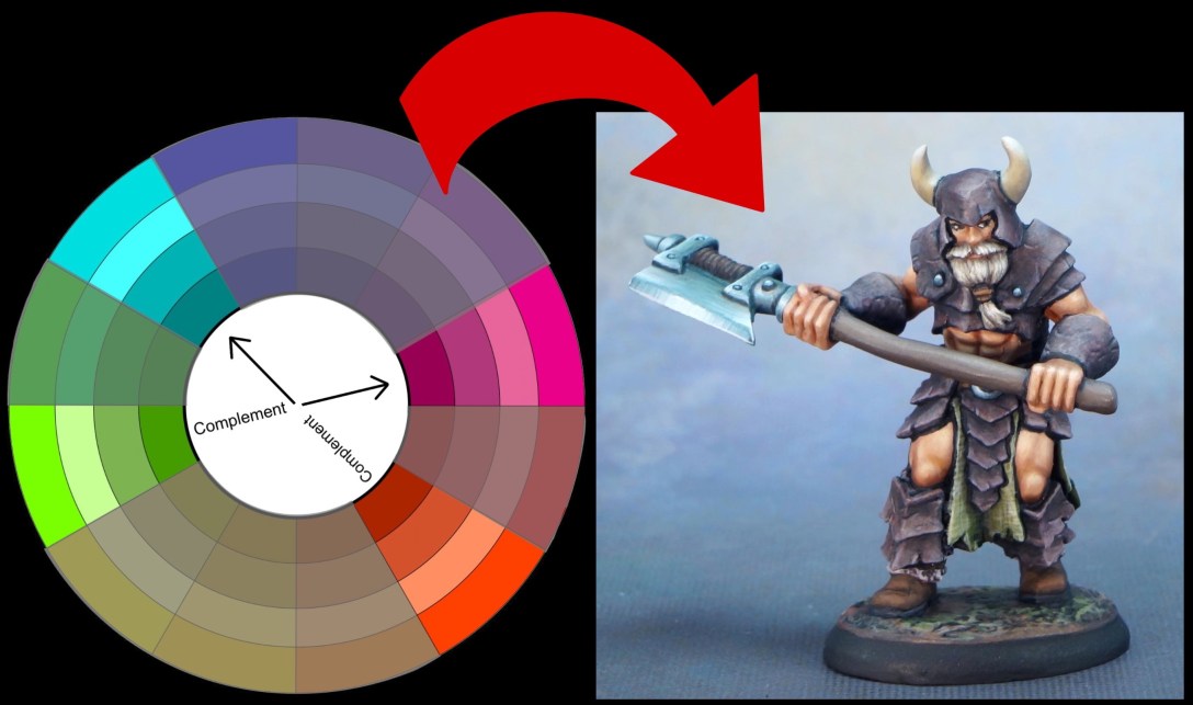
My experiences painting Lars Ragnarsson are a practical example of how to use some of the tricks and principles I discussed in my recent article about working with neutral colours. I started with red-violet, red-orange, yellow-green, and blue-green and ended up with a grizzled warrior.
 Base colour wheel by Karen Arnold.
![]()
Inspiration
If specific ideas for how I might like to paint a figure aren’t coming to mind, I sometimes do a few images searches for inspiration. The colour palette and general vibe of this painting appealed to me a lot.
 Viking Druid by Tomasz Ryger. Cover illustration for the fantasy novel Kroniki Dwuświata. Mrok we krwi by Paweł Kopijer.
I used a computer graphics program to isolate samples of the colours in various areas to get a clearer look at the individual components of the colour palette.
 Viking Druid by Tomasz Ryger. Cover illustration for the fantasy novel Kroniki Dwuświata. Mrok we krwi by Paweł Kopijer.
I wasn’t entirely sure of the root colour family of some of the browns and greys, so I used the color tool in my graphics program to identify the more saturated versions of the colours. (I used the Procreate app on the iPad, but you can do similar things with many different programs, including the free GIMP program which is available for Mac and Windows OS.)
 Viking Druid by Tomasz Ryger. Cover illustration for the fantasy novel Kroniki Dwuświata. Mrok we krwi by Paweł Kopijer.
While I think these digital tools can be helpful, I don’t assume that their interpretation of colours like this is 100% accurate. When you’re dealing with a very desaturated grey or brown, I imagine that one program’s coding could interpret something as closer to red, and another as closer to orange. I know that the programming of different digital cameras interpret colours colours differently, and I assume this might be kind of the same thing. Procreate interpreted these colours a little differently than I had expected – a lot of variations of orange and red, and less violet than I had expected.
![]()
Choosing and Refining a Colour Scheme
I decided to experiment with some of these colours in the other direction – if I wanted yellow-green cloth, orangey skin, and some kind of violet/magenta based brown for leather, was there a colour scheme that encompassed those colours, as well as an additional fourth colour? I headed over to Paletton to play with some colour schemes. Paletton is a very handy website that lets you choose different colour scheme options and then manipulate sliders around the colour wheel to refine the options within each scheme. It shows you the colour families to the right of the screen, with samples of different values within those families. You can also control the saturation of the main colour swatches as a group or individually.
I chose a tetradic colour scheme, which is a colour scheme composed of two pairs of complementary colours. Below is an image of the screen with the colours I settled on. I did not refine the saturation and value levels via Paletton. I find the Paletton saturation controls easier to use with a mouse, and I was using a touch screen at the time.

I did not take full advantage of some of the other features of this app, either. If you look at the sample colours on the right, you’ll see the swatches are different sizes. In this example I have the yellow-green set as the dominant colour. The app based its other colour suggestions around that. Regardless of the number of colours in your chosen colour scheme, you generally do not want to use each of them all on equally sized areas on your figure. It’s more visually pleasing to have one colour that is the dominant colour, then use the second on a smaller area, and then use the other(s) in smaller amounts or just as accents. Which colour you use in which role isn’t dictated by colour theory guidelines. Apart from allowing you to set the dominant colour, I believe that Paletton’s suggestions for which colour in which proportion are just that, suggestions.
I thought that set of colours would work if I used the red-orange for the skin, yellow-green for the cloth, blue-green for the metal, and then red-violet for the leather armour. But I would definitely need to adjust the saturation levels of some of those colours to make them fit my vision of a grizzled, worn warrior! I took the starting points suggested by Paletton and altered the value and saturation levels with my color tool in Procreate to get some ideas for other colours in that colour family that would better suit my vision for the character.. I sampled the colours on a middle value grey background to be able to better judge the value differences. (If you prefer not to use digital tools, the neutrals article includes tips for doing this kind of thing physical colour samples and how to desaturate paint colours.)

I selected versions of each colour that seemed like they would fit the intended areas of the miniature, picked out some paints to match, and got painting!
![]()
Painting Process
I will share the exact paints that I used at the end of this article. First I want to talk about some of my experiences with the colour scheme during the painting, and assess the end result compared to the intended colours. (I previously shared step by step photos and colour samples for the leather armour.)
The skin and armour painting went pretty well, but as I neared the end of the painting process there were a couple of areas I wasn’t entirely happy with. Below you can see the final version on the left, and a work-in-progress picture on the right. I repainted both the horns and the axe blade.

I still can’t quite put my finger on why I didn’t like the first version of the horns. Partly I think it is that the colour was a little off. I used a dark blue in the mix, and I think maybe it looked a little unnatural. The streaky texture and value transitions seemed like they should work with the vibe of the piece, but my instinct was that the streaky version of the horns was either stealing attention from the focal point of the face, or not sufficiently drawing the eye towards that area. Sometimes when I don’t like something on a figure I’m painting I try to analyze the problem to understand it better. Sometimes I don’t have time or energy to do that, so I just give it enough time and thought to be sure about exactly which part I think doesn’t work, and then I change that. The single colour horns do look very plain in comparison when I look at just at the horns, but when I consider them as part of an overall piece, I think they work better. I’d be interested to know what you think in the comments, should I have stuck with the original horns?

I did struggle a little deciding on paint colours to use on the hair and then the horns. The four colours of my colour scheme did not include a yellow, so a golden blond or yellow based ivory would mean straying from the scheme. As I mentioned in the neutrals article, colours like ivory and cream generally ‘go with’ most colours, and likely a blond/ivory type colour would have looked fine. But I wanted to work within the constraints of my chosen colour scheme. I instead opted to use khaki brown tans that had a touch of green in them. I am pretty happy with the platinum/aging blond end result.
I wanted to paint the metal trim items prior to assembly, to make sure I could reach everything. I thought it would also be a good idea to rough in the non-metallic metal on the axe head, as well. I wanted the final version of the NMM to have a little more texture, but I did some basic blends just to get colour on everything and see how the colours looked. (I would have no qualms about this level of NMM for a tabletop or quick paint figure, but Lars needed to be painted to store gallery quality.)

After roughing in the axe blade I assembled the figure, and then I put it up on my shelf overnight to give the putty and glue time to cure. When I came back to look at it the next day, I was not happy with the colour of the axe head. It was a lot more blue than I’d intended for this version of blued steel. I’ve used a colour like this for blued steel before, why did it work then but look wrong now? This is a good example of why using the same colour recipe for a particular materials will not look great on every figure, even for materials that are brown, or cream, or grey like hair, wood, and stone. It’s also an example of how working with neutrals that have a little colour in them can be tricky sometimes!
The way we perceive a colour is always in relation to the other colours that are around it. A moderate value colour seems dark when surrounded by light colours and light. A moderately saturated colour seems more intense if it is surrounded by more neutral colours, and less intense if surrounded by highly saturated colours Many optical illusions manipulate the way we perceive colour, but similar issues can occur on a smaller scale in life and with the colours we group together in a painting.
 The grey stripe in the centre is the same value throughout. It appears lighter at one end and darker at the other because of the surrounding values. Image by Dodek from Wikimedia commons. You can see some other optical illusions that make use of value perception.
 There are no red pixels in this picture. The strawberries are shades of grey. You can confirm the colours and read more about why Akiyoshi Kitaoka’s clever illusion works.
Mixing black into a colour will dull it down as well as darkening it, and mixing white into a colour dulls it down as well as lightening it. I chose a darker bluish paint that already had some black in it and added white to create highlight mixes. I repainted the axe and the metal bits on the belt knife, but I did not repaint the smaller bits of NMM. The stronger blue was not strongly noticeable in the small areas, and probably actually helps them stand out a little more. The finished axe colour was shifted a little more with some glazes. I added a little of the yellow-green from the kilt to a few spots, and some dark orange-brown in the crevices for weathering. These colours were thinned down to be extremely transparent before I applied them.
![]()
Assessing my Execution of the Colour Scheme
When I started working on the article about neutral colours, I wanted to check the colours as they appeared on the figure compared to the colours I had chosen from the online colour scheme tool Paletton. The majority were pretty close. The Procreate colour tool saw a bit of red and purple in some of the midtones and shadows of the leather armour, but I think overall it works as a brown version of red-violet. The one colour that isn’t quite right is the blue-green. Even the repainted axe head reads more as blue than blue-green, and I think that’s part of why the first attempt didn’t look right to me. Desaturating the blue made it clash less, but didn’t bring it in line with the tetradic colour scheme.

Out of curiosity I digitally edited the photo of Lars to experiment with a more and less saturated version of blue-green on the axe to compare it with how I painted the axe. I think the desaturated blue-green on the bottom left looks the most harmonious of the four options I tested. I don’t think the axe I actually painted is terrible! You don’t have to exactly follow a defined colour scheme for something to turn out looking okay. Colour theory and colour scheme suggestions are handy tools to help us out when we’re having trouble making decisions, they’re not shackles.
 Top left: final version of the figure. Top right: WIP version with more saturated blue NMM.
Bottom left: digital edit experiment with desaturated blue-green NMM. Bottom right: digital edit experiment with more saturated blue-green NMM.
Earlier in the article I talked about using the colours of a colour scheme in various proportions. I did use the four colours I chose in varying proportions on Lars, but but I did not use the proportions suggested by the Paletton site. Also when considering the coverage area for each colour, remember that it includes the different values and different saturation levels of that colour. The largest area is the red-violet. The leather armour is fairly dark, and the fur on the boots is quite light. The second largest colour area is the red-orange. The lighter skin tone and darker leather accessories like the belt and boots are both red-orange.
Is the third largest colour area on the figure the yellow-green, or the blue-green? This is also an example of how it can get interesting with three dimensional figures. The area of yellow-green kilt on the front is smaller than the axe, so the colours are in one proportion to another from most front viewing angles. But there is a larger area of yellow-green cloth on the back of the figure, and much less of the axe head is visible from most rear and side angles, so the proportion of those two colours appears reversed. The horns and beard are also in the yellow-green family, but are visible in all angles to one degree or another.
![]()
Final Pictures


![]()
Paint Colours Used on Lars Ragnarsson
Skin:

Boot fur:

Green cloth:

Leather armor:
 Paints to the right were used to paint the texture and battle damage. Paints to the left were glazed over to integrate the texture and add colour depth. See this article for step-by-step photos and swatches of colours used.
Orange-red leather accessories:
 Bright Skin 9233 is no longer in production. Add a little orange to 9445 Peachy Flesh for a similar colour.
Base:

WIP version of the horns:

Final version of NMM axe:
 Colours on the right were used to paint the main NMM. Colours on the left were applied as spot glazes.
Hair and final version of the horns:
 The Terran Khaki and Khaki Highlight are swapped in position to what they should be.
