The Patreon supporter PDF version of this article includes better formatting and high res pictures of the swatches to make it easier to match the colour suggestions to paints you own. Ko-fi tips are another way to help keep this content freely available to everyone.
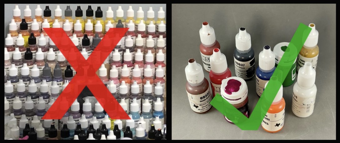
If you’re short on space or money, if you’re packing to paint on the go, what 15-20 colours of paint are most useful to have to paint a wide variety of miniature figures? This is one of the most common questions I see in discussion groups, and I’m finally going to take a stab at answering it.

This article is my short version answer to the question. I have been working on a longer article that includes information about colour theory and mixing tips, options for artist paint brand paints that are well-suited to figure painting, and more colour swatches and mixing examples. But since many of us need to get packing for ReaperCon and NOVA Open, I figured I’d better go with a short version for now! This article includes specific suggestions for three brands of miniature paint, and pictures of colour samples you can use to make choices from other brands you may own.
I have another article with more information on the hobby materials you need to paint on the go, and how to safely transport those.
![]()
What are YOUR Needs?
Your specific needs trump the advice of any other artist. Are you still working on your contest entry or worried it might get damaged in transit? Bring the key colours you used to paint it. Do you have a set of colours you’re using to paint your army? Pack those and some of your army figures to bring with you on vacation.
![]()
Saturation versus Opacity
The core of a compact paint set should be comprised of good mixing colours – colours you can mix with one another and obtain a wide range of other colours. The best mixing paints are vibrant colours composed of just one pigment. The problem is that many of those optimal mixing pigments are inherently transparent. Paints created with a transparent pigment are at least somewhat transparent, even if the paint maker adds a lot of pigment.
Most miniature painters prefer opaque paints. After all, it’s easier to thin a paint down than to make it more opaque. Paint companies create more opaque versions of a colour by mixing more opaque pigment(s) with the transparent one. More opaque pigments include white, black, and earth tones (browns and ochres.) Mixing those in dulls a colour down. They also add hidden variables, since you can’t always tell which of the more opaque pigments might have been added.
Paints mixed with multiple pigments have different properties than ones mixed with a single/pure pigment. The colours included in a multiple pigment mix are not always obvious. These hidden variables can create unexpected results that differ from what colour mixing guides like colour theory wheels suggest you should get when mixing two colours of paint together. You can mix the widest range of colours with a vibrant single pigment version of the colour.
I’ll discuss this conundrum and some of the artist paint answers to the problem in a bit more detail in the long version of this article. For now, my advice is to split the difference a little. For each colour I suggest, pick a paint that is pretty vibrant and intense in colour, but which also has coverage you can work with. Try to avoid colours that look like they have a lot of white or black mixed in. Colours with a lot of white or black will mix duller colours than those with less. You will have white and black in your kit, so you can add those yourself as needed to dull colour mixes down, but you can’t take them out of your premixed colours to brighten them up.
I talked about most of these colour choices and did some mixing experiments to test colour options on one of my Beyond the Kit videos. In most of my experiments the vibrant but more opaque versions of colours produced mixes that were pretty close in hue and vibrancy to the pure but transparent versions. The colours named Clear are Reaper’s version of pure single paint colours and would be the optimal mixing options for Reaper paints. Paint designer Anne Foerster put Clear in the name because these are fairly transparent colours. On stream, I tested some more opaque paint colours that were close to the same colours to see what the mixes looked like, and there were fewer differences than I expected.
The following is one of my mixing tests. The far right paint is Clear Red. You can see that it is pretty transparent. The other four are red Reaper paints I thought were similar in hue. The second from the right paint is a little transparent, as well. The other three are more opaque. I mixed each of these paints with Clear Yellow to see what kinds of oranges they would mix. There are some slight differences, but they all mixed a pretty vibrant orange.

Sometimes you have more of a decision to make. This example tests some options for magenta in the Reaper paint line. Clear Magenta is at the bottom. The two closest colours are Violet Red and Pale Violet Red. Both clearly have other colours mixed in with the magenta. I combined each of these with Clear Yellow to test what kinds of oranges and reds they would mix. Then I mixed each with Clear Blue to test the purple mix. The Clear Magenta created the most vibrant mixes for all of the colours. The Violet Red paint (middle) looks like it includes both magenta and red pigments. It mixed vibrant reds and oranges, but a duller colour of purple. The Pale Violet Red (top) looks like it is made from magenta and a fair amount of white pigment. The colours mixed with it are a bit washed out looking in comparison to the other two options.

So when you have options like that, which should you choose? Think about how you’ll use that colour and what will best suit your needs. For colours like the red, I would choose one of the more opaque options as I would find it easier and quicker to paint with, and the choice doesn’t have a big effect on my mixing options. For the magenta, I would think about that colour’s purpose for me. Is it primarily a mixing colour? I’d pick the Clear Magenta. Do I care more about opacity? I’d pick the Violet Red. My set suggestion includes vivid purple and orange paints, so I don’t have to worry about being able to mix the most vibrant secondary colours. I would not choose the Pale Violet Red, because it has a lot of white in it. I’ll have more mixing options if I include Clear Magenta in my set and mix white it to it myself when I want a similar colour.
![]()
Beware Web Store and Digital Colour Samples!
If you shop for paint in an online store, there is usually a coloured square or circle intended to show you the colour of the paint. You may also find all of the digital colour samples for a paint range displayed as a chart. Sometimes people put together spreadsheets or even apps/programs to compare the digital samples of various brands to try to find colour matches between different brands. Do not trust these digital colour samples or any colour matches based on them to be accurate! At all. Ever. Some samples may be only a little different from what the actual paint colour looks like, but often these digital samples appear very different than the actual paint colour.
Looking at a bottle of paint in a store in person doesn’t give you all of the useful information about a paint colour either, but it’s whole lot more accurate than relying on webstore sample swatches.
What if you have no way to shop in person? Review the digital colour samples in a paint range chart and make a short list of options for each colour that might fit the criteria I suggest in this article. Look for a company or fandom discussion group for that brand of paint, and ask members who own the paint for feedback on whether red X is brighter than red Y and so on.
You can also try image searches to see if you can find any hand painted swatches for the paint you’re looking at. Try searches like ‘brand-name paint swatches’ or ‘brand-name paint samples’. You’ll get lots of hits for the digital swatches, but scan through the image results looking for ones that look messy and homemade. Here’s is an example with Games Workshop Contrast paints, and one for Vallejo Game Color so you can see what I mean by messy and homemade looking. You may not be able to find what you need, but it’s worth trying.
I have included swatches for the three standard miniature paint brands I own below. Those brands are Reaper, P3, and N-Paint.
![]()
Don’t Panic!
Between what I wrote above or comments you might have seen about pure pigment paints online, you might be stressing out about picking the ‘perfect’ mixing colours, or thinking about whether you need to toss out your miniature paints and buy art store paints. Don’t! This is not a pass/fail test. You can ease into using a compact set of mixing colours and try it out for a while, and then decide if you want to refine your mixing set and try some different paint brands. Start by looking through the paints you already own for colours similar to what I suggest below. If one of the colours you pick doesn’t mix as well as you expected, you just pick out another version of it to try next time.
You don’t need the optimal perfect colours to paint a great looking miniature! I painted this figure with a set of colours I threw together at a convention. It won the Crystal Brush qualifier at CMON Expo, and a gold medal at the MSP Open.

Here is the set of colours I used. I don’t think any of these other than the black and white are in the Reaper examples of my suggested colour list below. A non-optimal set means you can’t mix as many versions of some colours; it doesn’t mean that any miniature you paint with that set will look like total crap.

Be aware that no set of miniature paints is going to allow you to mix every other colour that exists in the real world or in other paint colours. It’s tricky to put together a set of artist paints that does. There are multiple blue pigments, and multiple yellow pigments. You cannot mix the same green from any given combination of blue and yellow. I’ll have more information and examples of this in the long version article, just be aware that sometimes the limitations could be the paint colours, your mixing experience and expertise is not the only factor.
If you are new to colour mixing, I suggest that you do not try to mix an exact colour from a photo (or life, or your imagination, or a paint you left at home.) Aim to mix a colour that fills your need rather than an exact match to something. Are you painting blond hair? You need to mix a colour that looks like some shade of blond hair. You do not need to mix the exact same shade of hair as Chris Hemsworth as Thor. Mixing to match specific colours is a great exercise to improve your colour mixing skills. It is a recipe for frustration if you’re just starting to practice colour mixing and all you want to do is slap some paint on a mini.
![]()
My Suggested Colour Palette
Finally we get to what you came here for – the colours!
I am including specific suggestions for the three brands that I own – Reaper, P3, and N-Paint. For the Reaper colours, I tried to include only paints that are available for purchase at the time of writing for the sake of readers who might need to purchase paints. So my suggestions do not include promotional or out of production colours, and also do not include any of the paints from the Pathfinder paint sets, since licenses do not last forever. If you own some of the paints I did not include, there may be some excellent candidates to use in a compact set paint among them. My P3 paints are from the original release of 60 many years ago, and I am missing at least two. I do not know if any colours have been changed or removed from that original lineup. Additional colours have been released that I was unable to assess. Many of my P3 paint bottles do not have product codes. Hopefully the names have not been changed since original release. The N-Paint line is produced by Nocturna and I received the paints through their Kickstarter a few years back.
I am also including pictures of my bottle swatches for each colour. Hopefully this will allow you to look through whatever paints you own or have available to purchase to try to find something similar.
Most of my bottle swatches include three components:
* The most opaque/intense colour square is a thick application of paint intended to show the hue of the colour in the bottle. Artists call this the mass tone.
* The small stripe is a single stroke of paint straight from the bottle. This is applied over some of the printing on the label to give me an idea of the opacity of the paint.
* The transparent rectangle is what the paint looks when thinned down with a little water/medium. This shows you what artists call the undertone of the paint. It can give you a lot more information about the colour than the paint straight from the bottle. If you look at the blue and purple examples below, most of the paints are quite dark straight out of the bottle. Thinning the paint down and applying it over white allows you to more easily see variations in the colours and how vibrant (or not) they are. I recommend you try this yourself with a piece of white paper while making decisions about which paints to include in your compact set.

These are not perfectly colour corrected photos! And you’re probably not viewing them on a colour corrected screen anyway. The colour in these photos is a lot closer to true than digital colour swatches, but what you see on your screen is not an exact representation of the colours. Each swatch photo includes a certified colour corrected grayscale card, The background of the card and the white and grey rectangles are true neutral versions of those colours.
I want to be clear that I have not tested the compact set mixing properties of every one of these colours individually or as a set. Doing more mixing and testing is what is slowing down the long version of this article. I also don’t paint a lot of miniatures with a set of paints like this, so my core suggestions are not the tried and true colours of my own experience. I have 800-900 paints, and I make use of them in my day-to-day painting. That’s why I have avoided answering this question for so many years! However, I have been training in traditional art painting using small sets of mixing colours for some years now, and I have regularly painted miniatures with limited colour schemes, so my suggestions are based on relevant knowledge. If you’re a Reaper paint user, I also recommend joining Anne Foerster’s Patreon and videos for a lot more information about Reaper paints and how to mix with them.
![]()
The Core Colour Options
White
A true white paint. The vast majority of white paints use the same pigment, so there’s no wrong answer. Just grab the white paint you most enjoy using for mixing. Some whites may be a little more transparent or opaque depending on the binder to pigment ratio. Whites that are gloss or semi-gloss in finish may look brighter than those with a matte finish when painted out, but it’s more important to have a white paint that you enjoy using to mix other colours.


Pure White is the most pigmented of the Reaper options so I’d recommend that if you want to use a Reaper paint, but if you don’t have it, any true white is fine.
Do not choose an off-white as your core mixing white paint. You need a true white. Off-whites are great colours, and sometimes they’re easier to mix with. If you have extra space in your set and you like using an off-white, add it as a bonus paint, but do not choose one for your core mixing white paint.
In the photos below, the paint in the centre is Pure White. To the left is Vampiric Pallor, which has a slight green tinge, and on the right is Linen White, which as a touch of yellow. I love ‘em both, but if space is at a premium I’m going to bring white and mix in a little bit of green or yellow to make my own off-white.

Black
There are several black pigments that a company might use to produce their black paint. One black may be a little warmer or cooler in colour temperature than another. One might be more opaque or less dominant in mixes. If you only have one, choice made. If you have a few options, choose the one you most enjoy combining with other paints to make colour mixes rather than the one you think looks best when painted out in a flat coat of paint.
Some paint lines may also include chromatic blacks or near blacks. These are colours dark enough to appear black, but which may include pigments other than black. In general painting use, I often use a really dark purple or blue instead of black for mixing my shadow colours. If I want to keep my set as compact as possible, I will use black as my dark colour mixer and add a little blue or purple to customize it. If I have space for a few extra bottles, I might also include some of my favourite shadow mixing paints.
If you look at the three Reaper black paints below, you can see that there is a slight variation between them. Dragon Black on the left is slightly warmer, and Solid Black on the right is slightly cooler. I believe Anne Foerster has said that both have touches of other pigments. I have not encountered problems mixing with these, but if you want to ensure that the black you choose is made from a single black pigment, go with Pure Black in the centre.

Yellow
Try to choose a sunny yellow – one that isn’t shading towards either green or orange.


The three bottles in the centre photo below are better choices. The paints on the far left and far right are more yellow-orange. If you have space for some additional paints in your compact set, you could also include a yellow-orange, since it will mix somewhat different colours than the sunny yellow.

Red
Look for a bright firetruck kind of red rather than a red that has a touch of pink or purple to it. Thin it out and check the undertone.


Magenta
Is the blue-red-yellow colour theory right? Or is it the cyan-magenta-yellow? Why not both? You can mix different colours with magenta than you can with the bright red suggested above. Try mixing both of these with the blue you choose and check out the difference in the purples. Both purple mixtures are useful, but different. I would probably pick either of the two paints on the end over the Reaper options in the centre, since they offer a better compromise between opacity and true magenta hue. I discussed the Reaper options more in the Saturation vs Opacity section above.


Blue
This colour is a little trickier. If you’re looking for bright, vivid colours, you may think something like a royal blue is the best option. Almost all miniature paint blues (and craft paint, and economy paint) are probably mixed with a version of the phthalocyanine blue pigment. Phthalo is a very intense and vivid colour, but it may not appear that way to you straight out of the bottle, since it is also fairly dark in value.
The centre paint below is Reaper’s Clear Blue, which is likely composed of only phthalocyanine blue pigment. If you thin the blue candidates you have out with a bit of water and apply the paint over white paper, you should be able to judge them better. In the examples below, the second from the right blue has more white added, and it isn’t quite as vivid when thinned down. The colour on the far right looks to me as if it may include a little black pigment, and also isn’t quite as vivid. Paints that look more like the second, third, or fourth from the left are more optimal choices, but any of these are worth trying as your mixing blue.


Cyan (or Some Other Blue)
The issue with the cyan-magenta-yellow colour theory system for painters (as opposed to printing) is that there isn’t really a single pigment that corresponds to the colour cyan. Phthalocyanine blue is the one most often recommended. You may see paints named cyan or primary blue in both art brands and miniature paint brands, but these are usually a mixture of phthalocyanine blue and white pigments. You already have paints made from both of those pigments in your set, so you don’t need to take up space with a paint that is a combination of the two.
There are several other blue pigments, and it is useful to have more than one in a compact mixing set of colours. Unfortunately, I suspect most miniature paint lines use only phthalocyanine blue pigment. My choice would be to buy an art store brand paint made with the pigment PB29, traditionally called Ultramarine Blue. It is a very popular choice for as the second blue in a split primary palette for traditional artists, and mixes different hues of green and purple than the phthalocyanine blue. (There are a couple of miniature paint brands that include pigment information on their paints. Kimera Kolors has a PB29 paint in its Colors of Nature expansion set, which may go on individual sale at some point. The Scale Artist line includes two ultramarine blues that are a mix of PB29 and PV19.)
If you prefer to choose from miniature paints you own, look for a blue that is as different in hue as possible to phthalocyanine blue. It will likely be a mixture of pigments, but will hopefully give you different mixing options.
In the swatches below, the second from the left is pure phthalocyanine blue. The far left is an artist paint ‘cyan’, which is also phthalocyanine blue that has been mixed with white/white opacifiers. The far right is an artist paint Ultramarine Blue made with PB29. It looks even more strikingly different than the others in person. Second from the right is the Reaper painted named Ultramarine Blue, which clearly has more in common with the phthalocyanine blues than the one made with PB29.

 LAG is my bottle label acronym for Liquitex Acrylic Gouache, which is not traditional gouache but an acrylic formulation similar to miniature paint.
![]()
Secondary Colours
You can mix versions of purple, green, and orange with the core colour selections above, but if you have the space, I recommend including bottles of the secondary colours. One reason is for convenience’s sake. The other is that there are unique pigments for each of these colours, which gives you additional options for colour mixes.
Purple
Dioxazine purple is a common purple pigment. The art brand paints I have that were made with this pigment look pretty similar to Reaper’s Clear Purple, which is third from the right in the swatches below. This is quite a dark value purple straight out of the bottle, but if you thin it down and paint it over white paper, you can see the vibrancy of the colour better. The two options on the right probably have some black mixed in, and the two paints to the left likely have white mixed in, but if something like one of those is all you have in your collection, it would still be useful to add to your compact set.


Orange
The vivid orange colour of the Clear Orange third from the left is the kind of colour you’re looking for. The example on the far left is more of a red-orange.

 The P3 orange on the right that I forgot to turn around for the label pictures is Khador Red Highlight.
Green
There are a relatively small number of green pigments in comparison to other colours, and most of them are not the kinds of green we commonly see in nature. It is likely that most or all green miniature paints are mixed from several pigments. Many art brand greens are also mixtures of multiple pigments. Many traditional artists include mixed pigment greens on their palettes for the sake of convenience, and since many things we paint on miniatures are green, we may want to do the same.
As it’s relatively simple to dull colours down, I would still recommend choosing colours on the more vivid side. Another option is to pick one or two green paints that you know you use a lot and like using.
In the swatches below, the green in the centre is an example of phthalocyanine green. (Phthalocyanine green and phthalocyanine blue are in the same chemical family, but are two separate pigments.) The paints to either side of it are likely mixes with other colours, but are examples of colours you could include in your set if that’s what you have available.

 Clear Phthalocyanine Green was a limited edition paint, and is not currently available for sale. I tried to exclude unavailable paints from my recommendations, but this is the only miniature paint I have that is an example of the purest form of this colour.
The phthalocyanine type greens above are very cool greens, with notes of blue. You will find it useful to also have a warmer green with touches of yellow in it. If I had to choose only one, I could go with something like the greens below and mix cooler greens with my primary colours when I need them. The centre paint is Clear Green. The Clear (and Oxide) colours are Reaper’s equivalent of single pigment paints, so this should be a good mixing colour. It is pretty transparent, though, so I might choose one of the other options for convenience’s sake.


![]()
Earth Tones
Ochres and iron oxides found in the ground were likely the first pigments humans ever used. Most modern paints are mixed with synthetic versions of these colours. They are stable, inexpensive, and opaque, so it is my guess that all miniature paint lines include paints made from oxide pigments. While it is possible to mix browns and skin tones with just the core colours I suggested above, it’s a whole lot easier to do with earth tones. Many traditional painters include these on their palettes, and I recommend that you do, as well. The Reaper Oxide colours are their equivalent to single pigment versions of these colours.
 All of these Daniel Smith watercolour paints are mixed with the same pigment – PBr7, one of the natural oxides.
Pigment/paint makers can manipulate both natural and synthetic oxides to obtain a wide variety of colours. Burnt umber and raw umber are two different colours made from the same pigment. Heating the pigment used to produce raw umber changes its properties in a way that turns it into a different colour. So when you look at the samples of the oxide colours below, you’re not necessarily looking to match a colour exactly, just for something in the ballpark.
I demonstrated how to mix skin tones with earth tones in one of my Beyond the Kit videos.
Yellow Ochre/Oxide
You can see a few examples of yellow oxide type colours below. I would try to avoid something like the paint second from the right, which looks like it might include either white and/or standard yellow.


Oxide Red
Look for a rich rusty red.


Brown Oxide
Some traditional brown oxide paints can be a little dull in colour. I would look for a somewhat more vibrant miniature paint version for a compact kit. You can easily make duller/darker mixtures by adding grey or black. (Try mixing this with the purples I suggested above for an interesting dark colour.) The paint to the far left in the example below looks like it might include yellow oxide as well as black or grey. The far right and second from the left are workable options, but I think something more like the four in the middle would be a better choice.


![]()
Utility Products
If you want to be able to paint figures from start to finish using your compact set, you may need a few products in addition to paint. You can buy dropper bottles and pour these products into them if the containers they came in are too large for on the go painting. This list is more meant as a reminder to people who like to use these products to include them in their paint set, it’s not intended to imply that you need to include all of these in your set. If you don’t have or use all of these, or you don’t even know what they all are, don’t worry about it. (The link to the dropper bottles is an Amazon affiliate link.)
Primer
Brush on primer allows you to prime miniatures that need it wherever you paint. Reaper sells it in white, black, and grey, and other companies make this as well.
Medium
Medium is the clear acrylic binder part of paint. There are a lot of different options available from art store brands and miniature paint companies alike. It is useful to dilute washes and glazes to make them more transparent. Reaper’s equivalent product to this is Brush-On Sealer.
Specialty Additives
Do you like to add flow improver to paint for painting details? Are you traveling to a dry climate where you might need drying retarder? These products are also produced by a variety of manufacturers, and one or both of them are often added to commercial medium mixes.
Sealer
Many sealers are essentially the same as medium. Gloss is more protective than matte, but both are essentially a clear coat of paint. Both gloss and matte can also be painted over areas to smooth surface imperfections prior to applying paint. Gloss can also be used for some quick effects like making eyeballs look wet or a patent leather effect.
![]()
For Your Convenience
The rest of the paints in your set should be colours that make your life a little easier (particularly if you haven’t yet done a lot of colour mixing), or that fill specific miniature painter needs. I have some suggestions below, but it’s far more important for you to think about your personal preferences for the types of miniatures you paint and the techniques you like to use to paint them and select paints that fill your needs.
Neutral Grey
You can mix the entire value scale of neutral greys with combinations of white and black. But if you have space for it, I still recommend adding a medium value neutral grey to your set. Adding grey is another option for toning brighter colours down. Add a touch of brown for a warmer grey to paint fur, add a touch of blue for a cooler grey to paint stone. If you’re using Reaper paints, I recommend Cloudy Grey for this slot.
Flesh Tones
You can mix a wide variety of natural human skin tones from the paints I’ve suggested, but it can save time and frustration if you include a skin tone or two in your set. You want colours that are like soup stock – a starting point you can use together with your other colours to create recipes for different skin tones.
I recommend a medium value fairly neutral caucasian skin tone for one of your paints. Experiment with adding touches of red or magenta to shift it ruddy, oxide yellow and/or brown to shift it more golden or bronzed. Mix white with this to create highlights or make pale skin tones. In the swatch example below, the four colours to the left are examples of the kind of skin tone I mean by fairly neutral. The second from the right is not as neutral since it is peachy in tone. The rightmost is neutral, but a little darker in value than I suggest.


As a second option, try to pick something quite different from the first paint. My personal choice would be the second or third from the left in the picture below. These are warm golden skin tones. They would work well to paint different kinds of medium value skin tones than the above paint, and would also look great used as golden warm highlights for a darker skin tone. If I didn’t have something like that available, a ruddy/peachy option like on the far right and the dark bronze on the far left are examples of colours quite different from the paint suggested above. (Second from the right is one of the neutral skin tones that I included in the picture for comparison purposes.)


The oxide brown paint I suggested is a good starting point for mixing darker skin tones. Experiment with adding touches of black, purple, green, or blue to create different shades of dark skin, and then mix in one of your medium skin tones to mix highlights.
![]()
True Metallics
If you don’t want to paint non-metallic metal, you’re going to need at least a few metallic paints. I don’t paint with metallics a lot, so some of the paint bottles in these photos are older and a bit of a mess. That’s on me, not the paint companies that made them!
Steel
Look for a medium value grey metallic that you can use for steel or similar materials. You can use black or other dark regular paints to mix washes or shadows for it. Shadows should appear less reflective, so using a matte paint for them works well.


Silver or White
You can use a very light value silver or white metallic to mix highlights for both your steel and gold metallic paints. I recommend doing some test mixes to see which paint in your collection works best for this purpose. It may also be possible to mix this with small amounts of more transparent colours to create satiny finish paints. (This often works better with inks so might be more of an at-home with all your paints option, but test it and see what you think!)


Gold
Aim for a more yellow based gold than a rose gold or bronze gold. When I mixed my silver highlight colour into the paint on the far right, the mix was pinky gold and it didn’t look like a great highlight or pale gold colour. (Both the base paint and the mix are lovely colours, just not as flexible as what I would want in a compact set.)

![]()
Inks and Washes
Do you like to use pre-mixed washes for shading your figures? Inks for glazing? Reaper Liners for lining? Any other types of paint or similar products that I didn’t mention above? Pick a handful of your favourites to include in your compact set.
![]()
Time Savers and Favourite Colours
If you’ve been painting miniatures for any length of time, you have some favourite paints. These may be colours you just love the look of, or ones you’ve found super useful for various painting functions. You probably can’t fit all of your faves into your compact set, but if you have space for a few more bottles, it’s worth including a few of them.
I mix shadows far more often with Reaper’s Blue Liner than with black. Even though I could mix a similar colour by adding a little blue to black, I would want to add Blue Liner to my set as a timesaver. I could likewise mix one of my favourite colours for mixing highlights by adding a little yellow to white, but would want to add Reaper’s Mold Yellow to my set if I had the space. If I still had a slot or two, I might add teal or another colour I like a lot to have on hand. But it doesn’t matter what my faves are, you need to pick a few bottles of what you love to use!
![]()
I want to keep providing lots of free information, but I do need some support to justify taking the time away from paid painting work. To that end, I have joined Amazon’s affiliate program. This article includes Amazon affiliate links. If you purchase through the links I earn a small commission, at no additional cost to you. Unless specified otherwise, I am not endorsing the linked product, I’m just providing it as an example of what you could use.

Wow, another post chock full of a ton of information! This is handy for traveling, but also for making that ‘stuck on an island wishlist’! It’s been pretty thought provoking about paring down the number of paints I have, or making better ways to use some that I might not use as much. Thanks!
LikeLiked by 1 person
Thank you, I’m glad to hear you found it useful!
LikeLiked by 1 person