The Patreon supporter PDF version of this article includes high res photographs and better formatting. Ko-fi tips are another way to help keep this content freely available to everyone.
Using complementary colours together can create contrast and colour harmony. Red and green make up a major complementary colour pair, but their frequent use in Christmas themed artwork and decorations makes them tricky to use for non-holiday themed purposes. Let’s look at ways to kick thoughts of Santa and pine trees to the curb so you can harness the power of this potent colour combination.
 Painted December 2007.
Even apart from the subject, the colours in the above vignette include pretty much all of the elements that will make Christmas jump to many people’s minds:
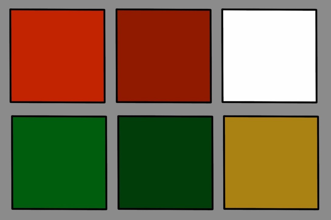
* The classic Christmas red is highly saturated, mid value to somewhat dark in value, and either pure red or a slightly warm red.
* The classic Christmas green is highly saturated, somewhat dark in value, and typically either pure green or a slightly cool green.
* The colour that most frequently accompanies the Christmas red and green pairing is white, either as snow and/or fluffy white fur. Rich golden tones are also often used as accents in Christmas scenes – on bells, gold trim and jewelry, gift wrapping, etc.
 It’s beginning to look a lot like Christmas is hogging these colours.
It is very challenging to paint a non-Christmas figure using a classic Christmas red in combination with a classic Christmas green, and almost impossible to avoid a festive spirit if your figure or scene also includes snow on the base or a lot of white elsewhere on the figure. But be of good cheer, because there are still a lot of other ways we can access the complementary colour power of red and green!
I also have an article with tips for painting red and painting green.
I digitally sampled the colours from the photos of several of the miniatures included below. I was surprised by some of the results. I know that I painted these figures with highly saturated red paints, but the sampled colours look muted or shifted a little from the true red paint colours I used, and sometimes also different from how they appear to my eye in the photograph. Some of the differences may be due to how various camera software processed the colours. I suspect some of it is due to the effect of painting with layers and glazes. The light and shadow colours that are layered over the main foundation colour create variations of that colour. I often glaze thin coats of alternate colours (purples, for example) into the shadows of reds, which subtly alters the appearance of the shadow colours. Some of the differences are also likely due to the fact that digital colour sampling is a simplification of the complexity of colours, though I think it can still be a useful tool to use to identify and interpret colours.
![]()
Family Ties
Colour families are quite broad. The overall colour green and the overall colour red encompass a lot of variations on each of those colours. English speakers tend to think of pink as a different colour than red, but they’re both members of the same colour family. In classic colour theory, magenta is also part of the red colour family. So there are a lot of other reds you can use with a lot of other greens and still get all the benefits of using complementary colours, without adding making anyone think of candy canes and plum pudding.
 Members of the red colour family.
 Members of the green colour family.
I used celery green with a soft magenta pink to paint Nemesra. I chose to paint the jewelry silver, but this red-green pairing diverges so far from Christmas red and green that it would not have been a problem if I’d wanted to paint it gold.
 Painted February 2017.

Both versions of the colour scheme on Tristan the Loremistress use a similar colour scheme approach – Burgundy red on the bodice, a light value and not at all festive green on the skirt, and an earthier green on the dragon. The red and greens are so far away from Christmas colours that there was no risk of Christmas spirit by using golden tones for the hair, jewelry, and the dragon’s throat scales.
 Left: painted April 2021. Right: painted May 2017.

You don’t necessarily need to shift both the green and the red. Shifting one can be enough to avoid a Christmas feel.
The shield on this figure is classic pine green, but none of the other colours fall into classic Christmas colour tropes. The green of her equipment is more of a summery green. The red is more of a red-orange with even more orange in the highlighting and texture.
 Painted July 2011.
 Okay this figure might be more orange and green than red and green, but it would work as well with rusty reds.
![]()
Tone it Down
The green and red colours on the above examples are fairly saturated. Another way to use red and green together more easily is to use less saturated versions of one or both colours.
The red on this figure is the kind of full saturation red used for Santa’s suit. The greens are desaturated, even sickly, and do not bring Christmas to mind at all.
 Painted August 2020. My character in the Reaper Errant RPG.
 This is one of the figures where I did use a saturated red as the midtone, but the colours sampled from the photograph appear less saturated.
Most of these goblins are painted with a complementary red – green colour scheme, with the other colours used being browns and blacks. The greens are khaki or a little greyed out. The reds are likewise dulled down, pastel, or closer to red-orange.
 Painted in 2013.
The red on the loincloth of this orc could easily be used on a Christmas figure, but the green of the skin is very desaturated, and the combination does not bring Christmas to mind, even though there’s white included via the skull and despite the fact that his boots have fur trim. (The composition placement of the colours on this figure is less than ideal, but the colours themselves are a non-holiday type of red – green.)
 Painted in 2013.
 This is another example where I used true red in the midtone, but the digital colour samples appear less saturated.
The figure below uses both a saturated red-green pair, and also a somewhat desaturated magenta and khaki green pair. This is one of the first figures I painted where I was trying to add a bit of an ‘artistic’ statement. I don’t think I succeeded in that, but I did use red and green together without making anyone think of Christmas.
 Painted June 2005.
 The top row of colours are sampled from the roses. I painted these with true red paints, with orange and yellow for highlights. The digital samples appear less saturated than the paint colours I used. The second row of colours is sampled from the rose stems and marble floor. The third and fourth row are sampled from the colours used on the dress and cloak.
![]()
Context Helps
The context of the figure includes the nature of the pose, and the way that clothing and other items are sculpted. The scene you put the figure(s) in, whether a simple base or an elaborate diorama, also creates context. I think one of the reasons we can end up with unintentionally festive figures is putting too much faith into the impact of context differences. The further that the context of your figure /scene is from anything Christmasy, the easier it will be to use true red and green. However, the association between Christmas red and green is so strong that context alone isn’t always enough to be able to safely use the colours. It would be a challenge to paint saturated red clothing or armour on a figure with a luxurious white (or even grey) beard and not bring Santa to mind, even if that figure is a weapon-wielding dwarf or barbarian.
This little dragon is painted classic Christmas red, and the only other non-neutral colour on the figure is green. The combination works for a few reasons. The horns and plates are ivory-tan, not white-grey. The green on the eyes is more of a Spring green. The green on the dragonfly is similar to Christmas greens, but it’s got enough blue in it to shift it a little away from classic Christmas greens. It also helps that there is nothing Christmasy in the context of this figure. Christmas is in Winter, and we don’t see dragonflies in Winter. And the figure is a little dragon, a creature not traditionally associated with Christmas. (Admittedly my Christmas tree decorations feature a lot of dragons, but I’m a dragon-loving nerd!)
 Painted August 2017.
 I painted Rocky with saturated reds that I highlighted with salmon and shaded with purples. The digital colour samples look less saturated than the paints I used.
Context can work the other way, of course. I think it would be possible to paint the figure on the left to look like a non-holiday figure with little or no conversion. (It wouldn’t hurt to smooth the points on the leaves and maybe shave off the berries or paint the cluster to appear more like a flower.) It would be challenging to repurpose the figure on the right to look like anything other than a Christmas elf without more extensive conversion. The fur trim and the shape of the hat are too tied to Santa’s suit to shift perceptions with colour alone.
 Left: painted November 2017. Right: painted December 2016.
![]()
Make it a Party
Another way to diffuse the spirit of Christmas out of the red – green colour combo is to add additional colours. Two of the main colours in the colour scheme of this diorama are pine green and red. The red has a touch more orange than the usual Christmas red, but the real reason the scene doesn’t make you think of the holidays is that the two other main colours are yellow-orange and brown.
 Painted September 2010.
This little scene features bright Christmas red and green. There’s also a lot of white, and a somewhat Santa style hat! But there still is no Christmas in sight. This scene is painted with a tetradic colour scheme that uses two sets of colour complements: red – green, and blue – orange. (The cat and the belts are both orange leaning browns.) Context also helps here, of course. The subject of a Smurf, and the the red and green are both are used on vegetation that grows in seasons other than Winter. (This scene is also a great example of why it improves our work when we paint with more contrast and use lining.)
 Painted November 2003. The ‘plinth’ is the lid from a cat treat container.
![]()
Put it All Together
The more of these tricks that you use, the easier it is to avoid the pine-scented air of Christmas. Here are a few more examples of different red – green colour scheme figures.
This one uses all of the tricks. Neither the reds nor the greens used are very similar to the traditional holiday versions. The red on the skin is quite desaturated, and the red on the wings is both very dark and desaturated. The green is a noxious, neon green. The bone isn’t very white. The purple of her equipment is an additional colour that is not at all Christmasy. The context of the sculpt and the scene it has been placed in has nothing to do with Christmas.
 Painted October 2011.
There’s nothing especially Christmas in the context of this figure, but I think it’d be possible to accidentally stray into Christmas territory if the hat and skirt were painted more of a true red and if the skin was a more saturated green, and especially if it had a snow rather than a grass base. Using a desaturated green on the skin, and magenta for the cloth avoids any hint of Christmas.
 Painted August 2020.
This one is interesting because I think my colour choices skirt very close to traditional Christmas red and green, but just managed to avoid it. Both of the colours have a lot of blue in the shadows. The highlights of the red are a bit more pastel rather than reddish orange. The context of the scene has nothing to do with the holidays, and there are no contextual elements like a peaked hat, wide belt, or flowing beard that might make Santa pop into someone’s mind.
 Painted March 2010.
 The digital samples of the red appear to be shifted a little more to the pink side of red than the colours I recall using. I did use a pale caucasian skin colour like the lightest sample for the highlights. I like using salmon to highlight red, but pinky-orange skin tones are another great option.
This last figure features a red and green colour scheme, with white and gold as the accent colours. The red is a dusty pink, and the green is a khaki, both very different from their Christmas versions. The white is more of a cream, much warmer than the usual holiday fur trim white. The context of a desert landscape complete with cactus is a far cry from the wintry North Pole, and there is nothing in the elements of the sculpt itself that brings to mind elves or jolly Santa.
 Painted March 2010.

![]()
Some Quick Mixing Tips
If you don’t have a lot of paints, it is likely that the paints you do have are more saturated versions of red and green. Try these tips to mix versions of those colours that aren’t as festive. (I do recommend getting a magenta paint. There are colours you can mix from magenta that you can’t mix from red.) After you finish a painting session, try some of these mixing tips with any paint you have left over on your palette. Experimenting with colours like this is a great way to get more comfortable mixing and using colour!
* Add white
* Add grey
* Add black
* Add brown
* Add dark blue (or medium blue mixed with some black)
* Add yellow (mix in a touch of white if you don’t want to shift something too yellowish)
* Mix a little black into yellow to make a not at all Christmassy green
* Mix a bit of your red into your green, and/or a bit of your green into your red
![]()
Figures Featured in this Article
Mrs. Claus
is from Hasslefree, their web store is temporarily closed
Naughty Waggamaeph
is out of production, it may occasionally become available on Noble Knight.
Nemesra is available in Bones plastic or metal.
Tristan, Loremistress
was a special edition in metal, and part of Bones 5, and should release to retail in the future.
Female Warrior with Shield is available in metal.
Churrusina, Hellborn Sorcerer is available in metal.
Pathfinder Goblin Warriors are available in Bones plastic or metal.
Orc Spearman is available in Bones plastic or metal.
Lady of Darkness is out of production.
Annoyed Rocky is available in Bones plastic.
Winter Elf is available seasonally during some 12 Days of Reaper.
Christmas Elf is available seasonally during some 12 Days of Reaper.
Franc Jeaunoir is available in metal.
Vendel Noblewoman is out of production.
Druss Darkblighter is available in metal.
Goblin from out of production Warhammer Quest boxed set.
The hissing cat is available in Bones USA or metal.
Harpy Supervillain is available in metal.
Goblin with Bow is available in Bones plastic.
Dionne is from Hasslefree, their web store is temporarily closed.
This version of Perdita Ortega is out of production.
