The Patreon supporter PDF version of this article includes high res photographs and better formatting. Other ways to help me keep making content like this freely available are one-time Ko-fi tips or shopping on Amazon through the affiliate links in this article.
Artists often use the term harmony when assessing a set of colours used in a piece. A harmonious colour scheme is one where the colours ‘go’ together. Colour harmony is strongly impacted by the initial choice of main colours, but it can be influenced in other ways, as well. The methods we use to mix and apply colours can help our selected colours work together more harmoniously, even if the initial colour choices don’t entirely get along.

![]()
Initial Colour Choices
The idea of colour harmony and sets of colours that complement one may bring to mind fashion, home decor, or soothing landscapes. Is colour harmony relevant if you want to paint grotesque monsters and the mighty heroes who fight them in unpleasant environments like swamps or sewers? Whatever the subject you paint, you want your colours to work with you and for you. Colours that don’t quite mesh can distract from the main action, mood, or character of your piece. It is possible for artists to use discordant colours with intention and effect, but slapping random lurid colours on a miniature does not guarantee that your piece will look gross, scary, horrifying, etc. Using colours which are excessively neutral and undifferentiated in the name of gritty realism can result in a piece which confuses the viewer, or outright bores them to look at.
Colour theory does not factor in whether a particular colour is ugly or appealing. It does not care about the mood, emotion, or cultural significance we may attach to certain colours. Care Bear pink and fresh blood red are both just kinds of red to colour theory. If you want to drop that pink Care Bear in a pool of toxic goo to symbolize the decay of society in your post-apocalyptic diorama, the role of colour theory is to help you decide whether neon green, mustard yellow, or rusty orange would work better for the colour of the goo.
It is always advantageous to spend some time thinking about what colours you want to use on the figure before you start painting, regardless of whether it’s a speed paint or a display figure you plan to lavish hours on. Taking a few minutes to make a colour plan can give you the jump on the other painters in a speed painting contest, or just help you avoid the frustration of getting halfway through a miniature and realizing you don’t know what colours to use on the last few areas.
 These Robb Stark figures were speed painted in 90 minutes by a group of pro painters at a convention. Most used clever colour choices and value placements to create visually striking and well differentiated pieces. And some were me, who did not do those things and ended up with a pretty boring figure. (Second from the right.)
If you are going to spend days/weeks painting a contest entry, gift, or army with a unified colour colour scheme, it is well worth taking some time to work out what colours you will use. It’s also worth the effort of testing how those colours work with one another in practice. The most effective method of testing is to do a quick paint on a test figure that has a few key elements in common with your final piece. This allows you to test how your main colours look in proximity to one another on a 3D surface, and also gives you an opportunity to test additional colours you could use for shading and highlighting. Digital tests are another useful way to assess what colours look like when used together. Even simple tests on paper can help you evaluate colour harmony, compare various shadow and highlight options, or test the effect of glazes.
 Examples of a few colour tests I’ve done over the years.
![]()
Colour Schemes Based on Colour Theory
If your starting point is a single colour, you’ve got a lot of options. Let’s make the exercise more challenging and imagine that you’ve painted two areas on your miniature or your friend/client/inspiration has dictated two colours, and you’re trying to find another colour or two that could work well with them.
The colour schemes suggested by colour theory are guidelines for groups of colours that look harmonious when used together. There isn’t room in this article for a deep delve into colour theory and recommended colour schemes, but that’s okay, because you don’t need to know all of that to start out, you just need a colour wheel. A colour wheel is a useful and inexpensive tool. Colour wheels are available for both the traditional red-yellow-blue and the CYM cyan-yellow-magenta colour theory systems. (If you spend a little more, you can get the same CYM colour wheel with a colour mixing workbook for mixing practice.) You may be able to find colour wheels for sale at your local arts or crafts store. I recommend the ones made by The Color Wheel Company for including the most option and printed colour fidelity.
There are online colour scheme tools/wheels, and these can offer a more comprehensive look at colour options. I still recommend owning a physical colour wheel. It is a compact quick reference to colour mixing tips as well as colour selection tips. It also depicts tangible colour, just like your paint. Printed/painted colours and digital colours are produced by different means, and it can be hard for our eyes to accurately compare one to the other, especially if we’re still learning colour theory and colour use.
Your colour wheel should have a side with diagrams that identify some or all of major colour schemes. The major colour schemes include:
* Monochromatic: different values of only one colour; we most often think of black and white, but can be any colour
* Complementary: two colours that are located opposite one another on the colour wheel
* Split Complementary: one colour plus the two colours located to either side of its complementary colour
* Triad: three colours that are located an equal distance apart from one another on the colour wheel
* Square Tetrad: four colours located an equal distance apart from one another on the colour wheel
* Rectangle Tetrad: two pairs of complementary colours, but no two are directly adjacent to one another on the colour wheel (also called double complementary)
The true neutral colours are black, white, and grey. True neutrals go with every colour, but they’re bland. Often it’s better to use colours that are close to neutral, but which have a slight colour cast fits into your colour scheme, like a cream (yellow), blue-grey, or greenish black. The colour of the clothing on the following figure is black, white, and grey. On the left, the figure has been primed with true neutral black, white, and grey. In the painted version on the right, the viewer understands the colour of the clothing, but the hints of blues and browns make the colours more interesting to look at.
 Barglemore is available in metal and was sculpted by Bob Ridolfi.
You do not need to visibly include every colour in a colour scheme. You can use one only in the shadows, or only in the highlights. You can use more than one value or saturation of a colour in the colour scheme, as well. If your colour scheme includes orange, you can highlight the dark skin tone with an orange based flesh colour, and also use a rusty orange for the leather.
Metals have (or can have) a colour cast. They can also be shaded with a wide array of colours. We think of silver and steel as true neutral grey, but they reflect colours from the environment and can be painted with hints of blue or brown. This applies to both non-metallic and true metallic painted metals.
Let’s say I’m painting my friend’s character who they have described as blond (yellow family), and who always wear faded jeans (blue family), and take a look at the colour wheel suggestions:
* Complementary: doesn’t fit
* Split Complementary: doesn’t fit
* Triad: blue, yellow, red – it fits!
If I look at the triad option though, bingo! If I add red, I’d have a triadic colour scheme. I could use reddish browns for the leather shoes and belt, and/or pick a skin colour that has some red in it. For the shirt I could use a true neutral white or black, or a yellowy tan, or bluish grey.
Is there another option though?
* Square Tetrad: doesn’t fit
* Rectangle Tetrad: blue + orange, yellow + purple – it fits!
If I add orange and purple, a rectangle tetrad works too! I can use a more orange based skin tone, and/or orangey browns for the leather accessories. For the shirt colours, yellowy-tan or bluish grey still work. I don’t have to use every colour on a specific part of the miniature. I could use purple colours to shade the hair and the leather to include the purple in my colour scheme.
![]()
Using and Identifying Subdued Colours in Colour Schemes
One of the frustrations of a colour wheel can be that it doesn’t have enough colours on it. What if you want to paint gritty and worn looking characters, not ones wearing blue, orange, or the other bright colours on the outer rim of the colour wheel? Think of each pie piece on the colour wheel as encompassing an entire family of that colour. Orange can be bright like the fruit, but a lot of human skin tones are variations of orange, as are a lot of other kinds of brown. A lot of grey colours have touches of blue or violet.
The inner rings on one side of your colour wheel include a few examples of more subdued variations of each colour, but what if you don’t like any of those. Identifying subdued colours that fit into your chosen colour scheme is a place where digital tools can come in handy. Pick a bright colour that matches your colour wheel suggestion in a colour picker tool. Then you can move your pointer around the square (or circle) to see darker, lighter, and less saturated examples of that colour. You can use a tool like Paletton to manipulate an entire colour scheme in a similar way.
Maybe you have the opposite problem – you’ve got a colour that is part of your scheme, you just aren’t sure where it fits on the colour wheel. Say your friend picked out one of your brown paints to use on their character’s leather armour. What if you aren’t sure whether the brown is part of the red, orange, or yellow colour families? If you don’t know the colour family of your main colour, how can you figure out where it fits in a colour scheme?
Determining the colour family of a paint is more easily done with physical comparisons rather than digital tools. Apply your paint to the edge of a piece of paper. Add a little water to one side of your sample and thin it out. Alternatively (or additionally), you can mix in some white paint and paint a sample of the mix next to your first sample. Hold your sample up next to the colours on your colour wheel. Does the paint (or the lighter version of) look kind of close to any of them? Remember to check against the inner rings for each colour, as well. The less saturated colours on the inner rings of your colour wheel are more similar to various browns, flesh tones, tans, greys, etc.
 Compare your colours to the inner rings as well as the highly saturated outer ring colours.
If you find comparing with the colour wheel is challenging because there are too many potential matches, there’s another technique that works more by process of elimination. You’ll need samples of the primary and secondary colours to use for comparison. I snagged some paint chip samples from the hardware store, but you can paint your own, or use coloured paper. Surround the colour you want to identify with the three primaries – red, yellow, and blue. Which does it seem closest to? Then compare it with the three secondaries – orange, green, and purple. Which seems closest? The last step is to compare your colour with your two finalists. Even if you can’t narrow it all the way down, knowing whether it is a yellow/orange brown or a red/purple brown is probably enough information to start choosing additional colours.

The Colours of Neutral article includes more information on how to interpret colour schemes with less vibrant colours, and how to identify the colour family of browns, tans, and greys. The Lars Ragnarson article is an example of how to take a colour wheel colour scheme and paint it in more subdued colours. Lars is a seasoned warrior character that I painted using a magenta (red-violet), red-orange, yellow-green, and blue-green colour scheme.
 Base colour wheel by Karen Arnold, annotations by Rhonda Bender. Lars Ragnarson by Bob Ridolfi.
![]()
Don’t Sweat Colour Theory Too Much
What if you aren’t sure whether one of your browns is more yellow or orange? What if you don’t have a colour wheel? I’ve been referencing the the red-yellow-blue colour theory system, but what if you prefer the cyan-yellow-magenta one? How can you ever be sure you’ve chosen colours that go together?
First off, don’t get too stressed out about your initial colour choices! The set of main colours you choose to start with is just one tool that you can use to make the colours on your figures more harmonious. The rest of this article will outline several others.
There is a reason it’s called colour theory. It is not a law of physics, like gravity. It’s not an absolute. Colour theory is a system for organizing colours. A colour wheel is a tool, not a rulebook you have to follow. It offers suggestions for sets of colours that are likely to look good together, but you’ll see plenty of fantastic looking art and graphic design that doesn’t strictly adhere to the colour scheme guidelines that colour theory suggests.
What about the cyan-yellow-magenta colour theory system? In terms of being a guide to colour mixing, I think the CYM colour system can be tricky for painters to use because there isn’t really a true cyan paint pigment. You can read more about the issue and options in the Cyan section of my compact paint palette article.
In terms of colour scheme suggestions, the CYM colour theory system suggests the same colour schemes – complementary, triadic, tetradic, etc. However, the colour sets that the CYM colour wheel suggests for most of those colour schemes may differ. This is because it uses a different set of major colours, and arranges them on the colour wheel somewhat differently. For example, the traditional theory colour complement of red is green, but the CYM complement for red is cyan.
A note on blue in the CYM system. The colour labeled Blue (C100 M100 Y0) on my CYM wheel looks a lot like purple to me. I would also have expected some kind of purple if I mixed cyan and magenta 50:50, as indicated by the printers ink proportions. I did a little online research, and was relieved to learn that there is nothing wrong with my eyes, my colour wheel, or my paint mixing knowledge. Printed CYM Blue is close to purple. The tertiary colour Blue Cyan (C100 M50 Y0) looks closer to the traditional wheel’s blue-violet than it does to blue.
The fact that one colour system says green complements red and the other says cyan does is an example of the reason I prefer to think of colour theory as an organizing system rather than an absolute. And these aren’t even the only two colour theory systems! So just pick one to use per miniature, and think of it as an assistant, not a straitjacket. Do not feel as if you need to try to find a selection of colours that every colour theory system approves as a recommended colour scheme!
![]()
Colouring Outside of the Colour Scheme Lines
In the real world, most of us don’t always pick our colours in advance. Sometimes we just dive into painting to practice a new technique or because we’re itching to paint a particular colour. If we want to paint the rest of the miniature, we have to figure out the rest of the colours.
Sometimes we aren’t even the one making the initial colour choices. If you’re painting a friend’s game character, or something for a client, or something to match a book/movie, someone else is making at least some of the colour decisions, and you need to find ways to make sure those colours work together as well as possible.
So how do we turn one or two colours into a cohesively painted figure? How can we take colours that aren’t cohesive and encourage them to work together? Let’s look at some tools to do just that.
![]()
Universal Shadow and Highlight Colours
Whether the colours on your figure look harmonious is not solely a function of the colour of the midtone paints you used. In the process of painting a miniature, we paint on washes or layers to make shadows, and we use drybrushing or layering or texturing to paint areas receiving more light. That process adds and intermingles other colours with our initial midtone selections. You can use the colour choices you make for your shading and highlight colours to encourage your main colours to get along with one another better.
An easy way to do that is to include the same dark colour in all of your shadow mixes. And/or to use the same pale colour in all of your highlight mixes. The shadow and/or highlight colour weaves through all of the colours on your figure, unifying them together. Since pure white and black are true neutral colours, using those to mix all your shadows and lights doesn’t have the same kind of strong unifying effect.
The figure below is an example. Lilith was the first figure I painted using universal shadow and highlight colours. I chose a purplish shadow colour for the shadows, and a yellowish white for the highlights. You can see hints of the purplish shadow colour in the hollows of her cheeks, and the darkest parts of her hair. The hints of yellow may be a little less obvious. We’re used to see things in the warm light of the sun, so it’s actually a pretty natural highlight colour. (I’ll share the exact colours I used at the end of this article.)
 Painted in 2007.
Jeremie Bonament Teboul outlined the universal shadow/light colour approach in a class that I took, and I painted this figure to try out the idea. I was pretty literal with the approach when painting Lilith. I picked a selection of midtones and then mixed all the shadow layers for them with my purplish shadow colour. I added yellowish white to the midtones to mix the highlight layers.
You are not required to have noticeably weird coloured shadow areas in order to make this trick work! To minimize the risk of visibly odd colours, try this variation to the approach – start with colours that are similar to the midtone for the first level or two of shadows or highlights, and then mix your universal shadow/light colours with that. For your first shadow layer, choose a colour that is similar to but a little darker in value than the midtone. Then mix your universal shadow into that colour to create the darker shadows that you’ll paint in the more recessed areas. Enough of the universal shadow colour will be present on the figure to unify your shadows, but not so much that the colour is very obvious to the viewer.
I actually used this approach with Lilith for the highlights on two colour areas. The first highlight layer for the dress was a lighter blue colour. I mixed that with my universal highlight colour to create the rest of the highlight layer mixes. The first highlight layer for the hair was a yellowish-tan. I mixed that with my yellowish-white to create the rest of the highlight colours for the hair. If I had painted the first shadow layer for the skin with a darker skin tone paint and then mixed in my purple, the shadows on her skin would look more natural.
 Lilith of Ptolus is no longer in production.
I don’t use the approach quite as literally now, but if you look through the colour recipes I’ve shared in previous articles, you’ll notice that I often use the same dark colour in the shadows of numerous colours on a given figure, but not all. Likewise there are usually one or two lighter colours that I’ve used in the lights on multiple colours.
I recommend you try painting a few figures using a universal shadow and highlight colour. I’d even suggest that you take a risk and experiment with painting it literally as I did on Lilith. My only regret with Lilith is that I didn’t experiment more with the approach after painting her. I went back to shading with darker values of my midtones and highlighting with lighter values of my midtone. Years later I found myself trying to think of ways to inject a little more visual interest into my colours and I circled back around to this approach. I’m pretty sure I could have shaved some years off of my learning curve if I’d kept experimenting with the idea back in 2007.
If you use washes to create shadow areas on your figures, this approach can still work, but you may find it tricker with some colours. A wash covers the entire surface of your initial paint layer, so tints the midtone and the highlight areas as well as the shadow recesses. Even if you start drybrushing with the initial midtone colour, you may not be able to cover over all of that tint in the midtone and light areas. Depending on the wash colour, it may shift the overall colour too far away from your intended midtone.
Part of the reason using weird colours in shadows works as well as it does is because those weird colours are confined to the shadows. For the most part, viewers determine the overall colour of an object by assessing its midtone colour. Viewers often do not consciously detect unusual colours applied to shadow areas.
Nonetheless, I still recommend experimenting with using richer colours in your wash mixes, you just may want to do some tests before trying it on figures that are important to you. You can see some experiments I did painting saturated wash colours on skeleton bone and grassy ground. A lot of those experiments ended up looking way better than I expected when I picked out the colours.

![]()
Other Universal Colours
The idea of having one or two universal colours that weave throughout your figure doesn’t need to be confined to only shadows and/or highlights.
The figure below incorporates 9025 Burgundy Wine into every area of the figure. There is a lot of Burgundy Wine is the shadows. If you look closely, you can spot it in the shadows of the green dress and the crevices of the rocks. Burgundy Wine itself is the midtone colour of the boots and pouch, and I used a darker colour to paint shadows onto those areas. I also used a darker colour to paint the lining, and in some of the hair shadows. Colour was added to the illustrations in the spell book with lightened versions of Burgundy Wine.
 The Female Mage is available from Dark Sword Miniatures. She was sculpted by Dennis Mize.
I experimented with different approach to using universal colours on Naus the Waghalter. I underpainted him using strong colours, with the intention of painting over that foundation with semi-transparent colours that would subdue the initial colours. The experiment didn’t go exactly as planned, but I ended up with a major (magenta) and a minor (grass green) universal colour that I incorporated throughout the figure using a variety of the techniques discussed in this article. You can see hints of the magenta and green as you look at the figure, but none of the individual areas on it appear as they are painted either magenta or green. You can read more about the painting process for Naus.
 The initial underpainting and final result for Naus the Waghalter, who was sculpted by Bobby Jackson.
![]()
Reduce and Reuse Your Colours
Another way to help your colours get along is to incorporate a colour you’ve used on one area of the figure into the colour you use on another area. Instead of reaching for a new dark colour to create shadow layers or washes, use a dark colour you’ve already used elsewhere on the figure. Instead of mixing highlights only with white, mix the first level or two with a light value colour you used to paint something else on the figure, and then add white as necessary for the lightest highlights.
I used similar midtone and highlight colours for the non-metallic gold on both of the figures below. For the figure on the left, I used the dark red colour from her skin shadows in the shadows of the gold NMM and the shadows on the horns. The shadows of the gold NMM on the right figure were mixed with the dark reddish-browns used on the wings and in the shadows of her hair.
 The Hellborn Dancer is currently available via the Bones 6 pledge manager. She was sculpted by Bobby Jackson. Masquerade Ball Sophie is currently available in metal, and available in Bones via the Bones 6 pledge manager. She was sculpted by Bob Ridolfi.
This colour approach is very quick paint friendly! Don’t waste time finding and dispensing several new colours to fit a set colour ‘recipe’ for a particular material. Instead, grab a midtone colour that fits the material you want to paint. Then look for a dark value colour already on your palette, and use that to mix the shadows/wash. Look for a light value colour already on your palette, and use that to mix highlight/drybrush layers. This approach works especially well for smaller areas like straps and pouches, especially if you use a wet palette. If you aren’t sure whether two colours would look good when mixed together, try it out on a corner of your palette and see what you think.
Base textures like stone, earth, and wood are a great place to start practicing this approach. Use your standard stone grey or dirt brown paint for the midtone. Use a dark colour you used on the figure to paint the shadows or mix a wash. Then use lighter value colours you’ve already used to highlight/drybrush the texture. I find that lighter value flesh colours I’ve used on the figure usually work well to highlight both stone and earth. Other good highlight options would be lighter tans or creams that I might have used in painting leather, blond hair, or gold non-metallic metal.
![]()
Introduce Your Colours to Each Other
What if you aren’t sure whether one of the major colours in your colour scheme goes with the others? Or maybe the closest paint you have to the recommended colour for your colour scheme is much more saturated, or a little more yellow, or there’s some other way it doesn’t quite fit?
Colours are like people – they make friends more easily when they have something in common with one another. You can give one colour something in common with a second colour by mixing a little bit of that second colour into it.
In my article about painting Lars Ragnarson, I talked about how I didn’t like the initial colour I chose for the non-metallic metal steel on the axe head. You can see a rough version of my original colour to the right. I ended up picking a completely different colour and repainting the axe head as it appears on the left in the picture below.
 Lars Ragnarson was sculpted by Bob Ridolfi.
Instead of choosing a different paint colour, I could have tried modifying my original paint colour a little. You don’t need to know much about colour theory to use this technique. You just need to be willing to waste a few drops of paint and a few minutes testing. The centre swatch below is the colour I tried on the axe on the right above and didn’t like. The swatches that surround it are the same colour mixed with a colour I used elsewhere on the figure. I think any of these would have worked better. The top left and lower right are pretty similar to the colours I tested out in my digital edit in that article that worked better. (I wish I’d thought of trying this while I was painting Lars! I was tired and in a rush and it just didn’t occur to me at the time.)


![]()
Limit Your Palette and Mix More Colours
People often think the term limited palette describes a piece painted with just one or two colours. Something like a black and white drawing, or the paintings from Picasso’s Blue Period. The limit in a limited palette is more about restricting the number of paints than about the specific colours. The more extreme versions of limited palette may include only two or three paints in addition to white and black, but how limited the colour selection appears depends on what colours those paints are.
The figure on the left was painted using only Oiled Leather, Ultramarine Blue, Pure White, and Pure Black. The end result doesn’t look too unnatural or monochromatic because the palette includes a brown colour that looks natural used for skin, wood, and leather, and grey and white work to depict the wintry setting. Portrait painters often experiment with the limited Zorn palette, which includes only white, black, ochre yellow, and bright red. The limitations of the palette are often not obvious to viewers because the those colours mix a wide range of flesh tones and clothing colours.
The figure on the right was painted using Blue Liner, Burgundy Wine, and Pure White. The colours that can be mixed from those paints are quite limited. I chose them with the aim of creating a moody, moonlit scene, and I think the colours work well for that. The figure was painted for a contest that allowed only three paint colours to be used.
 Amathor was sculpted by Bobby Jackson. I painted him in 2006, Melissa was sculpted by Kevin White, and painted in 2012.
Those are more extreme examples of a limited palette. You don’t have to exclude half the colours or paint your figures in scenes with weird coloured lighting to access the benefits of a limited palette. A palette of one saturated red, blue, and yellow paint, plus white and black, allows you to mix versions of most of the major colours. You won’t be able to mix every variation of green or purple and so on, but you will be able to mix some kind of green, and some kind of purple. Because the purple you mix is made from the same red and blue you’re using on the rest of the figure, it is in harmony with them. If you instead grab a pre-mixed purple paint off your shelf, you might choose one that is mixed from very different red and blue pigments and it will not mesh as well with the colours on your figure.
In the example below, I used a different red, yellow, and blue on the right and on the left. I mixed the secondary colours from the sets, and also the neutrals beneath the colour wheels. Notice how different the two purples, oranges, and greens are from each other. These examples are painted with watercolour paint, so they look a little different than the acrylic paint examples I usually include.

In the picture below, I swapped each of the orange colours from one side to the other. The orange on the right side looks far too vivid compared to the other colours. The orange on the left side isn’t quite as out of place, but it looks kind of washed out. You can see that if I swapped the greens it would be even more dramatic. This is the kind of thing that can happen when we grab a paint off our shelf and add it to the rest of the colours we’re using. It might be mixed from different pigments than the rest of the colours, and not quite mesh with them. (But discussed in the previous section, I could make it mesh a little better by mixing in a little of another colour, like the blue or the purple.)

The ‘secret trick’ of a limited palette is mixing colours. It’s more about paints than it is about colours. The more you mix, the more harmonious your colour selection will be, but you do not need to mix every colour you use to benefit from a limited palette. There’s a less daunting way to integrate the idea into your regular painting approach. Once you have painted the main areas of your figure, think of the paints you used to do that as your limited palette. Mix the rest of the colours you need to finish painting the miniature from those paints. Need a darker blue here, or a purple there? Try mixing it with some of the paints you’ve already used. Depending on the colours you’ve used and the colour you need, you may not be able to mix everything you need, but you can be confident that anything you do mix meshes with the colours already on your figure, because it was made from them.
I particularly enjoy this approach for painting bases and small areas like pouches and straps. Often I paint these with more neutral colours. There are a lot of different browns and greys, and a lot of different colours you can mix together to make them! A good starting point for mixing a neutral colour is to use complementary colours. Colours located across from one another on the colour wheel generally create versions of neutral colours when mixed together. One colour is often more powerful than the other, so you might need three parts of one to one part of the other to mix a grey or brown. You might also need to add a little bit of a darker or lighter colour to adjust the value of the neutral to what you need. Another approach is to take a brown you’ve already used (or orange, or skin tone) and transform it into a different one by mixing in one or another of your other colours.
I know that it can feel intimidating to mix your own colours! Like any other skill, you’ll find it easier and less time consuming to mix colours the more you practice doing it. The nice thing about practicing this skill is that you do it on your mixing surface, so failed experiments never touch the miniature. It helps a lot if your expectation when trying to mix is to mix a brown or a grey rather than this exact brown or that specific grey. Mixing to match specific colours is a good practice exercise, but it’s not the key to creating colour harmony (or realism). Once you’ve had some practice, working this way may even save you time. It’s often quicker to grab a bit of this and a dab of that and mix them together to paint small items like pouches than it is to stop painting, decide what colour works for what you need, get it out and dispense it, etc.
In addition to James Gurney’s article on limited palettes, I also recommend watching his video about gamut masking, a slightly different way of limiting a palette. The video compares a full spectrum painting he did against two with much more limited colour schemes. All of them convey the same information and are equally realistic, even though one has no blue and the other has no yellow. You can reference the paintings in the accompanying article.
The pictures below are from another James Gurney video. The top image is a photograph of the scene he paints in the video, and the bottom is the finished painting. Gurney very often paints with a limited palette. For this painting he used four colours in addition to white. If you compare the two, none of the colours in the painting ‘match’ the reference. The sky isn’t the same colour of blue, the reds are different, the whites/greys are different, etc. But the painting has blues, and reds, and whites/greys that convey all the same information and colour relationships. The painting realistically represents the objects and the scene as a whole. If you did not have the reference image to compare to, you would be likely to consider the colours in the painting quite accurate. Matching colours is not the secret code to painting realistically!
 Photo and painting by James Gurney.
If you really want to learn about colour I’d suggest not only that follow James Gurney’s blog and YouTube channel, but that you stop reading this and go grab a copy of his book Color and Light instead.
![]()
Use Glazes to Mingle and Unify
Most of these suggestions involve some variation of colour mixing. Those of you who dislike mixing may be relieved to hear that physically mixing colours together is not the only way to get them to mingle and make friends. You can also use techniques like glazes and washes to unify colours you’ve already painted on the miniature. Because glazes are applied on top of what you’fe previously painted, they’re kind of the painter’s version of adding or tweaking something in post production.
Glazes and washes are made by mixing water and/or medium into a paint until it is transparent. When the transparent paint is applied over another colour, it changes the appearance of that colour. The new colour appears like a visual mix of the original colour and the glaze/wash colour. It’s kind of like what happens when you wear sunglasses or look through tinted glass – the colour of the glass alters the appearance of the objects you view through it. The exact effect of the glaze/wash and its intensity is determined by a few different factors.
Glazes and washes are mixed in the same way, but they’re applied differently. The method of application is one factor that influences the affect. Painters apply a wash using a brush loaded with a fair amount of the paint mix. Gravity causes the excess wash paint to pool in crevices, depressions, and sculpted textures. The wash tints the entire surface, but the wash colour appears more concentrated in the areas where paint pooled. Painters often apply a dark wash to add shadows in recesses and accept sculpted textures, but washes can also be used to shift colours and add colour complexity. You can see an example of Fernando Ruiz using washes to add both shadows and colour interest to a metallic helmet in this video.
To apply the paint as a glaze, the painter first wicks all the excess paint off of their brush against a paper towel. Then they apply a thin and controlled layer of paint over the surface. This thin glaze evenly tints all of the underlying colour. You can see an example of three different glaze colours applied over some other colours below as an example.

One use for glazes is to shift colour. For example, you intended to paint reddish brown leather on your figure, but the leather ended up looking more orange brown. You can apply glazes of red over the leather areas to shift the colour to appear more red. If I’ve spent a lot of effort painting something and the colour isn’t quite right, I always start by trying to fix it with a glaze before I even think about repainting everything. It’s a pretty quick and easy fix to try.
I’d intended to paint the miniature below with auburn hair, but it ended up closer to blond. I applied glazes of a mahogany red colour to shift the appearance of the colour. It’s not quite auburn now, but it at least has some nice reddish tones to it.
 Dungeoneer Sophie was sculpted by Bobby Jackson.
Glazes do not have to be applied over an entire area! Where you apply the glaze is another way to influence the effect. You can apply a glaze just in the shadow areas, or just in the highlight areas. Part of the challenge of finding examples of the effect of glazing with unusual colours is that if the glazes are only applied in shadow areas, the colour is not that noticeable. Below is a closeup of the Female Mage. Look in the deep shadows of the green, the skin on the cheek and the side of the neck, and the hair. The dark pink colour on the pouch was glazed into all of these areas. A slightly less transparent glaze of the same colour was applied on her eyelids to create the appearance of eyeshadow.

The difference between the image on the right and the one on the left is the application of a lot of glazes. I used glazes of different colours and values to add richness and depth to the textured armour.
 You can read more about how I painted this armour and see swatches of the glaze colours I used.
Glazes can also be applied with an airbrush, even just in selective areas. When I took Aaron Lovejoy’s online airbrushing class, he demonstrated how he uses a selection of acrylic inks to add additional colour interest and shading in certain areas. (Aaron’s running the course right now. Sessions 103 and 104 include information on airbrush glazing.)
Other factors that affect the intensity of a glaze/wash effect are how transparent the paint is, and how many coats you apply. It is usually a good rule of thumb to start with a pretty transparent mix. It’s easy to add a little extra paint colour to the mix or paint additional coats, but here is no way to remove a glaze/wash once it’s dried.
You may find using glazes easier or less intimidating than mixing odd colours directly into your shadows/washes and highlights, especially when you first begin experimenting with colour. You can paint the figure in your usual way, and then use glazes to apply a universal shadow colour or add a bit of colour used on one area of the figure into another. In Aaron’s airbrush glazing process, he often uses an ink colour in several spots on the figure, similar to the idea of universal colours I discussed above.
This figure is an example of the effect of adding a universal colour to a figure with glazes. It is also an example of how these ideas can be implemented by painters of any level, and to tabletop as well as display figures. When I did a critique and touchup on this blacksmith figure, I added glazes of a dark but vibrant purple (9325 Carnival Purple) to all the shadow areas to increase depth and unify the colours. I did the touchups on a video stream, so you can see the exact colour and how I applied the glazes, as well as the other changes I made.

Glazes can also help you integrate colours when you don’t pick out all your colours in advance. As you add new colours to your figure, you can use glazes to introduce notes of those colours to areas you have already applied and help tie everything together.
Keep in mind that both the value and the colour of glazes and washes affect the underlying surface. The entire surface is tinted towards the colour of the glaze. The glaze may also lighten the value of deepest shadows, and/or darken the value of the brightest highlights. It can reduce the contrast range between your shadows and highlights. You may need to reapply some highlights and shadows to maintain the level of contrast you intend for that area. Glazes can also be used to shift the value of areas, like using a dark value glaze to deepen shadow areas.
For Sophie’s hair above, I applied one layer of the glaze mix over the entire surface of the hair to give everything a bit of a red tint. Then I applied several additional coats in the shadow areas. This allowed me to add more of the reddish colour in some areas and darken the shadows, but still preserve most of the lightest highlights and keep her hair looking shampoo commercial shiny.
![]()
Put it All Together
Several of the figures I shared as examples above focus on one of the colour harmony tools. I used one universal shadow and highlight colours on Lilith. The limited palette figures Amathor and Melissa were painted with only 3-4 paints. I recommend doing paint exercises like this periodically. Colour limitations focus our attention on one or two elements of colour so we can understand them better, or push our creativity to learn more about colour mixing or how to represent textures and surfaces through different aspects than just what colour they are.
In day to day painting, I employ several of these tools on any given figure. The Drunken Mermaid figure below is a good example. I did not really plan out the entire colour scheme before I started to paint. The first four areas I painted were the skin, hair, wood pilings and rope, and the tail. By the time I finished painting those, I had a number of paint colours in my palette. I incorporated those colours into other areas as much as possible. I reused colours from the wood pilings and rope to paint the beer foam, mug, wooden sign, and sand. I mixed colours I had used in the shadows of the skin and tail together to create the colours I needed to paint smaller areas like the shell bra and some of the items on the base.
I didn’t really plan it in advance, but by the time I finished those first four areas, I also had a few universal colours in play. There was a highlight colour I used in several areas, and a shadow colour I used in several others. I used one or more of these colours in most of my custom colour mixes. I applied glazes of a magenta and a vivid blue throughout the figure – skin, hair, tail, wood pilings, and rope. The wooden sign started with a tan colour, but then I applied successive washes of blue, magenta, one of the greens from the hair, and more over it to create an aged wood look and tie it in with the other colours.
 The Drunken Mermaid was sculpted by Christine Van Patten. More information about the basing materials is available. My Patreon supporters have access to an exclusive PDF with WIP pictures and more details on the colours that I used to paint the figure.
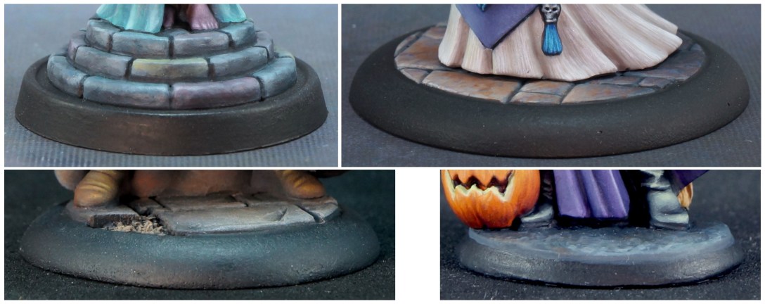
The way I paint bases is a great example of incorporating these tools. All four of these are essentially ‘grey’ stone bases. Sometimes I mix a custom grey. Sometimes I use a neutral grey for the midtone but then apply colours I used elsewhere on the figure for shadows/wash and highlights/drybrush. Sometimes I paint the whole stone area with shades of grey and then glaze and/or stipple on colours used elsewhere on the figure. I used weathering powders on the figure in the lower left, and added some of those to the base, as well. Weathering powders have colour, and you can use that colour to tie the figure together in the same way as you can use colours of paint.

The figure below is a practical example of choosing colours, testing colours, and using colour mixing and paint application methods to unify colours together. The article also includes information on how to adapt these tools if you don’t love colour mixing or are trying to paint more quickly to get figures on the tabletop.

 Cynthia the Wicked and two of the colours I used to paint her are available as Reaper’s Halloween gift with purchase promotion while supplies last. And you also get candy! Cynthia and friends were sculpted by Bob Ridolfi.

![]()
Colours used on Lilith
The majority of colours I painted on Lilith were P3 paints. To mix a very similar universal shadow colour with Reaper paints, use 9693 Coal Black or 29120 Grimm Grey mixed half and half with 9404 Cinnamon Red.

