The Patreon supporter PDF version of this article includes high res photographs and better formatting. Other ways to help me keep making content like this freely available are one-time Ko-fi tips or shopping on Amazon through the affiliate links in this article.
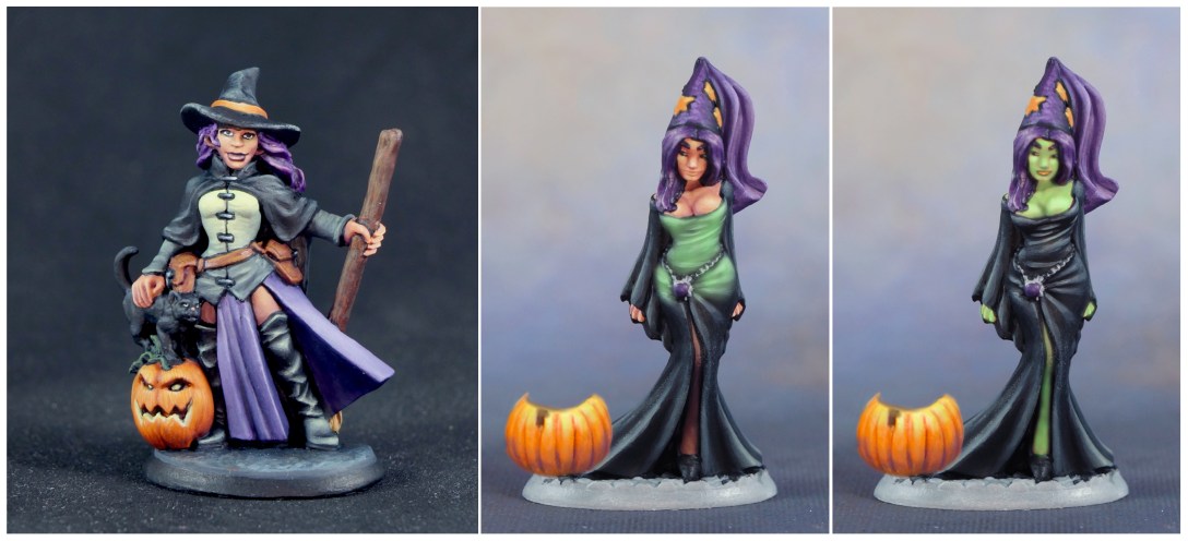
I painted a refined and a quick version of Cynthia the Wicked to demonstrate some of the methods I discussed in my colour harmony article for choosing a colour scheme and using paint application methods to encourage the colours used on a figure to work better together.


Cynthia the Wicked is part of Reaper’s Ghoulie Bag promotion, which also includes two paint colours – 9415 Dungeon Slime, and a special edition colour, Wolfsbane Purple. When the promotion has ended, I will edit this article to add suggestions for possible alternative colours that would work to paint a similar colour scheme. I also used 9670 Pumpkin Orange, a promotional colour from previous years. If you do not have that paint, 9201 Orange Brown should work as a substitute.

![]()
Choosing a Colour Scheme Based on Colour Theory
Sometimes we start a project knowing we need to include certain colours, and part of the challenge is picking one or two additional colours that will work harmoniously with them. Reaper asked me to feature the two Ghoulie Bag paints prominently in the colour scheme. Dungeon Slime is a light value vibrant green colour. Wolfsbane is a rich, dark purple. Reaper requested the cat be painted as a black cat. I kept myself open to ideas, but suspected that I would also want to paint at least some of her clothing black for a traditional Halloween witch feel.

I felt I would need at least one more major colour to paint the figure with enough contrast and visual interest. Orange seemed like the obvious answer – and not just because there’s a pumpkin in the scene! (If anyone is feeling iconoclastic about pumpkin colours, try one of these interesting pumpkin variant colours.) Even if this had not been a Halloween themed figure, I would likely have picked orange. I used fairly intense versions of my three colours to paint Cynthia, but this triad of colours can easily be executed with more desaturated (duller, more neutral) colours for other types of miniatures. Orange doesn’t have to be bright pumpkin orange; an orange-brown like that on the belt pouches is still considered orange for the purposes of implementing a colour scheme. The purple of her clothing could be muted further to more of a purple-grey. The green could be darker in value. You can read more about incorporating neutral colours into colour schemes.

Let’s look at the colour wheel to see why my mind jumped to orange for the third colour, but also why choosing the colours for this figure is an example of why I like to think of colour theory as a set of guidelines, not absolutes.
I flipped my colour wheel to the side with the spinner that displays colour schemes, rotating it to try to find schemes that include both purple and green. If the triad triangle is oriented to touch both green and purple, the third colour it indicates is… orange! A triadic colour scheme is one in which the three colours are equidistant from one another on the colour wheel. Two of the most common triads are pretty easy to remember – one uses all three primary colours (red, yellow, blue), and the other uses all three secondary colours (orange, green, purple.)
 Base colour wheel by Karen Arnold, annotations by Rhonda Bender.
I was looking at a traditional colour wheel that considers yellow, red, and blue to be the primary colours. What if you prefer the colour system that uses cyan, yellow, and magenta (CYM) as the primaries?
I grabbed my CYM colour wheel to take a look. The first thing I noticed is that the colour that looked most similar to Wolfsbane Purple is labeled… Blue (C100 M100 Y). And if I mixed equal parts cyan and magenta together as indicated in the numeric designation, I would indeed expect to mix some kind of purple. I did a little online research and discovered that when it is printed, CYM Blue is close to purple, although it may appear more blue when viewed on screens. The CYM triad suggestion that includes blue (purple) is blue-green-red. Does that mean the colour selection I want to use doesn’t work in CYM? I took a second look at the CYM colour wheel options.
There is another colour scheme recommendation that includes three colours – split complementary. To create a split complementary scheme, you find the colour opposite your main colour on the colour wheel (its complement). You don’t use the complement, rather you use both of the colours to either side of it. The colour opposite blue (purple) on the CYM colour wheel is yellow. The colours to either side of it are yellow-green and orange. So blue (purple), orange, and yellow-green comprise a split complementary colour scheme in the CYM system, and it’s still a colour wheel approved group of colours!
Wait, if Dungeon Slime is a yellow-green, then it’s not a true green, which means my classic colour wheel triad of purple, green, and orange doesn’t really fit, right? I switched back to the traditional colour wheel. My Dungeon Slime paint does indeed look more like the yellow-green examples on my colour wheel than the true green ones. If I look at the split complementary colour scheme recommendation on the traditional colour wheel, the three suggested colours are purple, yellow-green, and yellow-orange. So I’m still good!
Hold on, that only works if Pumpkin Orange is a yellow-orange. Is it? Not really. Does a yellow-orange still work with the colour scheme suggested by CYM colour theory? My CYM colour wheel doesn’t even have yellow-orange, so who knows. It’s all so confusing, how are we ever supposed to know if we’ve chosen colours that work well together?

![]()
Close Enough – Horseshoes, Hand Grenades, AND Colour Schemes
This kind of situation is when I remind myself that colour theory is just a system of organizing colours and a set of guidelines. And there’s more than one colour theory system! Trying to pick a set of colours that is endorsed by multiple colour schemes is just overthinking it and creating more problems. Just pick one. (Per figure at least.) I chose to use the traditional colour wheel system for painting Cynthia. Let’s review the options with my known and proposed colours:
Colour 1: Wolfsbane Purple – purple
Colour 2: Dungeon Slime – closest to yellow-green
Proposed colour 3: Pumpkin Orange – orange
Recommended triad: purple, orange, green (not yellow-green)
Recommended split complementary: purple, yellow-green, yellow-orange (not orange)
My three colours don’t quite fit into either colour scheme. In either colour scheme, I have one colour that is just a little off. However, it’s just a little off. It’s right next door to the recommended colour. That’s pretty close. That’s close enough for horseshoes and hand grenades, and it’s also close enough for colour schemes. As I discussed in the colour harmony post, the initial choice of main colours is just one tool for making the colours on a figure work together. The other tools relate to how I handle the colours as I mix and apply them to the figure, so let’s look at how I employed some paint mixing and application techniques to increase colour harmony on Cynthia.

![]()
Universal Colours
I took as much note of the values of my two starting colours as their hues. Dungeon Slime is a very light value colour, the kind of paint colour I often use to mix highlights for other colours. Wolfsbane Purple is a fairly dark value colour. It’s not dark enough to use as a near black for mixing the darkest shadow values, but it’s dark enough to use for the shadows of a medium or light value colour. I did a few tests to see how the two paints behaved in mixing highlights and shades, and they seemed to work well. (More on the tests in another section.)
I used Dungeon Slime in the highlights of almost every area of the figure, including the skin. Using the Dungeon Slime for highlights is a great example of how the way we mix and apply paints can help create colour harmony. Because Dungeon Slime is a yellow-green, the highlights I mixed for the orange had a fair amount of yellow in them. The base paint I applied to the pumpkin is true orange, but the highlights applied on top of that base orange make the colour appear more of a yellow-orange. Adding those notes of yellow nudges my orange colour closer to fitting into the split complementary colour scheme of purple, yellow-green and yellow-orange.
 Swatches of the layer mixes I used to paint the orange areas.
I did not use Wolfsbane purple on the black or green clothing, or on the cat, but I used it everywhere else on the figure. It is in the shadows of the skin, and the shadows of the orange and browns. I love how it works in the shadows of the pumpkin. It adds a lot of depth and richness. Wolfsbane alone wasn’t quite dark enough for the deep shadows on the pumpkin. I added a little 9066 Blue Liner to it to shift it darker. I also used Blue Liner in the shadows of the black clothing. Cool colours appear to recede from our view, so a very dark blue can often feel a little darker than black.
 Swatches of the layer mixes I used to paint the skin.
Weaving those two colours throughout the figure helps tie all the other colours together more. This effect would still occur even if none of the individual areas had been painted as distinctly green or purple, or if the overall colour palette was more muted.
![]()
Mix and Mingle
I mixed a lot of custom colours for this figure – far more than I usually do. I started with the brown of the pouches. Mixing Wolfsbane Purple into Pumpkin Orange creates gorgeous browns. However, since those are both fairly transparent colours, the browns they mix are also pretty transparent. You can get good coverage of transparent colours with just a couple of coats if you apply them over a foundation colour that is similar in value and hue. I painted the belts and pouches with a foundation of 9110 Oiled Leather, which is similar in value and a slightly orange-brown. Then I painted a couple of coats of my custom mix over that. I mixed Wolfsbane Purple into my custom mix for shadows, and Dungeon Slime in for highlights.
I also mixed the colours painted on the broom. These were slightly more complex colour mixes – the kind where you grab a bit of this, some of that, and a dab of the other from your palette rather than mixing with precise paint drop ratios. Viewed in isolation the colours on the broom may just look like a brown and a cream, but they are a brown and a cream that I can be confident work with the other colours on the figure, because they are made from them.
I didn’t look at my paints and just know in my mind how to mix them together to create the colours I wanted. I found out what kinds of browns and creams were possible through experimentation. I put a few drops of my main colours on a piece of index card and mixed different combinations and ratios of them together. It is also possible to do this on the palette, but I prefer a piece of paper for a few reasons. Paint can look a little different when it dries than it does wet. Depending on the colour of your palette surface, whether your paint mixes bead up on your palette surface, and the other paint colours out on your palette, it can be difficult to accurately assess colour mixes directly on the palette. Looking at dried swatches on paper allows me to more accurately view the colours and make decisions about which mixes I might want to use on the figure. It also saves space on my palette for the paints I actually want to apply to the figure.
 The four drops of paint at the top are the colours I experimented with to create the other colours on this index card. From left to right: 9670 Pumpkin Orange, 29175 Wolfsbane Purple, 9415 Dungeon Slime, 9321 Red Neon Glow (used in the skin colour mixes.)
![]()
Limited Palette
I used a pretty small palette of paints compared to most figures I paint. Each time you introduce a new paint there is a chance that the new colour won’t harmonize well with the other colours on the figure, so one of the most reliable ways to make the colours on your figure harmonious is to use as few paints as possible!

I think I could have shaved the number down to eight paints. If I’d had more time, I could probably have discovered ways to mix custom grey and green colours. (More on those below.) I only used the Kraken Ink to mix the darkest skin shadows. The skin was the first thing I painted, and I ended up not using the Kraken Ink elsewhere. Blue Liner would have worked just as well. The Oiled Leather isn’t really part of the colour scheme, as it was just used as a foundation to making painting a more transparent paint easier.
![]()
But I Don’t Wanna Mix Colours!
Maybe you aren’t comfortable enough with colour to mix. Maybe you just don’t want to take the time. Maybe you’re painting an army or a large figure and you need to use colours you can duplicate over multiple painting sessions. I hear ya! I have something like 800 paints, and I make use of them. I prefer to grab pre-mixed paints whenever possible as a time savings. Part of my goal in painting the second quick paint version of Cynthia was to see whether I could use tools other than colour mixing to paint a version of the colour scheme that still looks harmonious.
 You can watch me paint this version of Cynthia on an episode of my Beyond the Stream kit. I didn’t quite finish, so she’s still WIP.
The choice of colours and paints you make becomes a more significant element of creating colour harmony if you aren’t willing or able to do much colour mixing. Your colour schemes will be more successful if you have an idea for at least the major colours you will use before you start to paint. Sometimes choosing a colour scheme via the colour wheel/theory can seem overwhelming. Maybe that still leaves way too many choices and possibilities. Maybe you just don’t want to take the time.
There are online tools like Coolers, Mulzi Colors, and Colormind that generate colour sets of five colours that work well together. Some of these let you select or lock in a specific colour and then they suggest other colours that go with it. (There are lots of others, just search for ‘color scheme generator’.)
It can be difficult to compare digital colours on your screen to your physical paint colours to choose paints that match the suggested colour scheme. I find it easier to compare paint colours to printed colour. I lost track of them when we packed up for renovations, but for years I used a couple of compact books to help choose colour schemes – Color Index and Color Index 2. (I hope to find them again sometime soon!) The first organizes colour sets by a general feel or mood – modern, rich, intense, etc. The second is organized by colours – a section for blues and colours that go with them, and so on. The author has since released a third book, Color Index XL. From the preview on Amazon, it looks like it organizes colours into cool, warm, and mixed palettes. In each case the book displays both the individual colours and what they look like used together in a pattern or design. The individual colours are also printed along the edges of each page, so it is easy to hold a page next to a colour swatch of your paint to find good colour matches. I’m sure there are a lot of other books along these lines as well. Most are aimed at graphic designers and decorators rather than painters, so don’t confine a search for them to the fine art section of a bookstore.
Borrowing colour schemes from photographs and artwork can be trickier than it seems. The way we perceive a colour is strongly affected by the other colours that are near it. A colour will look bluer than it is when surrounded by reds, oranges, and yellows. A colour might look lighter than it is if it is surrounded by darker colours. If we pick out paints to match what we think the colour looks like rather than the colour it actually is, we can end up with something that isn’t as harmonious as our inspiration.
Many optical illusions depend on this kind of colour relativity, like the not-red strawberry illusion and the checker shadow illusion. Stuff like this is why colour is hard! Websites like Canva and Palette Generator create colour sets from uploaded photos. These can help, but keep in mind they are analyzing an average of the colours, which isn’t exactly the same as identifying the right paint colours to use to produce them.
Below you can see what Canva identified as the major colours in my photograph of Cynthia. The black and purple are pretty close to the actual paint swatches I’ve shared here in the article. The green matches the darker areas of that colour, but doesn’t capture the higher saturation and notes of yellow in the lighter greens. The orange has been averaged out to a tan that doesn’t really fit any of the browns in the source.
 Where’s the orange?
If you mix your own washes and highlights/drybrush layers, try to incorporate colours you’ve already used on the figure, or versions of them, as much as possible. Paints that have notes of colour but are not strongly saturated help tie your colours together better than pure black and white. For a colour scheme like Cynthia’s, a dark purple like Burgundy Wine should work well. If I needed brighter highlights than Dungeon Slime, a near-white with a touch of green would work, like Vampire Pallor. Another option is to create your own darker versions of colours you’re using by mixing some black/white in as appropriate. (I know, that’s still mixing, but it’s quick and simple mixing!)
This next method also involves mixing, but hear me out! I’ll use the browns I mixed on Cynthia as an example. I did some quick experiments on paper to see what browns I could mix from colours I had already used on the figure. I don’t have to actually use those mixes on the figure to take advantage of their colour harmony. I can instead compare my mixes to my paint bottles to find the best matches. This is the method I used to choose the paint colours for the quick version of Cynthia.

The bottom layer in both of these pictures are some of the browns mixes I experimented with on index card. The top layers are pre-mixed paint colours I painted out to compare against my mixes to find for the closest pre-mixed matches.

You can increase the colour harmony of your figure by using neutrals (browns, greys, creams, etc.) that have touches of colours in your colour scheme. You do not have to paint bright cheery colours to use a colour scheme suggested by the colour wheel or other sources. For more information on painting with colourful neutrals, consult the articles on painting with neutrals, painting Lars Ragnarson, and the colour harmony article.
![]()
Introducing New Colours
Painting Cynthia took much longer than I expected because I got sick with a cold that took quite a while to recover from. The clock was ticking and I needed to finish ASAP to get Reaper pictures to use for the Ghoulie Bag promotion. So instead of trying to mix all the colours for the final areas, I grabbed some off my shelf.
Using the same greens on the leaves as on the clothing would have been a solid choice from a colour harmony standpoint, but I wanted to differentiate the two green areas a little more, since they are very different materials. I looked through my paints for a green that was similar to the mixes I used on the clothing but a little more saturated, and settled on 9412 Ancient Oak. I tied it in with the other colours by mixing Pumpkin Orange and then Dungeon Slime in for highlights, and Blue Liner for shadows.
I painted out samples of some of these mixed colours on an index card to be able to share them with you.

I grabbed 9438 Tempest Grey to paint the base. I integrated the new colour into the rest of the scheme by using Blue Liner in the wash mix, and mixing the highlights with Dungeon Slime. I thinned down some of the browns on my palette and dabbed them on the base here and there to dirty it up a little and tie the colours together a little more. These are non-mixing methods for integrating colours! I wove the grey into the rest of the figure by using it to highlight the cat, and to paint the clasps on Cynthia’s top.
![]()
Non-Mixing Unifiers: Glazes, Weathering Powders, Inks
Glazing is my go-to method for increasing colour harmony on most miniatures I paint, especially when I haven’t planned my colours in advance. In the colour harmony article, I talked about how to use glazes and shared some examples in the colour harmony article. Cynthia stands out for being a rare figure I didn’t smother in glazes! I didn’t use weathering powders on Cynthia, but I have used them in the past on Romag Davl and Barglemore and Camille.
I did start out intending to use a glaze. Wolfsbane Purple is on the transparent side, so I planned to paint the skirt highlights and shadows with more opaque purple paints, and then glaze the full saturation purple on top of that. I created the more opaque but less saturated colours by adding grey to Wolfsbane Purple. Black and white (and neutral grey) are fairly opaque paints, and are true neutral colours. Adding any of those three to another paint will make that paint colour more opaque, and also desaturate the colour (make it less vivid.) Depending on the value difference between your original paint and the one you add, it may also shift it darker or lighter.
I started by doing some quick tests with various approaches to purple cloth and hair on the figures below. If you start doing tests regularly you’ll often find you can test something else on another area of a previous test figure.
 Gisele, Kelainen, and Gisele helped me paint Cynthia.
As I continued to work on the figure, I found that I liked the less saturated purple on the skirt. I felt that using the richer purple only on the hair helped separate the two materials, and helped keep the face a focal point. I checked with Ron and he liked it too, so I did not end up adding a glaze to the original version of Cynthia.

I did add the glaze to the quick version I painted on video. I first painted in the highlights and shadows using pre-mixed paints that had the same properties as the ones I had mixed for the original – a similar hue of purple, but desaturated and more opaque. Then I mixed a glaze with the Wolfsbane Purple and applied two coats. The end result is a lovely colour, but it demonstrates one of the common issues with glazing – reduction of contrast. The application of even a very transparent glaze shifts the shadows a little lighter and the highlights a little darker, reducing the original level of contrast. I thought I had painted strong enough highlights to compensate for the glaze, but if you compare the two figures, it is clear that I did not! If I wanted to paint the piece to a high standard or even just make it more visually effective on the tabletop, I would need to go over the purple areas and add back some highlights to bring out the shapes of the skirt.
 Quick painted version of the Cynthia colour scheme using more pre-mixed paints, WIP.
You might notice that the hair of the original and the quick version look different. I painted the quick version hair in the same way as the purple cloth. I painted the hair on the original using the same approach as I used on the pouches. I began with a foundation layer of my more opaque purple mix. Then I painted two coats of Wolfsbane Purple over that. I mixed Dungeon Slime into the Wolfsbane Purple to create the highlights and added Blue Liner to create the darker shadows and lining between the hair. When I look at the hair on the original version of Cynthia, there is a tinge of an almost pink in the highlights that makes it look much more vivid than glazed quick version. Mixing colours with one another can create different kinds of colour complexity than glazes. (Both can be good and useful, just different.)
Original and quick paint versions of the colour scheme. (The quick paint is still WIP.) The first figure I painted was a metal master. The height of its base is taller, so I placed a penny under the quick paint version to make them more similar in height and easier to compare.
![]()
Testing the Colour Theory
I was pretty sure the three colours would work together well, but there were other decisions to make. Like where exactly would I use these colours on the figure?
I began by thinking about the skin colour. Apart from the hands, the skin areas are recessed and surrounded by other sections, so it would be easiest to paint the skin first.
Colour schemes like complementaries and triads are useful not only as a guideline to picking colours for the miniature as a whole, but also for choosing colours for shadows and highlights. Cynthia’s skin is a good example of that. Purple works well as a shadow for many colours, and it almost always looks great as a shadow on skin tones. I suspected the Dungeon Slime would work for highlights, though I wasn’t completely sure. I thought using an orange based skin tone as the foundation for those shades and highlights would incorporate the triad synergy into the skin, which always a focus area on a miniature.
I grabbed some orangey skin tone paints off my shelf and did some quick tests on paper, which you can see in the image below. I liked the one on the upper left a lot. The darker skin tone on the lower left was a little too dark and too bland to work with my highlight and shade colours. I wanted the face to pop a little more than that. On the paper test, the stronger orange one on the bottom right looked too over-the-top to me, though now I wonder if would have worked a little better for what I wanted. I had wanted to create a not exactly natural human skin tone, and in the end Cynthia’s skin doesn’t really look that odd despite the unusual colours in both shadows and highlights. Like I said, purple works well in skin shadows! I also did a paper test of using the Dungeon Slime to highlight the Wolfsbane Purple, and that seemed to work pretty well, too.
 I used the colours on the top left on Cynthia’s skin.
Doing quick transitions on paper like that is a good way to check whether colours work with each other, but it doesn’t always give you an accurate view of how those colours will look painted on a miniature. One thing I should have done was to make the middle area of the base skin tones in my tests a little larger in size. The test of the more vivid skin tone on the lower right is definitely too compressed in size to see the midtones well. The midtones of a surface should cover 40-60% of the surface. The shadows and highlights are confined to smaller areas, and the darkest shadows and lightest highlights appear only in very small areas. To put that another way, when I apply these colours to a figure, only a very small area of the skin (5%?) would be painted with pure Dungeon Slime or pure Wolfsbane Purple.
Even if I had done perfect tests on paper, I’m not that great at visualizing. My mind’s eye isn’t completely blind, but I have mild aphantasia. And sometimes what I want to test relates to the specific shapes of a figure – will this texture look good on a cloak with that style of folds, say. This is when having a big pile of unpainted Bones plastic figures comes in handy. I can look through to find a figure that has elements in common with the one I’m painting (pose, equipment, style of cloth folds), give it a quick dip in isopropyl to clean it, and start slapping paint on it within minutes. I grabbed a copy of Gisele and painted her skin to see what my preferred paper test colours looked like applied to the skin of a figure. Now I kind of wish that I had tested the more vivid orange skin tone as well.
Sometimes I will leave a test just at that. In this case, I had a few other things I wanted to test. Also I had been sick for several weeks, and I wanted to shake off the dust off my brush with a couple of hours of low pressure painting.
My colour thoughts at this stage were to paint the hat and at least some of the clothing black, for a classic Halloween vibe. If I painted the hair black/dark brown as well, the value contrast would help the face stand out, but it would be challenging to keep the areas of hair, hat, and cloak visually distinct from one another. I decided purple hair would look pretty cool. I also wanted to test the idea of using the Dungeon Slime to highlight the black. Looking at the two colours straight out of the bottle, that seemed like a weird idea, but mixing the Dungeon Slime into the black resulted in lovely greenish-grey colours and helped me discover a new highlight to use with black! I painted Gisele’s dress to test out what it looked like on the cloth area of a figure.
I tested a couple of other things, as well. You can’t really see it from the angle of these photos, but the cone of Gisele’s hat (apparently called a hennin), was a test of what black looks like highlighted with Wolfsbane Purple. I used the stars on Gisele’s hat to test what Dungeon Slime might look like on the ribbon of Cynthia’s hat. I did not actually paint the veil during this initial test, it was part of later tests exploring ways to paint the purple areas.
 Testing various colour mixes on Gisele.
The head area of the test figure gives you an example of the challenge of keeping adjacent areas visually distinct if they’re painted with similar colours and values. The hair, cone, and veil were each painted as distinct and separate areas, and with different paint mixes. I painted the hair to reflect the unique texture of that material, and with lots of contrast to make it look shiny. I painted the hat black to test what the black looked like highlighted with Wolfsbane Purple. I applied the highlights with stipple strokes to test if painting Cynthia’s hat as if made of felt fur would work. I mixed a more neutral and slightly lighter value version of the purple to paint the veil. Despite using different paint mixes and different methods to apply the paint, the three areas all look pretty similar. If you look at the head of the figure, particularly from any distance or scaled down in size (aka on a tabletop or social media thumbnail) it looks like a face surrounded by a purple blob. (The difference between the hat and the veil is a little clearer from the back.)

Since the skin tone was a little unusual, I thought it would be a good idea to check with the art director at Reaper before I proceeded. I posed my test Gisele with two other figures that have more natural skin tone colours for a comparison. As I mentioned previously, the way we perceive colours is affected by the colours around them. An unusual skin tone can look more natural when the figure is viewed in isolation, and more obvious if you place it next to more traditional skin colours. In the end, I don’t think Cynthia’s skin tone does look that unnatural, but I do think the green tones in the highlights are more obvious in this comparison picture than when I look at Gisele on her own. This is probably because the comparison figures I chose both have a lot of red/magenta. Since those red is the colour complement of green, each intensifies the appearance of the other.
 Gisele on the left was painted as an example of the importance of highlights on dark skin tones. I painted the Female Warrior with Sword to practice freehand.
Ron was cool with weird skin and hair colours! But he wanted me to feature the promo colours more prominently. I wasn’t eager to take the time to paint up more Giseles, so it was time for some digital colour testing. (If you have the right kind of photograph of a figure, you can do digital colour tests from the beginning.)
I tried two variations for adding an area of the Dungeon Slime green to the figure. One was to paint the torso garment green. My second idea was to take some inspiration from Oz and try green skin. I thought it would be a good idea to include some orange in the tests to verify that the three colours worked well together. I remembered that I had painted a pumpkin on another figure ages ago. I copied it from a photo of that piece and inserted it into the photos with Gisele. I added a little yellow-green to the highlights and purple to the shadows since I planned to use those when painting Cynthia’s pumpkin. I also edited the stars on Gisele’s hat to orange to test using that colour on Cynthia’s hatband. I sent the digital experiments to Ron for his feedback.
 The pumpkin I copy-pasted doesn’t have a top because it is a hollow one from a trick or treat diorama.
I kind of preferred the green skin version, but Ron loved the idea of the green to black fade on the dress of the figure in the middle. Except I had not actually intended the green area to look like a colour shift, I just painted the green over the equivalent area of Cynthia’s top. But I thought Ron’s idea was intriguing, so I went ahead and painted Cynthia’s top with a colour fade transition from the Dungeon Slime on her chest down to a darker green at the cuffs and hem of the shirt. Concentrating the area of the lighter value, more saturated green near the face also helps create more visual interest in that key focal point area.
You can compare the final version of the figure to the various tests below.

![]()
A Few Notes and Work in Progress Pictures
The Patron PDF of this article includes several additional work in progress photos.
This photo shows the paints I used to paint the skin next to swatches of the paint mixes I used.

I used the same colour mixes to paint the green shirt and all black areas other than the cat. I knew this would take multiple painting sessions, and I also knew that I might make mistakes and need to do touchups. I decided that using my ‘reverse wet palette’ system would make all of that easier. I mixed a series of steps from black, to Dungeon Slime, to white on my ceramic palette. I mixed a lot of paint, aiming to fill each well at least three quarters full. The small diameter of the wells and a larger volume of paint in each well help slow down the evaporation of the paint during a paint session.
When the paints are not in use, or even when I’m not using one section of the palette, I place two very wet sponges on top of the palette. The sponges should be almost but not quite dripping wet. I check the water level in the sponges at least once a day. I also check the paint consistency before using it at the next paint session. Periodically I need to mix in a drop of water to keep the consistency of the paint correct. If I use a lot of a mix and the paint level gets below half, I add additional paint. Using this method I was able to keep the paint mixes in good working order for five days.

The card below shows swatches of the colours I used on various areas of the miniature, with some information about what colours went into the mix. The top is the colour for the broom handle. I don’t think I used the second mix. The third mix was used on the broom bristles, which were washed with the fourth mix. The bottom mixes were used on the pumpkin leaves. WP is Wolfsbane Purple, PO is Pumpkin Orange, DS is Dungeon Slime.

I compared my paint mixes to pre-mixed paints to choose paints for the quick version.
Quick Version Green and Black Paints


Quick Version Purple Paints
 I painted a glaze of Wolfsbane Purple over the skirt colour above on the quick version.

