Ko-fi tips help keep this content free. Patreon supporters receive PDFs with high res photos.
Most of us actively seek out feedback on our miniatures to discover what people like about them and what we could do to improve our work. But often we are reluctant to repaint or do touchups on the figure that receives feedback, which makes it difficult to visualize what our figure might look like if we addressed the feedback issues. To help encourage people to give it a try, and to provide an apples to apples comparison, I did a critique and then touchup on this bugbear miniature to provide a visual example of feedback in action. I have previously done a similar exercise with a human blacksmith figure, and also a digital touchup comparison.
 Left: The miniature I critiqued.
Right: The same figure revised to address some of the critique issues.
If you prefer video, you’re in luck! I did the critique and paint touchups on a couple of live streams of my Beyond the Kit show on the Reaper Twitch channel. During the streams I also used some other figures to show examples of common issues with contest entries, and I have additional blog entries on that topic as well. (Currently the video links are to Twitch, I will update these to YouTube links when they become available.) This article includes a summary of the critique and what I revised, as well as before and after pictures for you to compare.
As with the blacksmith, one of my goals with this exercise is to encourage people to be less afraid of doing touchups and revisions to completed figures. If you are nervous about trying it on an important figure you’ve received feedback on, you can still take the general ideas from that feedback and try to apply them to an older figure or something you painted quickly for a game to get more comfortable with the process.
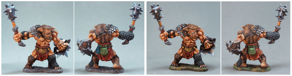
 Left: The miniature I critiqued.
Right: The same figure revised to address some of the critique issues.
![]()
The Critique
My first step was to critique the original miniature. I identified several common issues that experienced instructors or contest judges see when they assess a figure. Bear in mind that this is actually a more thorough review than you are likely to receive in social media comments or after a contest. I had plenty of time to assess the miniature carefully and consider how best the issues might be addressed, whereas a busy contest judge or instructor might have only a few moments to spend talking with you about your figure. This is one of the reasons I encourage you to work to improve your visual eye and critical thinking skills. You are the person in the best position and with the most time to help you improve.
 The before version.
Below is a summary of the main issues I found with the bugbear. If you prefer, you can watch the video to see the figure in the round and watch me point at the specific areas in question for each topic.
Paint Job Damage
It’s hard to see in the photo, but there are a few chips on the leather straps and kilt. I can’t speak for all judges, but I tend to assume a one or two isolated areas of damage could have happened during the trip to the event, and I don’t penalize entrants for that.
Unfinished!
Areas that are unpainted or partially painted or extensive damage are a different issue than minor damage, however. That kind of issue reflects on the general workmanship of the figure, which is definitely a factor that contest judges consider! Although this bugbear was stored in my completed game figures case, when I started to look at it I saw several incomplete or outright unpainted areas: the strap on the shield, the rivets on the leg guard and shoulder strap, the claws/nails, and the facial details like eyes and teeth. This is an extreme example, but it’s actually pretty common to forget to finish (or even start) a part of a figure. I often take a couple of photographs before I’m completely done with something and make a checklist of issues to address while I’m doing the final touches on a figure. (I have an example of doing that in this article on Tara the Silent.)
Assembly and Presentation
Paint is not the only element that affects how viewers (and particularly contest judges) assess your figure. Assembly, basing, mould line removal, and other hobby skills are also important. On this bugbear, the straps and hand are a separate piece from the shield. They were not attached well at the factory. This breaks the illusion that the bugbear is really holding the shield. My Tips for Contest Entries Part 1 article has examples of other common hobby skill issues.
Definition
This miniature has a pretty solid foundation of colour and value choices. Those give it a good level of definition and make it readable to the viewer – it’s easy to tell at a glance and from a distance what the various areas of the figure are, and the general nature of the character. The shiny metallic areas stand out well from the more matte skin, cloth, and leather areas. The lighter skin stands out from the darker leather, fur, and cloth. The skin, cloth, and the bags are more saturated colours than the rest of the gear. This contrast between areas is a different kind of contrast than miniature painters usually talk about, but one which is just as important. You can read more about the importance of definition and the arm’s length view in Tips for Contest Entries Part 2.
I scaled the photos down to simulate seeing the figure from a distance or in a thumbnail. Try to view these photos about 2” or 5cm tall. You can see that the stronger contrast between areas, the increased shadow/highlight contrast, and the added lining make the revised figure more ‘legible’ to the viewer at a smaller size/from a greater distance.
 Before
 After
After
Face and Skin
The main issue with the face is that it lacks detail and interest. The eyes and teeth aren’t really painted as separate areas. If a figure has a visible face, that is a very important part of the miniature, and should be painted as the main focal point unless the story of your piece dictates otherwise. The skin overall is pretty good and has a decent level of contrast. But it could have more contrast, and more importantly, more depth and interest.
Contrast
The shadow/highlight contrast level isn’t bad, but there are areas that would benefit from more – the fur of the figure, the fur trim on the weapon, and the kilt are the primary ones.
Colour Cohesion
While the overall colour choices work in terms of visual definition, it doesn’t quite gel together as a coherent colour scheme. It also lacks some cohesion. In particular, the blue and green bags on the back are a little random. Those colours are not present elsewhere on the figure, and they don’t really fit the type of character. The base colours don’t conflict with the rest of the figure, but they also doesn’t mesh with it, either.
Detail and Visual Interest
Apart from the unfinished bits everything is painted to a decent standard, but there’s not much detail or visual interest. This kind of figure provides opportunities for weathering and wear and tear that could help with that.
![]()
Prepping the Figure
I did this part prior to the stream. I dusted the figure off with canned air and brushed it with a large brush. Then I mixed a solution of water with 91% isopropyl alcohol and brushed that over the figure. My goal was to remove any dust and also skin oils that might be on it from handling in game play. Acrylic paint adheres well to acrylic paint, but not as well to grease floating on top of acrylic paint. Painting over dusty miniatures could result in a rough bumpy looking surface.
![]()
The Touchups
I used to be very nervous to do touchups on a miniature, or even just to go back over an area I had thought was finished to increase the contrast or make other tweaks. Eventually I found that if I kept notes of the colours I used used and if I kept mixes to only two colours I wasn’t likely to have problems. Now I don’t even worry about that. If you stay even roughly in the same colour family, the key is to try to match value. Value is how dark or light a colour is. If you’re working on adding more highlights, aim to start by beginning with a paint colour that is roughly the same value as your current highlights. Then lighten it up and add a bit more and paint on some more highlights to create additional contrast. Or the reverse with shadows – start close to the current shadow level and then add darker colours.
That is what I did on the figure below. I matched the actual colours pretty well on the skin and the teal part. I did not match the colour as well on the purple part, but because the colour I did use was in the same colour family and I started with similar values, the end result is a slightly different colour, but nothing looks ‘messed up’. (An article with larger pictures is available.)
 From left to right:
The starting point
Added contrast to the skin.
Added contrast to the dress.
Added contrast to the teal areas (cloak, underskirt, and ribbons).
It might be best to start experimenting with some older figures you wouldn’t be upset to mess up a little. It can take time to improve your eye for matching value, and improving your eye will help your overall painting, not just this kind of revision. Also keep in mind that acrylic paint doesn’t really dry immediately. If you make a mistake, just grab a damp brush and scrub it off. Then let it dry, adjust your paint mix, and try again. I cut the bristles short on an old worn out flat brush and it works particularly well as an ‘eraser’ on recently applied paint. And even if you don’t see the mistake right away or you have trouble scrubbing it off, remember that you can paint over mistakes with fresh paint.
To demonstrate my belief that you don’t need to use the exact same colours to do touchups, most of the paints I used were brand new colours that weren’t on the market when I first painted the bugbear. I used colours from the ReaperCon 2020 and 2021 swag boxes, and those that had just released as part of the Bones 5 Kickstarter fulfillment. I added a few additional colours because that collection of paints didn’t include any standard steel and gold metallics or a dark brown. I didn’t keep track of the colours as I was painting, but I think I mention them as I use them in the videos.
 Front view of the revised version.
Below is an outline of my changes.
Construction
I used a thin strip of plastic to apply glue between the straps and the shield and held the two parts together until the superglue set. It would be ideal to do this before starting to paint, but sometimes we don’t notice things or we have to make repairs to damaged painted figures. There was one strap that didn’t want to stay glued, and for the fix to really look seamless I would have needed to fill some gaps. Painting the straps dark and using dark shading on that section of the shield helps divert the eye from looking around there much. You can see a little spot of light colour in the above photo where the strap pulled away that I should have covered with darker paint to conceal.
Finish
The most important paint task was to get paint on the parts I missed the first time! I painted the shield straps, the rivets on the shoulder strap and leg guard, the eyes, the teeth and tongue, and the claws. The eyes are fairly small, so I went with a simple all black eye and a small light reflection dot of white.
Colour Cohesion
I wanted to tweak the colours a little to be more visually interesting and to work together a little more. I decided to paint over the blue bag on the back. I kept the green bag, and worked it into the colour scheme by introducing green into other areas of the figure. I wanted to focus on a colour scheme of red and green. I glazed some additional red into his skin with very transparent paint. I added more saturated red into the midtone of the red kilt, and also added more highlights with a bit more saturated orange and yellow. I thinned down a dark green colour (Goggler Green) and painted it into the shadow areas of the skin and the red kilt. I also added some to the shadow areas of the weapon and shield, though that was offscreen. I repainted the base with browns and greens used on the figure to suggest either an outdoor setting or a dirt and moss covered cave floor, as that was another way to add some additional green and tie things together.
 Back view of the revised version.
Lining and Definition
I had done some lining when I first painted this, but there were areas where I needed to make it stronger or clean it up. I lined around the belt and shoulder rivets, and the design on the belt buckle. I darkened the lining at the base of the claws where they meet the fingers. I increased the lining between the various elements on the weapon and I think it looks more defined now. I added definition with both darker and lighter paint on some of the wood areas on the shield.
Increased Contrast
I deepened shadows and increased highlights on many areas of the figure. The fur was one I paid particular attention to. The fur on his body didn’t have enough contrast to fully indicate the shapes of his muscles on the back view. Increasing the highlights on the fur around the face also helps draw the viewer’s eye there a bit more. The fur trim on the weapon was defined, but was kind of boring to look at. I gave it some additional highlights to make it appear a little shinier and more interesting to look at. I increased the shading on many of the metal areas, and touched up highlights there as necessary as well. The gold in particular needed more highlights. Although I was pretty happy with the original painting on the green bag, I added a bit more contrast to that as well.
Wear and Tear
In addition to slightly increasing the contrast on the straps, I also tried to make the leather look a little more worn, though I didn’t go crazy with that. I accented the rips sculpted into the kilt fabric by applying darker paint to the depressions, and highlighting around the edges of holes and rips. I used reddish brown and orange colours to apply rust all over the metal areas. He is sculpted as someone who takes great care of his equipment, but to really make that apparent to the viewer requires reinforcing the damaged areas with paint.
 Face angle of the revised version.
Off Stream
Much of the changes were painted during the two streams, but I did do some of it off-stream. I wasn’t sure I could paint the small details on stream. My eyes aren’t what they used to be, and I wasn’t sure I’d be able to position the figure so I could see it and also keep it in frame so viewers could see it. I didn’t think about repainting the base until the end of the second stream. The initial layers of paint were still wet, so I worked on that more later. I also did a bit more work on the shading of the metallics and enhancing the texture of the shield off stream. I hadn’t really thought too much about the rust previously, but as I was working on finishing the changes to the metallics it seemed like a way to tie in some more orange and yellow, add some visual interest, and reflect the nature of the character.
It has been my experience that looking at painted figures in black and white can help people (including me) more easily see the effects of added contrast and lining, so I’ve converted the bugbear pictures to grayscale. While hue and saturation can add valuable contrast to our figures, they tend to look most visually effective if there is also some solid value contrast, both between the shadows and highlights, and between different areas of the figure. Taking a black and white picture of something you’re working on is a great way to get a different view of it. Looking at black and white pictures is also a great way to see if you really have as much contrast between your highlights and shadows as you think you do. Most cellphone cameras have a black and white mode or editing feature that allows you to convert photos to black and white so you can check your own figures while you’re painting.
If you’re having trouble spotting the specific differences that add up to the overall difference, another thing you can try is to compare individual parts. For example, look at the ear on the two figures below. The updated ear has a darker line of shadow under the upper ear ridge, and that helps you more clearly see the individual parts of the ear. If you compare the belt buckle, the darker lining in the crevices of the design and the additional highlights on the relief of the design help you better see the design, and make the belt buckle stand out more from the belt. Added highlights on the rivets on the belt also help those stand out more distinctly, even when viewed at smaller size.
Both of these techniques are also useful if you’re doing some practice painting to try to match someone else’s work. For example, if you’re following a tutorial, pause after each major step and compare your work to what the demonstrator has painted at that stage. Convert pictures to black and white to better compare the values. Look at individual sections or areas within sections. Where have they made things darker/lighter, or put the texture, etc.


![]()
Other Comparison Studies
If you would like to see another comparison with a different figure (and also a comparison between two similar figures), I wrote an article with a digital repaint of the figure below.

I also did a similar project with a human blacksmith.

![]()
Figures in this Post
The Bugbear is available in Bones plastic or metal.
The Blacksmith is available in Bones plastic or metal in a pack with two other townsfolk. The copy I’ve shown here is Bones.
The Victorian lady is available in a pack with a second Victorian lady in metal.
Beach Babe Libby is available in metal.
